No edit summary |
|||
| (One intermediate revision by one other user not shown) | |||
| Line 22: | Line 22: | ||
'''Widgets/WebApps (however its called in ten years)''' | '''Widgets/WebApps (however its called in ten years)''' | ||
There is no good concept to integrate widgets or webapps in the browser. | |||
'''So what is the browser?''' | '''So what is the browser?''' | ||
The browser isnt just another program. Its an abstraction layer and so we need an interface to do all the things that are possible. Now that all work and fun happens in the browser, the browser does all things, the os-interface does, we need an interface that is same as powerful as the desktop/explorer. | The browser isnt just another program. Its an abstraction layer for the www and so we need an interface to do all the things that are possible within the www. Now that all work and fun happens in the browser, the browser does all things, the os-interface does, we need an interface that is same as powerful as the desktop/explorer. | ||
===Why are current systems unable to solve this problem?=== | ===Why are current systems unable to solve this problem?=== | ||
| Line 67: | Line 67: | ||
Overall, you've identified some real problems (and challenges) with the current state of bookmarks. There's an opportunity to make things better. I'd like to hear more details about your idea and designs, but unfortunately they are not available on this wiki as I'm writing this (date: 7 March 2011). | Overall, you've identified some real problems (and challenges) with the current state of bookmarks. There's an opportunity to make things better. I'd like to hear more details about your idea and designs, but unfortunately they are not available on this wiki as I'm writing this (date: 7 March 2011). | ||
===Eric Reiss=== | |||
I liked the statement of the problem. Jim has already pointed out some basic flaws in the presentation (e.g. the use of "of course"). But my greatest problem was that I couldn't really figure out your solution based on the deliverables presented here. The needlessly noisy video would have done better with a verbal description of what was happening on-screen instead of the irrelevant music. | |||
A short statement that described how your application has solved the basic problems of bookmarking (that links/media go out of date or cannot be bookmarked at all) would have helped a lot. Although your ideas may be great, you have simply not succeeded in proving to me that you have done something truly remarkable. | |||
Latest revision as of 11:42, 18 March 2011
Concept
Which problem did you identify?
The interface concept behind not only browsers is way too old and got no improve to handle the wide range of contenttypes and generally the massive increase in data. To mention, the visualisation and organisation of data is one of the biggest tasks for this century. So what are the problems?
- There werent many websites in the early age of the web -> Massive increase
- You had a starting site and then you clicked your way through the web through links. The was no index. You couldn't go to site, you never heard of/no link existed -> Now there are searchable indexes of nearly all webpages that exist on the web
The thing with bookmarks.
Links tend to be outdated just in the moment you bookmarked them. Sites go offline, url are changing, content changes. Months later, the information itself is no longer relevent - outdated or maybe the information is already manifested in you brain and no longer needed externally. Its faster to "google", than to search your own bookmarks. "Ah, new computer, my bookmarks are gone.. ."
The integration of multimedia.
Bad for the user: Every website has its on videoplayer, photo-script (lightbox), audioplayer.. . "What happens when i click the link..? Oh no..". For the webdesigner: You want to put music on the page. But how? You could link to a mp3-file. But every browser does a different strange thing. Maybe you have to download the file. Maybe there is a new white window with an internal player in the center, maybe there is a blank page whith a custom player (plugin) in the center of the page. Also: Just because of the lame multimedia integration, there are less downloadable files and more adobe flash. Congratulation!
Widgets/WebApps (however its called in ten years)
There is no good concept to integrate widgets or webapps in the browser.
So what is the browser?
The browser isnt just another program. Its an abstraction layer for the www and so we need an interface to do all the things that are possible within the www. Now that all work and fun happens in the browser, the browser does all things, the os-interface does, we need an interface that is same as powerful as the desktop/explorer.
Why are current systems unable to solve this problem?
Webbrowsers are just outdated. Use any browser, open twenty tabs. You see. The problem is, how people think about browsers.
What research findings led you to your first concept?
After surfing the web for some years, i recognized that over the years, the internet and so the browser became more important - more than any other program, more than the desktop. The problem was and is: The actual concept isn't doing the job.
In 140 characters, what is the essence of your project/solution?
An interface that is same as powerful as the desktop/explorer.
Implementation
The user knows what a desktop is. The one who doesn't know - there could be a short introduction video. Its wrong that good interface is usably without knowing anything about it. Look at apple - they explain the use of their products via direct (commerial) and indirect (presentations, blogs, geeks/early adopters) marketing.
What makes your solution more useful or efficient than current products?
later
(Essential: Sketches and/or Video to illustrate the interaction)
User tests
No usertesting at this time due to there is nothing material nor virtual to test. Its just a concept.
Mentor Comments
James Kalbach
Concept
- The opening to your problem statement is good, but try to stay on track more. You start mixing topics right away--from browser limitations to information overload.
- Try to avoid saying "of course" as if every one has the same opinion or is following your thoughts. Also don't make assumptions about users without backing up your statements. ("Very very few people really need offline webapps...")
- There are other systems that have been looking at the problem you indicate. I'd like to hear about what you've come across, even if they incomplete or experimental solutions. Google Chrome, for instance, let's users sync bookmarks between browsers (which addresses at least part of the problem).
- It doesn't sound like you did any research. Even if you don't have time for that, you can at least do something structured, like a heuristic evaluation. Right now it just sounds like your own unproven opinion, which isn't convincing.
- The essence of your project is incomplete and too high level. It's important to be able to communicate your idea clearly and succinctly.
Overall, you've identified some real problems (and challenges) with the current state of bookmarks. There's an opportunity to make things better. I'd like to hear more details about your idea and designs, but unfortunately they are not available on this wiki as I'm writing this (date: 7 March 2011).
Eric Reiss
I liked the statement of the problem. Jim has already pointed out some basic flaws in the presentation (e.g. the use of "of course"). But my greatest problem was that I couldn't really figure out your solution based on the deliverables presented here. The needlessly noisy video would have done better with a verbal description of what was happening on-screen instead of the irrelevant music.
A short statement that described how your application has solved the basic problems of bookmarking (that links/media go out of date or cannot be bookmarked at all) would have helped a lot. Although your ideas may be great, you have simply not succeeded in proving to me that you have done something truly remarkable.
Goals & Non-Goals
- Goals
- make use of todays technology (higher resolutions and color depth, more memory, faster prozessors, gpu-processing) and interface elements such as drag 'n drop, (multi)touch
- forget everything about tabs, bookmarks and history
- one interface for everything - seamless browsing
- Non-Goals
- do minor enhancements to the old interface
- build on top of outdated ideas
Based on an older idea
File:Webtop-jan Schepanski.pdf
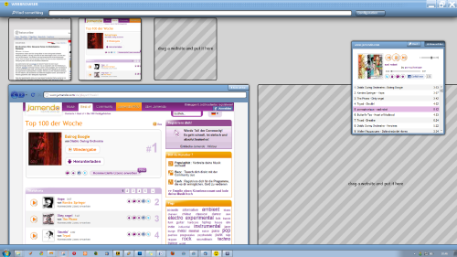
Animation
<videoflash>kysvUDQWZYg</videoflash>
Visualisation
(older concept)
Animation
Sometime.
Idea: All in One
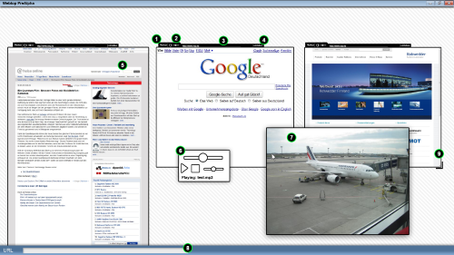
Toolwindows (6)
- Toolwindows make no sense. No one needs extra windows so they should be inside the browser.
- Toolwindows could be some kind of app. So lets redefine the following:
Window=window.open(,'name','toolbar=no,location=no,status=no,menubar=no, scrollbars=no,resizable=no,width=500,height=200')
this could mean: create an "app" which is 500x200 in pixels. This box can be moved around, snapped, dragged, dropped. It doesn't depend on anything. Its just there and does something. Maybe an online radio, a chat, an calculator. There could be an extra app-bar or somewhat.
File linking (6,7)
What happens when you click a link to media file in your browser? Yeah, it opens the file in a new tab or in the same tab. Why not open the image, video or music file in a new overlay that is always on top, movable and includes the typical controls?
Volume control (2)
Every tab should have a slider to control the volume. It also need some visual feedback, to signalize that the tab generates sound.
sleepy tabs
Tabs should go to sleep if not need to reduce cpu-power. There should be a button to prevent this behavior. See the FireFox Addon Tab Bar.
MORE TO COME
Links
APPS (don't ignore apps - they need a fine place to breathe on your browser!)
- Googles Web App Store gestartet
- Firefox 4 Beta 2 - Mit App Tabs und schnellerem Scrollen
- Mozillas Open Web App Ecosystem macht Fortschritte
ZUI (Zooming User Interfaces)
Zoomy Websites
- Image Viewer build with Flash
- Zoomable website navigation Worth a look
- The Scale of the Universe
- Gapminder World
Firefox Design Challenge results and other not that bad ideas
- Lifestream – Redesign history and bookmarking – Wei Zhou
- Firefox Panorama/Tab Candy
- Mozilla Labs Design Challenge: Weave Web UI "Tabs and History visualizations" - Miyoung's Idea
- The interconnection between sites, bookmarks, passwords..
- Editing bookmarks
- TabViz Worth a look
- Tab Wall vs Nodes
OHTER
Articles
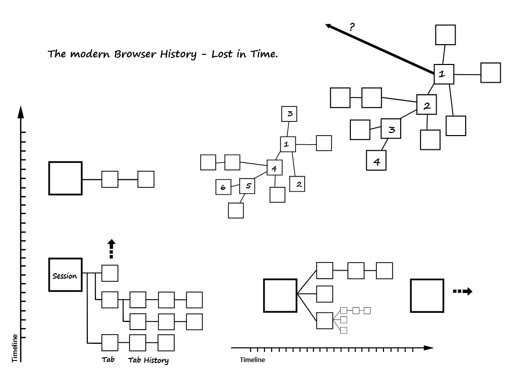
The Browser History
Little sketch to visualize the problem of presenting the todays non-linear browsing history.
Research
Some Images
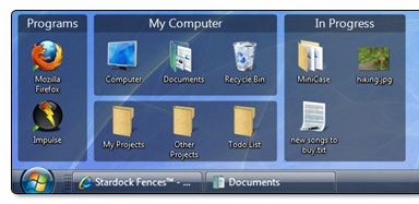
(Screenshot of Fences more Informations on stardock.com) Sophie, Jule, Tristan, Laura
(Screenshot of the webbrowser Safari, more Informations on Apple.com) Carlo, Johannes, Sven
