(Created page with '*Concept / '''WORK IN PROCESS''' ---- 2. entwurf <br> The supermarket of synthetic biology! The synthetic biology supermarket offers a wide range of consumer products, that are…') |
|||
| (30 intermediate revisions by 7 users not shown) | |||
| Line 1: | Line 1: | ||
* | *[[GMU:Synbio supermarket/Technical Descriptions]] | ||
*[[GMU:Synbio supermarket/summaery shifts]] | |||
==marke.6== | |||
*[[GMU:Synbio supermarket/marke.6 text]] | |||
please read this and add missing things and correct wrong things and please do it NOW... | |||
== personal opinion wanted == | |||
*[[GMU:Synbio supermarket/What do you think about Synthetic Biology?]] | |||
Where does SynBio lead us to? | |||
The personal opinion about the topic and also scenarios you could imagine (good or bad) are interesting and important for building a story (through user comments, ci,designer comments ...) | |||
== PR == | |||
*[[GMU:Synbio supermarket/Public Relations]] | |||
**[[GMU:Synbio supermarket/Radio]] The Radio is an integrated part of the PR concept as well as part of the supermarket experience. | |||
== timeline == | |||
*[[GMU:Synbio supermarket/Personal Schedule]] | |||
*[[GMU:Synbio supermarket/Personal Roadmaps with deadlines]] | |||
== Budget planning == | |||
we need a budget plan | |||
== Supermarket Experience == | |||
===The Offline Version=== | |||
Christian and me were talking about offline version, what the iGEM headquarter calls "poster presentation", which wont be a poster in our case. but we only have the same space than a poster, so 1,20x1,20 meters. The idea is to make a machine where people can buy our products. As we taked about that last week the ide is to have three quality categories (in the online version you can customize that in the shopping basket section) The Machine only offers the lowest and cheapest version: the dna-kit to grow the product at home. So what people get is a petridish, some liquids... | |||
a must is to use the things we prepare for the online version. | |||
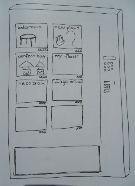
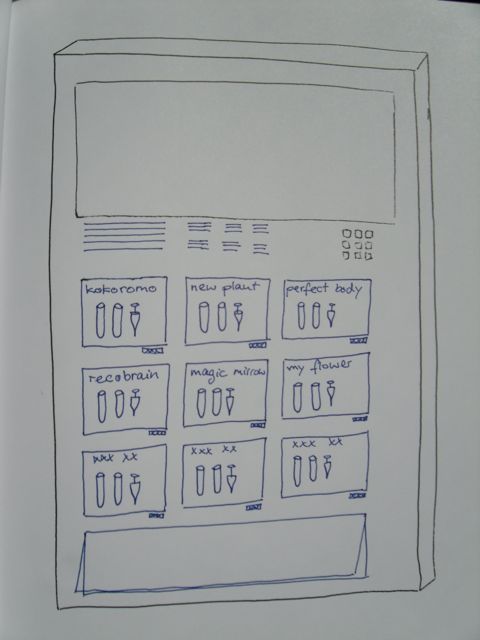
Here now two firs sketches how we could work with that: | |||
[[File:Offline-version1.jpg]] | |||
here each product has a little screen where it is presented with the best things (pictures, videos..) you prepared for the onlineshop. | |||
[[File:offline-version2.jpg]] | |||
here you see that all the kits look the same but you can choose the number to see the presentation on the big screen above. | |||
if you have ideas, critique...great! now is the time. | |||
--[[User:Mila|Mila]] 17:40, 29 June 2010 (UTC) | |||
==== Webshop front page==== | |||
Hi everybody. | |||
I upload my concept of webshop, and some explanation of it. | |||
You can find them with this link~ | |||
[[Media:Webshop-Yu Xiaorui.pdf]] | |||
PS: Thanks for the correction of my wrong spelling! | |||
--[[User:yuxiaorui|Xiaorui]] 12:34, 25 June 2010 (UTC) | |||
---- | |||
====My idea about Logos and webshop==== | |||
Hello, <br/> | |||
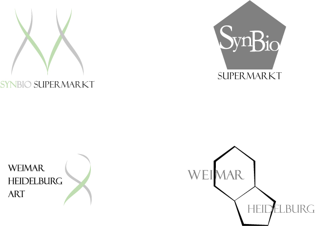
here is the picture about my Logo design.<br/> | |||
[[File:Logo yu.jpg]] | |||
There are two sets of logos, One for our team, one for the supermarket each.<br/> | |||
I choose the double-chain structure of DNA and the shape of displaying bases in Biology as factors in my design. Also means the combination or collaboration of Weimar and Heidelburg. | |||
It's HeidelBERG, not BURG. Berg = Mountain, Burg = Castle. There is a castle in Heidelberg, but the city is named after a hill.--[[User:Max|max]] 12:41, 23 June 2010 (UTC) | |||
........ | |||
Secondly, it's my concept of our webshop.<br/> | |||
[[File:Webshop yu01.jpg]] | |||
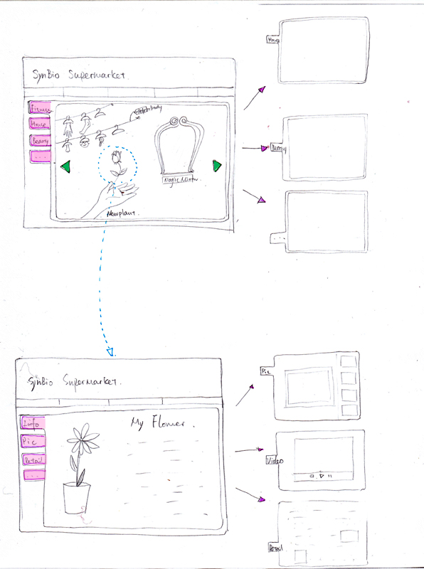
* There is a bar on the top of page to show links to other subpages.<br/>Such as My account, Contact us, DNA Test, etc. | |||
* The pink tags are the catalogs of different groups of product.<br/>The chosen group will show the pictures on the right. I like to make all the products in a really scene. | |||
* The green triangles is to flip the page if one picture is not enough. | |||
* To click on one product will lead to the page for it as the blue arrow show.<br/>This page is also designed the same way of the main page. So the interface will stay the same and less confusing. The tags are about different information of this product,such as: Basic info, Picture/video, 3D model, technical details, designer's story and comments... | |||
In my opinion, our webshop should stay simple and clean. In that we can highlight our product mostly.<br/> | |||
And the supermarket is just a concept or a container for our idea, so we don't have to compare our supermarket with the real ones. Especially the marketing Stratagem part. After all we sell nothing. That means we can be more free when we think.<br/> | |||
And I also did a little swf file to show my idea of the navigating system of the supermarket, if we need one. | |||
<flash>file=Supermarkt.swf|width=600|height=350|bgcolor=#eeeeee|scale=exactfit|quality=best</flash> | |||
<br clear="all"/> | |||
Looking forward of your suggestions. | |||
--[[User:yuxiaorui|Xiaorui]] 21:34, 22 June 2010 (UTC) | |||
---- | ---- | ||
The | ==='The I-know-what-you-want-system'=== | ||
A mechanism well known by all internetshop users...but in this case taken to extremes... | |||
As known from computers as a personal key to use the fingerprint there should be a small interface next to your computer which analyses your body needs and genetical code. | |||
According to this you get special commercials in the supermarket | |||
e.g. for vitamines, diet-helpers or anti-transpirants | |||
Online: next to the computer there is this interface. | |||
Offline (real life supermarket): when entereing the shop you get a shopping basket, at the handle bar there is a sensor which analyses these things. With a W-Lan system it sends it to the server which coordinates the data of all the shoppers. On a small display in the shopping basket you get special informations. | |||
Aditionally if you pass by the light in the supermarket spots those products that are 'good' for you. | |||
the | As a special service the system makes shopping to a social event. It locates persons that would fit very good with your genetic material or your current feeling. So you get the advice (online as a pop-up window, offline as a note ob your screen) 'have a look in corridor 4, section B you may find...(and you have the possibility to contact this person, so also in the online version you see who else is shopping at the same time). | ||
When entering the supermarket you also may give yourself a profile, which works as a filter. | |||
(e.g. show me only woman between 30-40, not having had sex in the last 48 hours, smoking but in general healthy. | |||
Or an extra as a visualization of how a child with this person would look like... | |||
..to be continued... | |||
Even if I dont want … I always come back to the idea of a „second life“-market – it really has some good options – seeing the other, having the possibility to interact, really going through the world and so on. and maybe its easier to use existing systems than to create something completely new... but i am not really happy with this thought) | |||
--[[User:Mila|Mila]] 20:34, 15 June 2010 (UTC) | |||
I checked some secondlife supermarkets. If you get in account (its free) you can visit it too. | |||
Jazzy, Großräumig, leer, unecht. | |||
http://maps.secondlife.com/secondlife/Tethea/162/148/86 | |||
Essen, schlechte Grafik. | |||
http://maps.secondlife.com/secondlife/FOOD/126/128/37 | |||
„Wild fashion“ Mall | |||
huge. I am getting lost | |||
http://maps.secondlife.com/secondlife/Cheonma/103/201/101 | |||
market huge... | |||
http://maps.secondlife.com/secondlife/Aspen%20Grove/75/103/22 | |||
It makes some things very clear and visible: | |||
not good in virtual makrekts: flying through the things. (want it more touchy) if there is someting in the way there is something in the way.... more the feeling of being able to take something out and have it in the hand... | |||
to | often only 2D ictures at the wall..thats not nice. shoul be more a rack... | ||
although i preferred the mall - it seems not to be a good solution. you run too long until you find something. So lets make ONE NICE SUPERMARKET with nice spotlights on (our personal project-) products and than racks with other products. | |||
- | ...to be continued | ||
==Party== | |||
* | *[[GMU:Synbio supermarket/Party]] | ||
Latest revision as of 09:52, 6 June 2011
marke.6
please read this and add missing things and correct wrong things and please do it NOW...
personal opinion wanted
Where does SynBio lead us to? The personal opinion about the topic and also scenarios you could imagine (good or bad) are interesting and important for building a story (through user comments, ci,designer comments ...)
PR
- GMU:Synbio supermarket/Public Relations
- GMU:Synbio supermarket/Radio The Radio is an integrated part of the PR concept as well as part of the supermarket experience.
timeline
Budget planning
we need a budget plan
Supermarket Experience
The Offline Version
Christian and me were talking about offline version, what the iGEM headquarter calls "poster presentation", which wont be a poster in our case. but we only have the same space than a poster, so 1,20x1,20 meters. The idea is to make a machine where people can buy our products. As we taked about that last week the ide is to have three quality categories (in the online version you can customize that in the shopping basket section) The Machine only offers the lowest and cheapest version: the dna-kit to grow the product at home. So what people get is a petridish, some liquids...
a must is to use the things we prepare for the online version.
Here now two firs sketches how we could work with that:
 here each product has a little screen where it is presented with the best things (pictures, videos..) you prepared for the onlineshop.
 here you see that all the kits look the same but you can choose the number to see the presentation on the big screen above.
if you have ideas, critique...great! now is the time. --Mila 17:40, 29 June 2010 (UTC)
Webshop front page
Hi everybody. I upload my concept of webshop, and some explanation of it. You can find them with this link~
PS: Thanks for the correction of my wrong spelling!
--Xiaorui 12:34, 25 June 2010 (UTC)
My idea about Logos and webshop
Hello,
here is the picture about my Logo design.

There are two sets of logos, One for our team, one for the supermarket each.
I choose the double-chain structure of DNA and the shape of displaying bases in Biology as factors in my design. Also means the combination or collaboration of Weimar and Heidelburg.
It's HeidelBERG, not BURG. Berg = Mountain, Burg = Castle. There is a castle in Heidelberg, but the city is named after a hill.--max 12:41, 23 June 2010 (UTC)
........
Secondly, it's my concept of our webshop.

- There is a bar on the top of page to show links to other subpages.
Such as My account, Contact us, DNA Test, etc. - The pink tags are the catalogs of different groups of product.
The chosen group will show the pictures on the right. I like to make all the products in a really scene. - The green triangles is to flip the page if one picture is not enough.
- To click on one product will lead to the page for it as the blue arrow show.
This page is also designed the same way of the main page. So the interface will stay the same and less confusing. The tags are about different information of this product,such as: Basic info, Picture/video, 3D model, technical details, designer's story and comments...
In my opinion, our webshop should stay simple and clean. In that we can highlight our product mostly.
And the supermarket is just a concept or a container for our idea, so we don't have to compare our supermarket with the real ones. Especially the marketing Stratagem part. After all we sell nothing. That means we can be more free when we think.
And I also did a little swf file to show my idea of the navigating system of the supermarket, if we need one.
<flash>file=Supermarkt.swf|width=600|height=350|bgcolor=#eeeeee|scale=exactfit|quality=best</flash>
Looking forward of your suggestions. --Xiaorui 21:34, 22 June 2010 (UTC)
'The I-know-what-you-want-system'
A mechanism well known by all internetshop users...but in this case taken to extremes...
As known from computers as a personal key to use the fingerprint there should be a small interface next to your computer which analyses your body needs and genetical code. According to this you get special commercials in the supermarket e.g. for vitamines, diet-helpers or anti-transpirants
Online: next to the computer there is this interface.
Offline (real life supermarket): when entereing the shop you get a shopping basket, at the handle bar there is a sensor which analyses these things. With a W-Lan system it sends it to the server which coordinates the data of all the shoppers. On a small display in the shopping basket you get special informations. Aditionally if you pass by the light in the supermarket spots those products that are 'good' for you.
As a special service the system makes shopping to a social event. It locates persons that would fit very good with your genetic material or your current feeling. So you get the advice (online as a pop-up window, offline as a note ob your screen) 'have a look in corridor 4, section B you may find...(and you have the possibility to contact this person, so also in the online version you see who else is shopping at the same time).
When entering the supermarket you also may give yourself a profile, which works as a filter. (e.g. show me only woman between 30-40, not having had sex in the last 48 hours, smoking but in general healthy. Or an extra as a visualization of how a child with this person would look like... ..to be continued...
Even if I dont want … I always come back to the idea of a „second life“-market – it really has some good options – seeing the other, having the possibility to interact, really going through the world and so on. and maybe its easier to use existing systems than to create something completely new... but i am not really happy with this thought)
--Mila 20:34, 15 June 2010 (UTC)
I checked some secondlife supermarkets. If you get in account (its free) you can visit it too. Jazzy, Großräumig, leer, unecht. http://maps.secondlife.com/secondlife/Tethea/162/148/86
Essen, schlechte Grafik.
http://maps.secondlife.com/secondlife/FOOD/126/128/37
„Wild fashion“ Mall
huge. I am getting lost
http://maps.secondlife.com/secondlife/Cheonma/103/201/101
market huge... http://maps.secondlife.com/secondlife/Aspen%20Grove/75/103/22
It makes some things very clear and visible:
not good in virtual makrekts: flying through the things. (want it more touchy) if there is someting in the way there is something in the way.... more the feeling of being able to take something out and have it in the hand... often only 2D ictures at the wall..thats not nice. shoul be more a rack...
although i preferred the mall - it seems not to be a good solution. you run too long until you find something. So lets make ONE NICE SUPERMARKET with nice spotlights on (our personal project-) products and than racks with other products. ...to be continued