GMU:Einführung ins Programmieren mit Processing/Seminar: Difference between revisions
| Line 371: | Line 371: | ||
===Johannes Konrad Altmann=== | ===Johannes Konrad Altmann=== | ||
https://dl-web.dropbox.com/get/Photos/IMG_1179.JPG?w=6450145a | [[File:https://dl-web.dropbox.com/get/Photos/IMG_1179.JPG?w=6450145a]] | ||
= 11/11 = | = 11/11 = | ||
Revision as of 20:29, 10 November 2011
28/10
Homework
Check the links below. Choose one or two projects, works you really like and write a short text about it. (why you like it, what is interesting for you and what happens there. Feel free to look at other sources as well. We'll have a look at them tomorrow.
http://processing.org/exhibition/
http://www.openprocessing.org/
http://vimeo.com/groups/processing
http://www.visualcomplexity.com/vc/
http://www.creativeapplications.net
http://www.complexification.net
Patawat Phamuad
project:
Balldroppings
click at above picture to go to application.
description:
This web-based application is constructed from Processing.js, a part of Processing language which is able to run on browser. The most interesting point of this project is to focus on both 2 of 4 approaches to interactive design.
For the first approach "User-Centered Design" , the designer tried to make a simple drum without any complicated set of drum pieces. Only lines and circles working with physic law are able to initiate a set of user-based instrument. Importantly, the user foresees what is supposed to be happened without any instructions.
Furthermore, the second approach focuses on "Activity-Center Design" . The system flows until the user press "close" button on web browser. The system has no fixed ending. Thus, the designer designed tool for actions. In addition, each action directly depends on each own person's experience and mental processes. (Exteriorized:-interesting in what people do)
system & technology:
I.application processes active to each order <balls & lines>
II.Users active to application process. <dragging line & outputsound>
III. Processing.js + html5
referred:
Dan S. Designing for interaction. The four approaches to interaction design. (2001)
Processing.js, iProcessing: javascript does everything for you!
everyware, Soak
<videoflash type=vimeo>27158491|549|309</videoflash>
Soak is an empty canvas made of an elastic material. The moment you touch it the canvas gets virtually soaked with color.
A Kinect detects any deformation of the elastic surface and passes this data to Processing, which then simulates virtual drops of dye.
What I like about this project is the combination of digital tools with analog materials and the beauty of being so simple. The simulation of watercolor on the other hand is very interesting as well. (*cellular automata)
// Sebastian
Substrate
by Jared Tarbell [1]
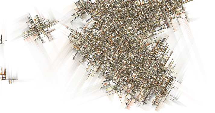
0001 iterated substrate by Jared Tarbell [2]
Substrate is a piece of generative art written in processing that creates a landscape looking a lot like urban plans.
At the start of the program a couple of straight black lines are placed randomly on the canvas. They expand during the program, each line growing other lines at right angle but at random positions and at random times. This process is repeated for the newly grown lines. The expansion of a line stops when it collides with another line.
Each line has a shadowish colouring of variable hue and amplitude to the left of the line's growing direction.
Due to the different angles of the starting lines the growing image consists of distinguishable parts that could resemble city districts if the image was compared to an urban plan.
Substrate seems particularly interesting as it creates beautiful patterns using a rather simple algorithm.
(md)
Alexander Gustke
OASIS

http://everyware.kr/portfolio/contents/09_oasis/
Was ist OASIS?
In OASIS hat der Benutzer die Möglichkeit mit einer virtuellen Unterwasserwelt mit allen möglichen Tieren die dort leben zu interagieren.
Basis ist ein Touchscreen der vollständig mit schwarzem Sand bedeckt ist. Wenn der Sand zur Seite geschoben wird und freie Stelle entstehen, bildet sich in diesen eine kleine Welt voller Fische, Seesterne und Quallen. Durch das Wegschieben des Sandes entsteht eine erweiterte Welt in der sich dann mehr Fische und andere Tiere bilden können. Das Verkleinern der Welt führt dazu, dass sich alle Tiere den engeren Platz teilen müssen. Weiterhin reagiert die Welt auf Hindernisse, wie zum Beispiel Steine. Diese können inmitten einer freien Stelle platziert werden, welche die Unterwassertiere dann versuchen zu umschwimmen.
Was mich zu den oben genannten Dingen zusätzlich interessiert ist, dass Fische Schwärme bilden können und versuchen innerhalb des Schwarms nicht miteinander zu kollidieren.
Julia Putscher
Project:
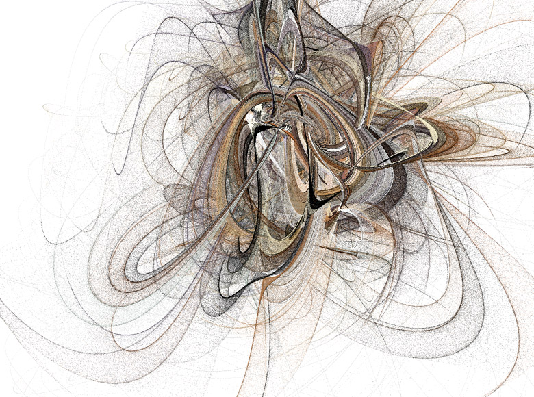
Algorithm Art Code
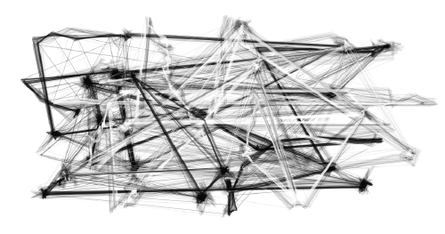
click at above picture to go to application.
Description:
This project was made by Joao Martinho Moura with Processing.js.
Processing.js is the sister project of Processing and designed for the web. It makes makes your data visualizations, digital art, interactive animations, educational graphs, video games, etc. work using web standards and without any plug-ins. Processing.js allows Processing code to be run by any HTML5 compatible browser, including current versions of Firefox, Safari, Chrome, Opera, and Internet Explorer.
Algorithm Art Code is a generative system that creates compositions of lines and even sculptures. It is able to cause multiple results and may even produce art. By clicking into the interactive frame and moving the mouse you can influence the appearence of the creating composition. There are six different types of the "Algorithm Art Code": TR-Lines (Transversal Lines), Closed Lines, Infinite-Boils, Perls and Sine-Paths. I think this project is interesting because I like interactive surfaces that "act" according to a human's behavior and through which you can influence the result of the process.
Links:
- http://www.jmartinho.net / Webpage of Joao Martinho Moura
- http://projects.jmartinho.net/#1577272/Html5-Algorithm-Art-Code / Examples for Algorithm Art Code
Dianna Mertz
 New York Talk Exchange
Globe Encounters
This animated infographic illustrates the flow of information in real time between I.P. addresses in New York City and elsewhere around the world. The greater the illumination of each arc, the greater the internet traffic flow between NYC and that particular city within the last day. This project appeals to me mostly because it successfully demonstrates information consumption — a personal area of interest. This is also a great way to relay the usage of I.P. address data. I only wish that it wasn't limited to NYC; ideally, we'd see how the info traffic consumption flowing from NYC compares to other cities around the world.
Jelena Djokic

http://xiaoji-chen.com/blog/2010/map-of-paris-visualizing-urban-transportation/
The work is a mental map of the city of Paris, not related to the proportional distancies of diferent points to the city center, but to the cost it takes to get there.
Touch DJ
http://vimeo.com/groups/processing/videos/30735367/
The project, by which the user interface and sound come to dialog. I find it interesting because it is about a usual case of influencing sound by picking diferent buttons from the board, but the both sound and user interface influence changes to each other. Otherwise people developed a new tool for themself, making a ppeace of work. Or were oposite?
Life Support Systems - Vanda

The system analyzes electrical signals from the vanda hybrida orchid and generates a virtual model of this "language". It then produces similar signals based on the learned model, even after the orchid's death. In this way, the plant's spirit somehow is preserved in a digital system.

Link: http://www.visualcomplexity.com/vc/project.cfm?id=40
Tristan Weis
Andreas Dietrich
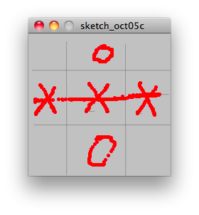
E7
E7 from http://www.openprocessing.org/visuals/?visualID=40859 is a little game to play (in German XXO should say everything). You need to draw the things alone, but so you can change the number of rows and colons. With a left click (or the left mouse button is pressed) you draw a horizontal line, with the right mouse button you draw a vertical line. If you drag the mouse you can draw the O or the X (or whatever you want).
JOHANNES KONRAD ALTMANN
<videoflash type=vimeo>26383732|549|309</videoflash>
VOID is a conceptional processing magazine for the iPad. It is aimed to bring coding closer to designers, with focus on enhanced user integration and personalization with a strong visual approach.
The magazine app features sections where the reader is able to explore projects, learn about other processing artists, manipulate source code live inside the app and immediately see the changes highlighted in the code.
Users can save their modified versions of a sketch, screenshots or short videos to a custom dropbox folder that is linked to the app. It is also possible to share this data via facebook, twitter and email.
Idea, Concept and App-Layout: Natalie Hanke
Camera and Postproduction: Daniel Oliveira Carneiro
Music: Pivot — Make Me Love You
For more information:
- http://cargocollective.com/coffeemakescreative
- http://cargocollective.com/coffeemakescreative/1736030/VOID
- http://www.danielcarneiro.eu/
- http://www.pvtpvt.net/
Sources for text, images and code:
- http://www.creativeapplications.net/
- http://www.generative-gestaltung.de/
- http://www.openprocessing.org/
Lu JIN
- Name: Sand Traveler
- Link:http://www.complexification.net/gallery/machines/sandTraveler/
- Description: use single dot to create a three dimensional figure in the 2d plane.
- Reason: The sand pictures change frequently and leave me a great expectation for the next picture, when the dot stops.
Jan Schepanski

Shadow Monsters
Wer kennt sie nicht aus Kindertagen: Die illustren Schattenspiele. Die Hand in gewissem Abstand vor eine Lichtquelle gesetzt und los ging der Spaß. Dank moderner Technik lassen sich die aus Hand geformten Monster nun zum Leben erwecken! Technisch wird es umgesetzt, indem man die jeweiligen Hände filmt, deren Bewegungen samt Silhouette erfasst und mit Hilfe eines Beamers dann die Hände in kleine Monster verwandelt.
http://www.youtube.com/watch?v=tSJTTkwrZ9s
29/10
Homework
Look for a visual pattern on your way home, at your house, somewhere around you. that can be: a textile, the pattern on the sidepath, a pattern in the sky, a pattern on your wallpaper. Make a photo or a sketch.
Patterns are always repetitions of elements. The elements are sorted in a certain way. That’s the rhythm. try to describe the rhythm. cut your pattern in its smallest elements. How many elements do you have. in which way are they composed? write a short text about the composition.
cobblestone
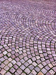
cobblestone (photo cc-by-sa by a2t [3])
Cobblestone pavements are often laid in interesting patterns like the one shown above.
The stones are placed in arcs which are repeated to the inside and outside of the arc's circle and in similarly oriented arcs at their endpoints.
Due to the irregularities in the stone's sizes a random component is added to the pattern, making it harder to decode while still keeping it repetitive.
Pattern definition:
The pattern consists of basically one shape, a square. The squares are arranged in rows and columns as shown in the image on the right (one row highlighted in green, the two columns separated in red). The tricky part is that within each row/column the stones are placed along an arc while being rotated according to their position on the arc.
The radius of the arc is determined by the size, number and spacing of the squares used to form one row/column segment of the pattern and will stay the same during the whole drawing process. The position of each square on an arc is determined by its width and the predefined spacing. The orientation of each square is determined by its position on the arc, starting with -45 degrees and being rotated clockwise by 90/(n-1) degrees (where n is number of squares on each arc; this is also the angle between the centers of two stones on the arc).
The pattern can be drawn with three nested loops:
- ONE looping through each row, setting the center Y for the arc's circle (starting with the position of the square closest to the bottom (highest value) plus the radius and being decreased by the square's height and predefined vertical spacing during each run)
- TWO looping through each column, setting the center X for the arc's circle (starting with the of distance of the leftmost square to the center of the arc's circle and increasing it by two times that distance during each run)
- THREE looping through each stone, going along the arc in previously determined steps and placing a square in it's proper rotation (-45 degrees incremented by the length of the step during each run).
- TWO looping through each column, setting the center X for the arc's circle (starting with the of distance of the leftmost square to the center of the arc's circle and increasing it by two times that distance during each run)
Each stone shall of course be drawn only if inside the pattern's bounding box and the first stone of each column is only drawn for the first column as it is the same as the last stone for all following columns.
(md)
Growing Ivy
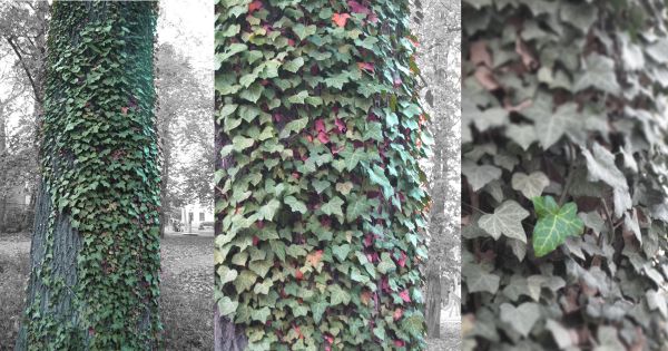
The pattern of growing ivy is a pretty dense one. The l[link title]eaves are the smallest elements within that pattern. Looking at the boundaries of it you can observe that ivy grows up in lines, each covered with leaves to the left and right side by turn. Through this the pattern has an appearance like an organic, random grid which is extendable in all directions.
--Julia Putscher
Textile on a Chair
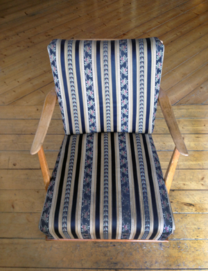
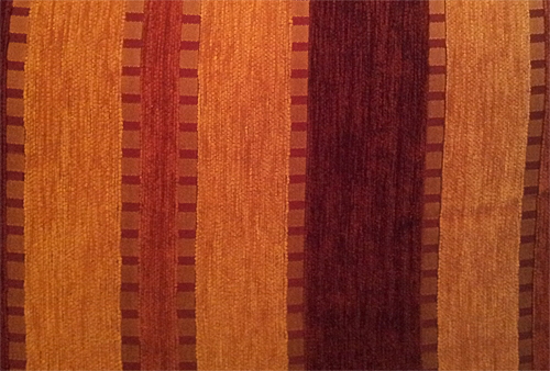
The textile pattern on this chair has alternating vertical stripes. Some of these stripes are solid colors; others have patterns within them. Within the patterned stripes, a few have vertically stacked repeating elements. One set has a floral pattern sitting alone a line that resembles a sine wave. The floral pattern mirrors itself along the vertical axis.
Color plays an important role in this textile pattern, as the plain black stripe is consistently placed between the two main alternating floral stripes. The black stripe contrasts sharply with the flowery pastels.
--Dianna Mertz
Spider
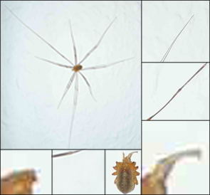
This is the spider on the white wall. It has two antennas and 8 feet, 3 long and 5 short feet. The most part of it is symmetrical. I think it can be realized through rotation and mirror effects.
--Lu Jin
Case
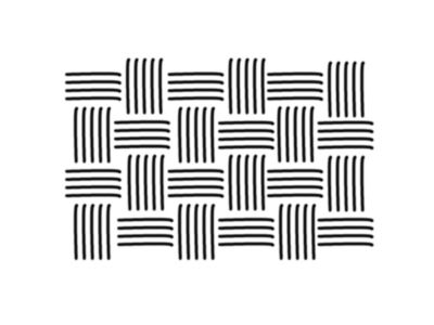
A sketch of a part from a hard drive case. It consists of two lines of a different length and a point. Put this in a line, one line, one point, one line, three points, and in the next line just mirror it.
Raphael K.
My midnight pizza
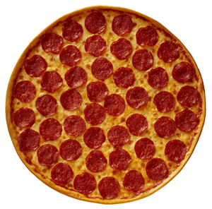
Do you like pizza? yes I like it. Pizza is always founded as circle big shape background then come after with a lot of edible stuffs on second layer or surface. Your favorite pizza always decorates with tomatoes, concentrated-tomatoes sauce, cheese, pepperoni, paprika, salami, and so on. They are laid on the surface with random position but with sense of human that drop anythings on surface with an appropriate position:- not too far, no too close to each other. More,each will be laid on each other layer by layer.
-PATawat. P-
Plattenbau
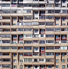
(image © Oleg Borodin [4])
Plattenbauten, or prefabricated houses always shape patterns because of their construction and design, which aims to make them cheap, quick and rather easy to build. They consist of ready-made standardized parts, which all look basically the same and form quite repetitive patterns automatically.
// Sebastian
Sofakissen
(Farben auf dem Bild nicht originalgetreu...)
Auf dem Bild zu sehen ist das Muster von einem Sofakissen. Dabei kann das Muster im ersten Schritt grob als parallel aneinander liegende Rechtecke beschrieben werden. Im zweiten Schritt kann man sagen, dass neben jedem nicht gelben Rechteck ein gelbes Rechteck ist, welches nicht weiter zu unterteilen ist. Diese gelben Rechtecke haben immer dieselben Abmessungen. Die Muster in den Rechtecken zwischen zwei gelben Rechtecken alternieren in zwei Varianten.
Die erste Variante ist wie folgt aufgebaut: Der Rand längs des Rechtecks besteht aus gelben kleinen Quadraten, wobei zwischen zwei Quadraten ein roter Zwischenraum von der Breite eines halben Quadrates ist. Die Seitenlänge jedes Quadrates ist ungefähr ein Fünftel der Breite des gelben Rechtecks. Zwischen diesem Rand aus Quadraten ist das entstehende Rechteck rot, wie der Zwischenraum der Quadrate. Das rote Rechteck ist etwas größer als die gelben Rechtecke.
Die zweite Variante unterscheidet sich zur ersten nur in dem Punkt, dass der Zwischenraum zwischen dem Rand aus Quadraten nur noch ein Drittel so groß ist, und die Farbe mehr ins Orange geht.
Alles in Allem kann man sagen, dass dieses Muster aus insgesamt 5 Elementen besteht.
|Alexander Gustke|
Jelena Djokic
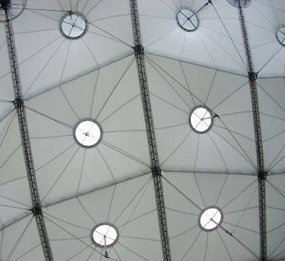
A tent pattern
Though is the composition of the pattern simple central structure, the complexity comes from the structure and the way, the patterns with each other connected are. This provokes 3dimensionality, on the way, that putting facets together by different angles provokes the look of broken lines and broken shapes.
Andreas Dietrich: Pavement
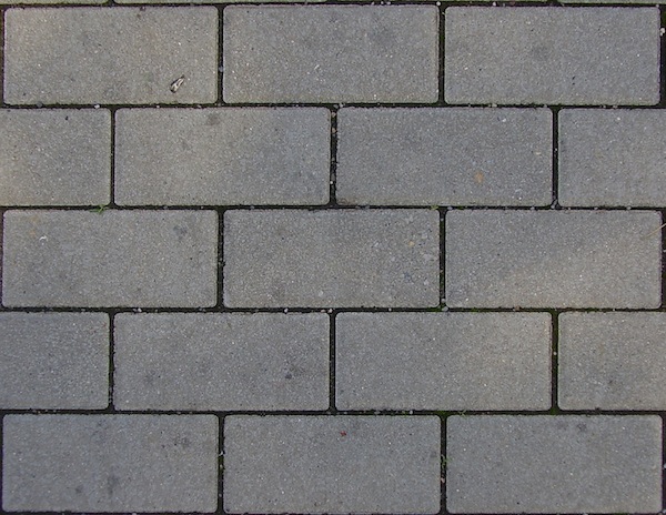
Pavements have often paving stones. The are many patterns available. In this example the pavement consists of two rectangle. Both have the same heights. The bigger one has a width of the height times two. The width and the height of the smaller one is equal.
To Draw this shapes:
Begin with the bigger one. Place three of them next to each other. Go the height of the rectangles downwards and to the rectangle, which is on the left. Begin on the left side with the smaller rectangle. Place two bigger rectangles next to it. Finally place a new smaller rectangle next to one of them.
Go the height of the rectangles downwards and to the rectangle, which is on the left.
Repeat this steps, if you want.
Tristan Weis: Couch cloth pattern
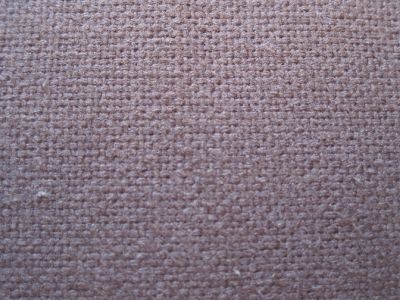
The pattern consists of very small strings. There are strings from the bottom to the top, and from left to right. Running from one side to another, every few millimeters a batch of strings runs over the crossing batch; after that it runs under the next one; over the one after - and so on. The batches running from left to right seem slightly thicker, forming a diversified web with the thinner ones from top to bottom.
Florian Meyer: Fake 3D
This pattern provides an illusion of depth due to use of simple 2D geometry (rhombus)
with different shades that matches with our conception of how three-dimensional
shapes must look like as soon as light is getting reflected off their surfaces
from a specific angle.
Jan Schepanski: Schneefall

Wie im Flug schritten sie durch des Winters Flockenflug mit frohlockend lockrem Lockenhaupt und so war schnell klar wer von beiden keine schützend Mütze trug.
So wie jede Schneeflocke nach dem Regelwerk der Natur gebildet wird, so segeln sie dahin, getrieben von Wind, Schwerkraft und der Lust des Tanzes.
Johannes Konrad Altmann
File:Https://dl-web.dropbox.com/get/Photos/IMG 1179.JPG?w=6450145a
11/11
Homework
Textile on a Chair
To write the code for this pattern, you could set the background fill to (0). Then, there could be one main "for" structure, that continually repeats itself horizontally for the width of the window. Within this structure, there would be two sub "for" structures: A + B. The first (A) would feature the thicker main vertical set, and the second (B) would feature the thinner vertical set. Each set would be spaced roughly 1 inch (or x pixels) apart from each other.
For each of the two vertical sets, we could create a stack of lines of varying thicknesses on top of each other. The bottom layer would have the heaviest weight, and the top layers the lightest weight. Within each of the two sets, each line would be centered, so that an equal part of the line appears from both sides as we move towards the center of the vertical set. As we approach the center of each set, we would have to create:
A) The vertical sine wave mirrored upon itself vertically
and
B) The vertically stacked flowers
For A), we create a trigonometic (sine wave) function. Perhaps we use another "for" structure with a float + sin() function.
For B), we create yet another "for" structure, this time repeating an image along a vertical line.
--Dianna Mertz
Textile on Pizza Chilino
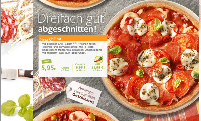
If we focus closely to this Chilio Pizza, we would see that the pizza contains with many layers. Each layer is decorated with vegetables, cheese and meat. However, the distance between each asset doesn't random itself, there is a hidden pattern which each edible lays far from each other by almost constant distance.
To make sketch of this pizza, we would follow these processes below:
1) Make a pizza flour base layer by drawing an ellipse and fill with cream or yellow color.
Function: ellipse(),fill()
2) Put a concentrate tomato sauce by drawing another layer on top of pizza flour, after that, fill red color.
Function: ellipse(),fill(), pushMatrix(), popMatrix()
3) Create salamis() function by drawing ellipses and put little white spots on around salamis' surface.
Function: ellipse(),fill(), point(), random()
4) Spread salamis around the pizza with random() function BUT not further than pizza flour edge(2*PI*radian). Furthermore, we could use For loop or While loop iteration to define a number of salamis we need.
Function: salamis(), random()
5) Repeat 3) and 4) to drop more tomatoes, chilis, basils and mozarella cheese layer by layer. Moreover, we could rotate assets to make it more real pizza by rotating function.
Function: tomatoes(), chilis(), basils(), mozarella(), random(), rotate()
6) Enjoy your Pizza Chilino :)
--Patawat P.
Florian Meyer: Fake 3D
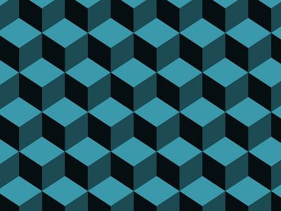
One single cube consists of 3 rhombs which can be drawn simply by using the
”beginShape()-endShape()” method. Besides, the values of their coordinates
and colours depends on the angle of perspective from which we want to look
at the cube. After that we have to make a row by using the 'for loop ' and
another 'nested loop' for making the columns. As we can see in the image,
each column underneath isn't placed exactly in same order as their previous
ones are. There are shifted sideways by half the size of a single cube for
each time the nested 'for loop' is calculating a further one.
We have to consider that moving the columns in only one horizontal direction
will cause a bad looking stairway. To get rid of that, we have to find a way
to turn the values from every 2nd counting step the nested loop does, into
negative values instead of just adding them, so that each 2nd column is placed
back to its original starting position. This can be done for example by declaring
a new variable that is working as a multiplying operator and carries switching
values of 1 and -1.
