IFD:Nutzerstudien WiSe1314/Sicherheit endpresentation (security): Difference between revisions
(→Ideas) |
|||
| Line 70: | Line 70: | ||
|} | |} | ||
==Preparation for the interviews== | ==Preparation for the interviews / Observation== | ||
'''Student 1:''' | '''Student 1:''' | ||
| Line 80: | Line 80: | ||
'''Student 3:''' | '''Student 3:''' | ||
==The interviews== | ==The interviews== | ||
Revision as of 17:24, 3 March 2014
Aims of design
We concentrated on the interface of the message window. First, it should be easy to handle, of course. It should provide an uncomplicated and plain interface, where you can figure out the functions fast and remember them for the next time. It’s essential to spare symbols that confuses the user or that are barely necessary by themselves. So we searched for some design ideas to answer the questions:
- What can I do to guarantee a conveniant handling in the message window?
- How can we improve the interface for the functions of secure, unsecure and verified messaging?
Ideas
We searched for possible symbols that provide security and tried out some designs to improve the current look of the chat. Examples had been locks and shields in many variations. We also tried out various colors to make clear the differences between functions.
BILDER!!!!
How we prepared for interviews / our questions
For our interviews, we tried to choose open questions that don’t require a yes or no, but longer answers. So we would find out more about what our test subjects like or not.
Main questions have been:
- What chats do you use?
- Are you happy with them or would you want to improve something?
- Which functions are important for you?
- Have you ever think about the security in the chat programs? Why?
- Are you feeling secure in your currently used chats? If no, did you restrict yourself in some way and how far?
- What are the limits of effort you would accept to feel safer in a chat?
- Have you ever been attacked before?
We interwiewed ten people of these courses of studies below. Since we all studies something similar we had an easy access to them.
| Number | Age class | Course of studies |
|---|---|---|
| 1 | <20 | Media Science |
| 2 | 20-25 | Computer Science |
| 3 | 20-25 | Business Economics |
| 4 | 20-25 | Computer Science |
| 5 | 20-25 | Computer Science |
| 6 | 20-25 | Computer Science |
| 7 | 20-25 | Computer Science and Media |
| 8 | 20-25 | Computer Science and Media |
| 9 | 20-25 | Media Arts/Media Design |
| 10 | 25-30 | Game Design |
Preparation for the interviews / Observation
Student 1:
The preparatioin was quite easy for me, because I’ve already known the test subjects. It was fast done to find a fixed date. During the interviews II realized that I sometimes had to look between the lines to filter what my interview partner really thinks. So I got the most usable answers by questioning their answers (“Why do you think so?”) or ask a question like “So, do you think it’s like…?” I used pen and paper, I haven’t had audio equipment, but the written answers had been useful.
Student 2:
Student 3:
The interviews
Student 1:
- Test subject 1: She is not quite satisfied with her current chat programs. Sometimes she holds back her opinion about political references and don’t give an access to her adress, e.g. in facebook. She’d like to have a chat that’s secure, but she only uses it, if all of her friends would use it, too.
- Test subject 2: She knows about the dangers of someone that could spy out her messages, but it doesn’t bother her at all. As long as it isn’t someone that she knows and it could have consequences for her, she not interested in a secure chat. For her functions and look is more impotant.
- Test subject 3: She is a quite cautios person that feels insecure all the time when being in the internet. She don’t hold back with her opinion, but writes messages with the perpetual feeling of “I can be watched now.” She would appreciate a chat that is secure, but one that is instinctively and simple to handle, because she gives up pretty fast and changes the app when she needs a longer time to figure out the single functions.
Student 2:
Student 3:
Data Analysis
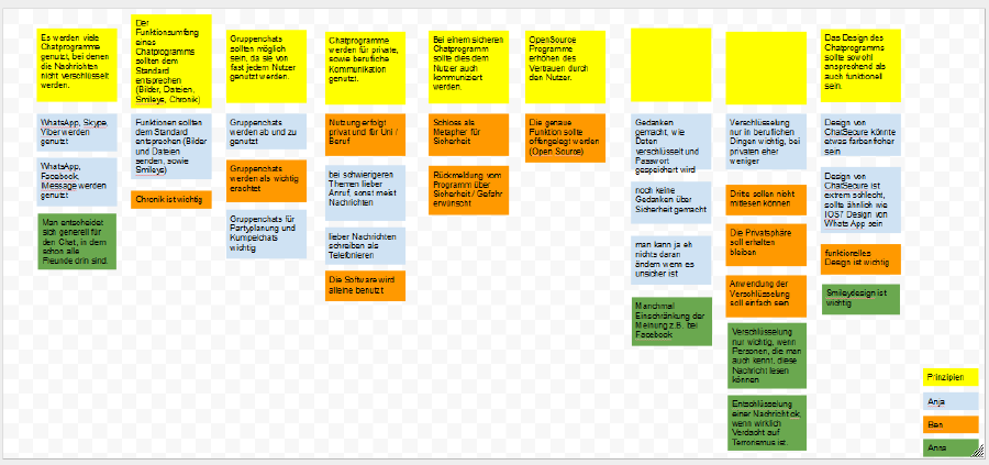
We searched for specific answers in the interviews and looked how it could help to spot a problem. Then we put all our results together and created an affinity diagramm.
Results:
- Most people use chat programs that are unsafe. The amount of friends that use a specific chat is more important. They know about the danger in these chats, but it doesn’t bother them enough to change to another one. Related to this we also found out that people using chat software for business had much more concerns about their personal information and especially the topic and content of the talk then the private users.
- Standard functions like Smileys and data/picture transfer should be offered
- There should be a function to create a group discussion
- Chats are used for job messages as for private ones
- User want to see (e.g. by a lock-symbol), if a program or message is secure or not
- Open Source programs provide trust
- The design should be functional AND appealing
What we learned from our user research:
We got a lot of information about the requirements and the possible use of a chat application. The most important features people wanted to be part of such an application where group chat functionality, image transfer, smileys and an easy to use but appealing interface. People often want to plan parties in a chat, so the group function could be necessary and image transfer is also an important factor of communication for most people.
It was also interesting for us to find out that the main percentage of the users know about possible security issues:
- fear of being in a computer surveillance/being watched in general
- fear of theft of an account/a mobile device
- e.g. personal messages were posted on the pinboard because of a Facebook bug
Collecting Ideas
Based on our results, we’ve drawn some of our ideas on the paper and discussed them.
(Habt ihr da noch eure Bilder von, Leute? Bzw. könnt welche machen von euren Skizzen?)
Choosing Ideas and creating prototype
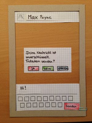
Prototype 1
This prototype is for informing the user what is going on, if the message can't be encrypted.
Testing it / Results
When testing it, we found out that the colors had been irritating for our testperson.
Improvement of the first prototype
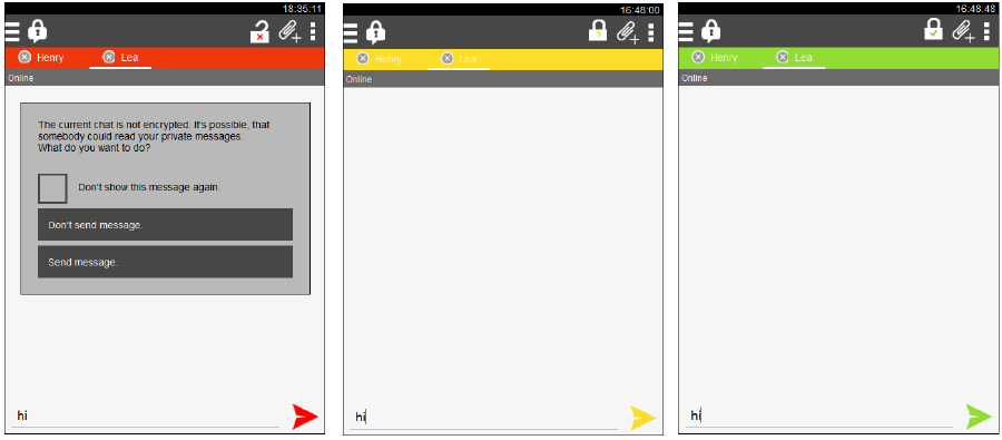
Protoype 2a)
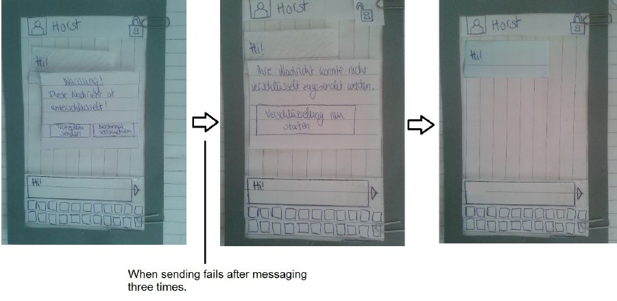
If the chat is unsafe, a pop up appears. The colors change with the security level.
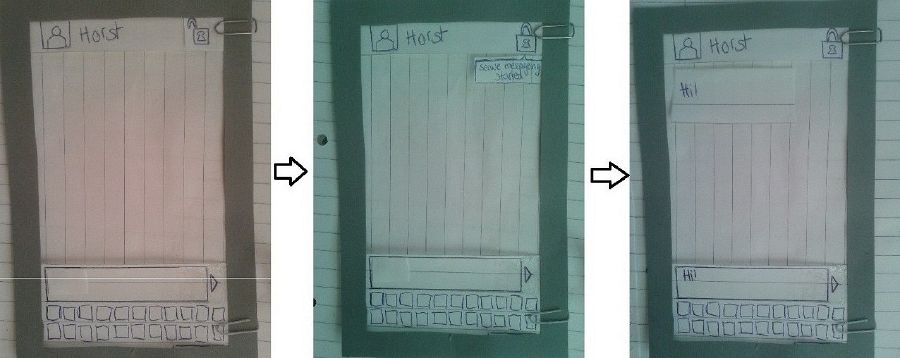
Prototype 2b)
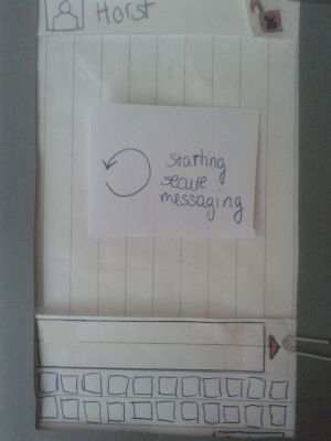
If the message is secure (In the speechbubble in the middle picture is written: “start secure messaging”, because one problem was that user don’t know what OTR means.)
If the message is not secure, a pop-up comes out to tell the user what is going on and if he wants to continue or to cancel the message-sending:
Testing prototype
a)Our testperson liked the ideas, told us loudly what she tought, how it works and didn't seem to have problems.
b)Same here.
Prototype 3
This prototyp is mostly for informing the user about the verifying process.
Since ChatSecure is a chat where people want to chat secure obviously, we thought it would be a good idea to start the security function automatically. There is the possibility to cancel this, if someone doesn’t want that, though.
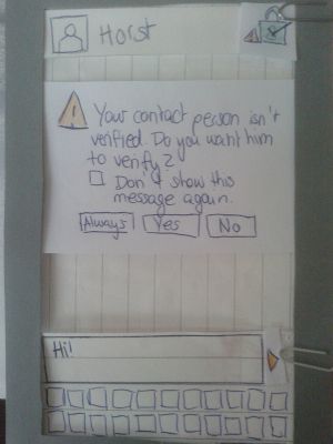
If someone writes a message and want to send it (or if someone clicks on the caution-symbol nest to the lock), a pop-up appears to remind the user to verify himself and/or his contact person.
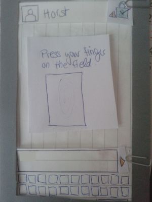
If someone is asked to verify himself, a field appears asking him to do a finger print.
Testing again
The testperson went through it without problems.
Presentation
Student 1: Password security
Student 2:
Student 3:
