No edit summary |
No edit summary |
||
| (16 intermediate revisions by the same user not shown) | |||
| Line 2: | Line 2: | ||
by Belikova Marina | by Belikova Marina | ||
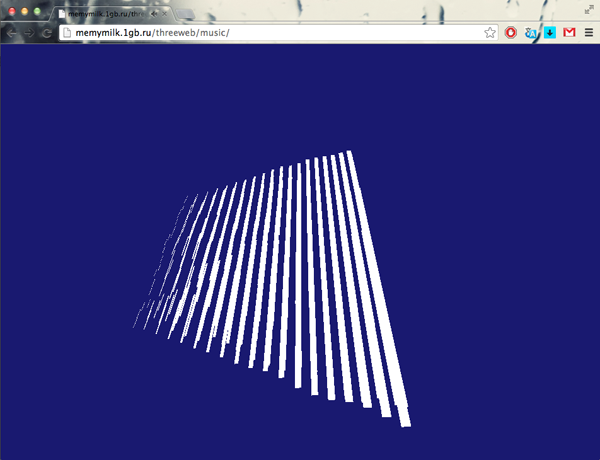
1. Visualization of the music - we can see it in lines, that move according to the sound. | 1. Visualization of the music - we can see it in lines, that move according to the sound, so that the visualization reminds some weird music instrument. The line length change from the longer to the shorter ones. | ||
[http://www.memymilk.1gb.ru/threeweb/music/ link] | [[File:music.png]] | ||
[http://www.memymilk.1gb.ru/threeweb/music/ The link] | |||
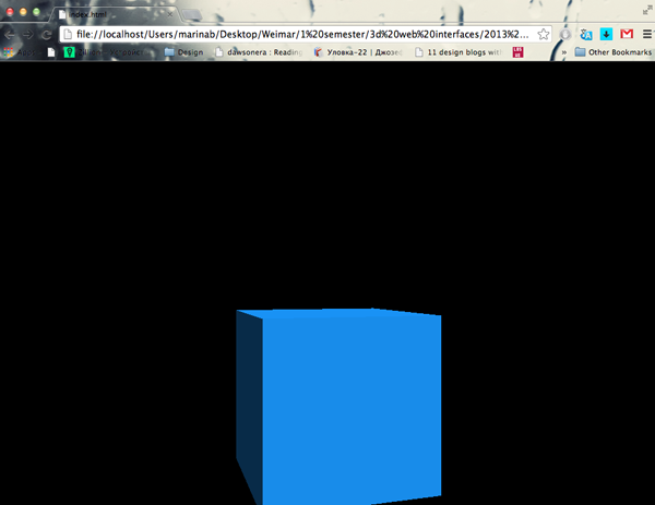
2. The first attempt of exporting an object from Blender into the browser: | |||
[[File:cube.png]] | |||
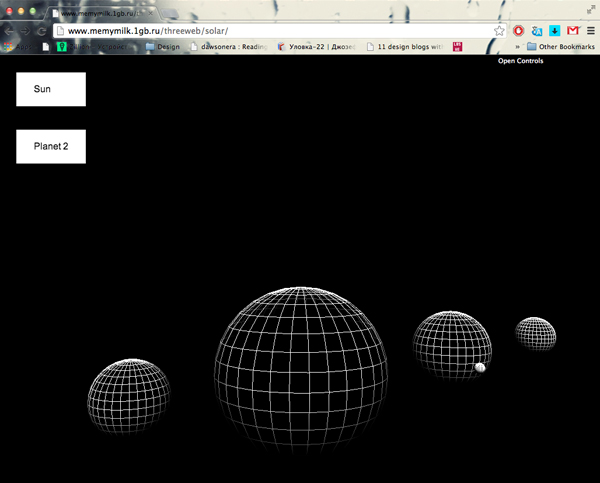
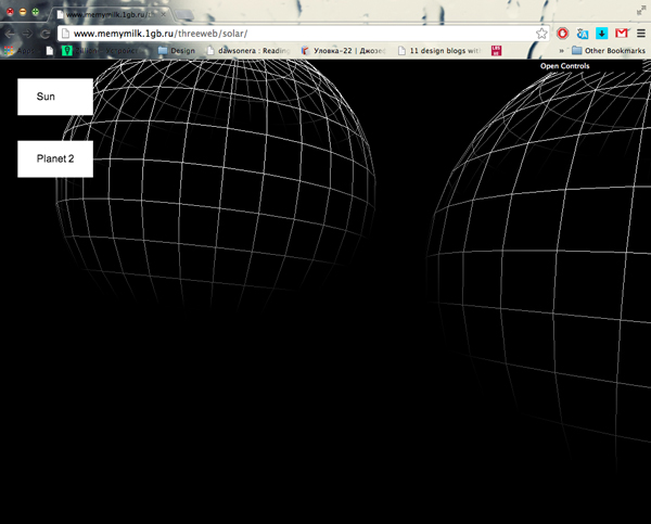
3. Playing with the solar system model, making a simple navigation, clicking on the "buttons" places us near one or other planet of the solar system: | |||
[[File:solar1.jpg]] | |||
[[File:solar2.jpg]] | |||
[http://www.memymilk.1gb.ru/threeweb/solar/ The link] | |||
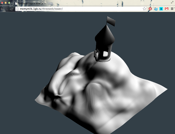
4. The model of a building (here - tower), an example of using a model from Blender in the browser. We can navigate around freely, coming further and closer etc. The tower is "located" on a piece of a ground. | |||
[[File:tower.png]] | |||
[http://www.memymilk.1gb.ru/threeweb/tower/ The link] | |||
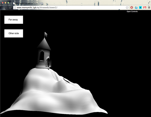
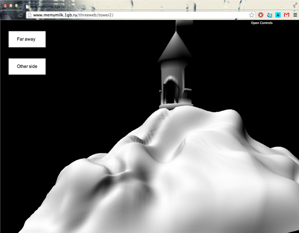
5. The same tower, this time with the simple navigation, that gives you an opportunity to have a look from two fixed different points of view: | |||
[[File:oneside.jpg]] | |||
[[File:otherside.jpg]] | |||
[http://www.memymilk.1gb.ru/threeweb/tower2/ The link] | |||
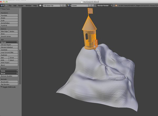
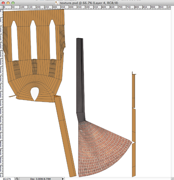
6. These are the screenshots from the work on the texture - first making the mapping of the tower, then using the file in photoshop in order to apply different colours and textures: | |||
[[File:towertex.png]] | |||
[[File:texture.png]] | |||
7. Haus am Horn | |||
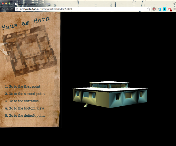
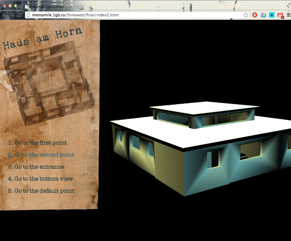
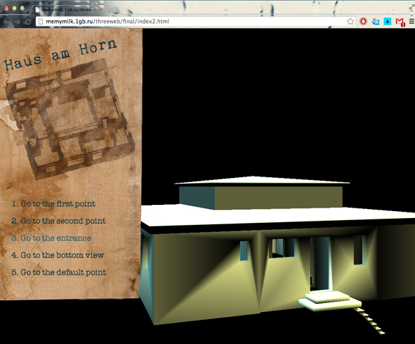
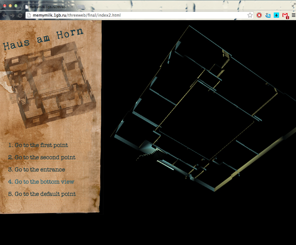
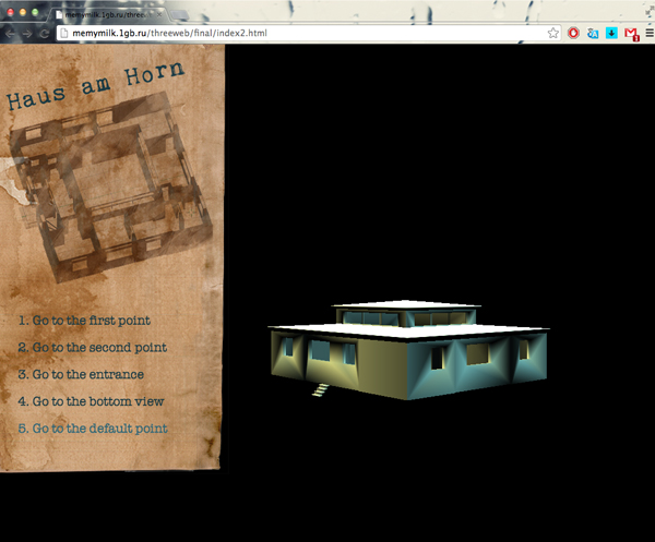
I wanted the navigation to look interesting, on the one hand to be readable and convenient, but on the other to be fun visually, so I thought I could imitate some old paper plan, like old pirate maps. I used the blueprint of the house combined with the paper texture I made by putting usual paper into tea and coffee and then scanning these pages. | |||
Clicking on the links allows to see the house from different sides. | |||
I also experimented with different light colours on the different sides of the house - it doesn't prevent the viewer from seeing the details but makes the model look more interesting. | |||
[[File:house1.jpg]] | |||
[[File:house2.jpg]] | |||
[[File:house3.jpg]] | |||
[[File:house4.jpg]] | |||
[[File:house5.jpg]] | |||
[http://memymilk.1gb.ru/threeweb/final/index2.html The link] | |||
Latest revision as of 21:59, 31 March 2014
Three Dimesional Web Interfaces submission by Belikova Marina
1. Visualization of the music - we can see it in lines, that move according to the sound, so that the visualization reminds some weird music instrument. The line length change from the longer to the shorter ones.
2. The first attempt of exporting an object from Blender into the browser:
3. Playing with the solar system model, making a simple navigation, clicking on the "buttons" places us near one or other planet of the solar system:
4. The model of a building (here - tower), an example of using a model from Blender in the browser. We can navigate around freely, coming further and closer etc. The tower is "located" on a piece of a ground.
5. The same tower, this time with the simple navigation, that gives you an opportunity to have a look from two fixed different points of view:
6. These are the screenshots from the work on the texture - first making the mapping of the tower, then using the file in photoshop in order to apply different colours and textures:
7. Haus am Horn I wanted the navigation to look interesting, on the one hand to be readable and convenient, but on the other to be fun visually, so I thought I could imitate some old paper plan, like old pirate maps. I used the blueprint of the house combined with the paper texture I made by putting usual paper into tea and coffee and then scanning these pages. Clicking on the links allows to see the house from different sides. I also experimented with different light colours on the different sides of the house - it doesn't prevent the viewer from seeing the details but makes the model look more interesting.
