| (45 intermediate revisions by 2 users not shown) | |||
| Line 1: | Line 1: | ||
==Introduction== | ==Introduction== | ||
The mobile age is as well a challenge for commercial websites to provide e.g. an e-shop running compatible on different mobile devices. See also [ | The mobile age is as well a challenge for commercial websites to provide e.g. an e-shop running compatible on different mobile devices. See also [[wikipedia:M-commerce]] ! | ||
Retailers are faced with a wide range of various hardware & software conditions. First of all, they have to decide between web or native applications. | Retailers are faced with a wide range of various hardware & software conditions. First of all, they have to decide between web or native applications. These two app types keep different advantages & disadvantages. A native shopping app is on the one hand more expansive to build up than a web shopping app. On the other hand a native app allows to use more features of a given device in comparison to a web app. A web app is platform indepentent but mostly doesn't ensure such a high user expierence like a native app. | ||
Online retailers have to managage a huge amount of data (product catalogues, customers's information, supplier specificatons etc.) via their shop software. Additionally, they have to assure the security of all electronically safed data. This has to be valid for their mobile applications, too. | Online retailers have to managage a huge amount of data (product catalogues, customers's information, supplier specificatons etc.) via their shop software. Additionally, they have to assure the security of all electronically safed data. This has to be valid for their mobile applications, too. | ||
==The task: Creating Web App== | ==The task: Creating a Web App== | ||
A web app is mostly created with HTML5, CSS3 & Java Script. And it's executed trough a mobile browser. See also [ | A web app is mostly created with HTML5, CSS3 & Java Script. And it's executed trough a mobile browser. See also [[wikipedia:Web app]] & Jonathan Stark, O'Reilly: Building iPhone Apps with HTML, CSS, and JavaScript ISBN 9780596805784 ! | ||
Within this project a mobile web application for an existing shop software has to be created. | Within this project a mobile web application for an existing reference store of a commercial shop software has to be created. The version for the desktop website already exists with all its corporate design guidelines. The mobile reference store will have a technical connection to the running software in order to maintain access to all the given data structures. The main focus of this projects lies in the visual design of the mobile app. The technical realisation is interesting as well. | ||
==First Mockup== | |||
<gallery heights="150px"> | |||
File:Entwurf_02a.jpg|Screenshot 01 | |||
File:Entwurf_02b.jpg|Screenshot 02 | |||
File:Entwurf_02c.jpg|Screenshot 03 | |||
File:Entwurf_02d.jpg|Screenshot 04 | |||
</gallery> | |||
After creating a first visual layout I've uploaded and fitted a simple image online in order to get a first impression over an iPhone. I discussed this first result with several people. My discussion criterias concerned particularly the following questions: | |||
*Is the concept of a fixed header & footer useful? | |||
*Are the sizes of fonts, images or icons visible for all users (as well for people who wear glasses)? | |||
*Are all interactive elements easily clickable for everyone? | |||
*Are pictures, icons, colours or even gradients adequate presented & rich in contrast, hue & saturation? | |||
==Specified Design== | |||
After reflecting the first mockup & resolving some non-functional design elemnts - these are my final designs for the mobile shop: | |||
<gallery widths="150px" perrow="6"> | |||
File:01_home.jpg|Home (Portrait) | |||
File:02_home_landscape.jpg|Home (Landscape) | |||
File:03_category_list.jpg|Category List | |||
File:04_product_list.jpg|Product List (Portrait) | |||
File:05_product_gallery_landscape.jpg|Product Gallery (Landscape) | |||
File:06_filter_list.jpg|Filter Products | |||
File:07_sort_list.jpg|Sort Product List or Gallery | |||
File:08_product_detail.jpg|Product Detail | |||
File:09_product_detail_images.jpg|Product Detail: Images | |||
File:10_basket_overview.jpg|Shopping Cart (SC): Overview | |||
File:11_basket_edit_item.jpg|SC: Edit an Item | |||
File:12_basket_remove_item_layer.jpg|SC: Remove an Item | |||
File:13_basket_adress_overview.jpg|SC: Adress Overview | |||
File:14_basket_new_adress.jpg|SC: Add a new Adress | |||
File:15_basket_new_adress_form_error.jpg|SC: Add a new Adress (Error) | |||
File:16_select_payment_method.jpg|SC: Select a Payment Method | |||
File:17_payment_method_overview.jpg|SC: Modify a Payment Method | |||
File:18_checkout_review.jpg|SC: Checkout Review | |||
</gallery> | |||
They base upon evaluated patterns of specific interactions. Furthermore they represent a visual overview of all visual design elements which are used to build up the mobile shop's user interface. | |||
In the next step I summarize all applied design rules as a guideline for my visual concept. | |||
==Style Guide== | |||
Every single design element needs its own special definition in order to get constructed in the following process of technical implementation. The style guide is supposed to exactly indicate all design elements. For instance, colours are defined by hexa values & font sizes are defined by relative dimensions. Additionally, all dimensions & conditions of icons, images, buttons, headlines, text sections, form fields, layers or even list elements are given in this style guide. | |||
You can get some more impressions via these excerpts of my style guide: | |||
<gallery widths="200px" perrow="5"> | |||
File:Auszug-Styleguide-S02.jpg|Content | |||
File:Auszug-Styleguide-S05.jpg|Main Grid | |||
File:Auszug-Styleguide-S06.jpg|Colours | |||
File:Auszug-Styleguide-S07.jpg|Font Sizes | |||
File:Auszug-Styleguide-S09.jpg|Usage of Fonts 01 | |||
File:Auszug-Styleguide-S11.jpg|Usage of Fonts 02 | |||
File:Auszug-Styleguide-S17.jpg|Buttons & Links | |||
File:Auszug-Styleguide-S19.jpg|Dimensions of Images | |||
File:Auszug-Styleguide-S21.jpg|Dimensions of Layers | |||
File:Auszug-Styleguide-S24.jpg|Dimensions of Home Screenshots | |||
</gallery> | |||
==Technical Realization== | |||
[[Image:Process-of-a-mobile-request.jpg|right|thumb|300px|The Process of a Mobile Request]] | |||
The setup of the visual interface has to be implemented via the application framework of the specific e-shop software. Therefore the application framework provides a so called mobile application programming interface (short: mobile API). This mobile API threads the necessary content information for every single request of a mobile device. A markup language (e.g. HTML5) predefines the layout of the requested mobile page. | |||
Furthermore, this mobile API enables an external management service to finally configure the mobile content. Such an external service is mostly a company that is primarily specializing in concerns of the mobile web. They direct a heavy expertise of mobile software & hardware as well as mobile usability. Currently a quick & high divided developement underlies the age of the mobile technology. The cooperation with such external services ensures that the e-shop always offers up-to-date mobile content. | |||
Finally the request of a mobile device to the URL of an e-shop enables the application framework to chek out its technical relevant information. As you can see in the figure, the redirection to the mobile page passes the management service & the mobile content can be processed back to the requesting device. | |||
Latest revision as of 18:50, 7 August 2011
Introduction
The mobile age is as well a challenge for commercial websites to provide e.g. an e-shop running compatible on different mobile devices. See also wikipedia:M-commerce !
Retailers are faced with a wide range of various hardware & software conditions. First of all, they have to decide between web or native applications. These two app types keep different advantages & disadvantages. A native shopping app is on the one hand more expansive to build up than a web shopping app. On the other hand a native app allows to use more features of a given device in comparison to a web app. A web app is platform indepentent but mostly doesn't ensure such a high user expierence like a native app.
Online retailers have to managage a huge amount of data (product catalogues, customers's information, supplier specificatons etc.) via their shop software. Additionally, they have to assure the security of all electronically safed data. This has to be valid for their mobile applications, too.
The task: Creating a Web App
A web app is mostly created with HTML5, CSS3 & Java Script. And it's executed trough a mobile browser. See also wikipedia:Web app & Jonathan Stark, O'Reilly: Building iPhone Apps with HTML, CSS, and JavaScript ISBN 9780596805784 !
Within this project a mobile web application for an existing reference store of a commercial shop software has to be created. The version for the desktop website already exists with all its corporate design guidelines. The mobile reference store will have a technical connection to the running software in order to maintain access to all the given data structures. The main focus of this projects lies in the visual design of the mobile app. The technical realisation is interesting as well.
First Mockup
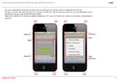
After creating a first visual layout I've uploaded and fitted a simple image online in order to get a first impression over an iPhone. I discussed this first result with several people. My discussion criterias concerned particularly the following questions:
- Is the concept of a fixed header & footer useful?
- Are the sizes of fonts, images or icons visible for all users (as well for people who wear glasses)?
- Are all interactive elements easily clickable for everyone?
- Are pictures, icons, colours or even gradients adequate presented & rich in contrast, hue & saturation?
Specified Design
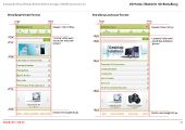
After reflecting the first mockup & resolving some non-functional design elemnts - these are my final designs for the mobile shop:
They base upon evaluated patterns of specific interactions. Furthermore they represent a visual overview of all visual design elements which are used to build up the mobile shop's user interface. In the next step I summarize all applied design rules as a guideline for my visual concept.
Style Guide
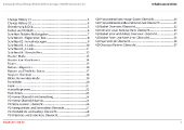
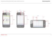
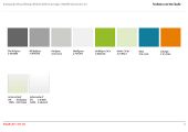
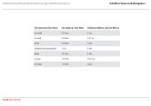
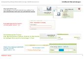
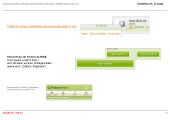
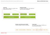
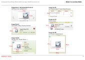
Every single design element needs its own special definition in order to get constructed in the following process of technical implementation. The style guide is supposed to exactly indicate all design elements. For instance, colours are defined by hexa values & font sizes are defined by relative dimensions. Additionally, all dimensions & conditions of icons, images, buttons, headlines, text sections, form fields, layers or even list elements are given in this style guide.
You can get some more impressions via these excerpts of my style guide:
Technical Realization
The setup of the visual interface has to be implemented via the application framework of the specific e-shop software. Therefore the application framework provides a so called mobile application programming interface (short: mobile API). This mobile API threads the necessary content information for every single request of a mobile device. A markup language (e.g. HTML5) predefines the layout of the requested mobile page.
Furthermore, this mobile API enables an external management service to finally configure the mobile content. Such an external service is mostly a company that is primarily specializing in concerns of the mobile web. They direct a heavy expertise of mobile software & hardware as well as mobile usability. Currently a quick & high divided developement underlies the age of the mobile technology. The cooperation with such external services ensures that the e-shop always offers up-to-date mobile content.
Finally the request of a mobile device to the URL of an e-shop enables the application framework to chek out its technical relevant information. As you can see in the figure, the redirection to the mobile page passes the management service & the mobile content can be processed back to the requesting device.


