IFD:Nutzerstudien WiSe1314/HeuristicAnalysisAnmeldung: Difference between revisions
No edit summary |
|||
| (8 intermediate revisions by 3 users not shown) | |||
| Line 4: | Line 4: | ||
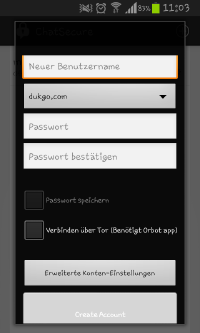
** While creating an account the app keeps the user informed about what is to do. There are several input fields which have to be filled. If all fields are filled up, the user gets into the main page of ChatSecure where he/she sees a box with the account. | ** While creating an account the app keeps the user informed about what is to do. There are several input fields which have to be filled. If all fields are filled up, the user gets into the main page of ChatSecure where he/she sees a box with the account. | ||
** Unfortunately there is no special information that the creation was successful. | ** Unfortunately there is no special information that the creation was successful. | ||
[[File:new_account.jpg]] | |||
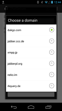
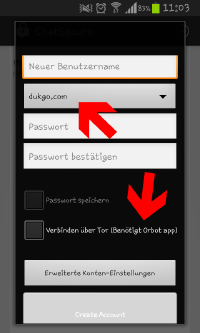
** The list of the provider sounds not very confidential to someone who is not familiar with "jabber". So it would useful to give the user some help. The same would be necessary down to the option "Verbinden über Tor (Benötigt Orbotapp)" - I think some of the user don't know what this item means. One solution could be an infomationbutton next to the pointed problems. (picture 2) | |||
[[File:new_account.jpg | 200px]] | |||
[[File:Nutzerstudien_anmedlung_create_jabberanbieter.png | 200px]] | |||
* Log In | * Log In | ||
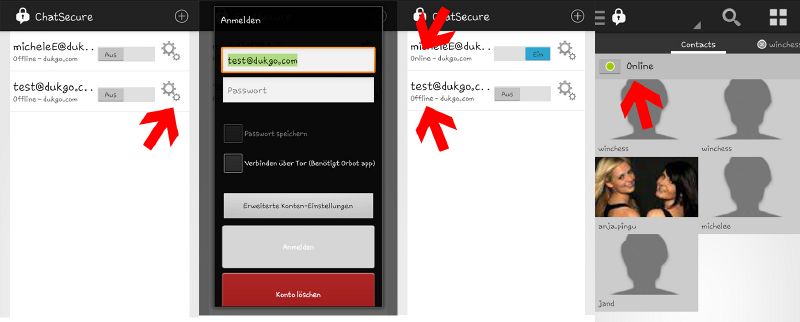
** On the start page the user finds his created account and the information if it is on or off. So the app always shows if the user is signed in or not. | ** On the start page the user finds his created account and the information if it is on or off. So the app always shows if the user is signed in or not. | ||
** Usually the user pushes the button of the account to start to chat. What misses is the request to enter the password | ** Usually the user pushes the button of the account to start to chat. Then you get in your inside page with your friendlist. But you can’t go online without entering your password (if you didn’t save the password) Than you get this information: | ||
[[File:problem_passwordentering.jpg | 200px]] | |||
** What misses at the beginning is the request to enter the password if it isn’t saved. | |||
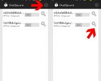
** There is no visible button to enter the password on the main page. When the user found out that it is the tool button where he/she can enter the password, then the app shows “application accomplished” and then the status “online” at the main page. | ** There is no visible button to enter the password on the main page. When the user found out that it is the tool button where he/she can enter the password, then the app shows “application accomplished” and then the status “online” at the main page. | ||
** When the user is finally online, he/she gets into the chat page and there is a button with “online” so that the user knows his/her status. | ** When the user is finally online, he/she gets into the chat page and there is a button with “online” so that the user knows his/her status. | ||
[[File:login_visability.jpg]] | [[File:login_visability.jpg | 800px]] | ||
* Settings | * Settings | ||
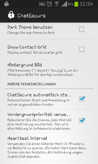
** There are visible boxes to fill with ticks so that the user always knows which option he/she uses or not. | ** There are visible boxes to fill with ticks so that the user always knows which option he/she uses or not. | ||
[[File:settings.jpg]] | [[File:settings.jpg | 200px]] | ||
*Create new account: | |||
**The created account is visible and thus it's sure that the account was successfully created. | |||
**But after I created a new account and agreed to the certificate the system crashed. | |||
[[File:report_chat_secure.JPG | 200px]] | |||
[[File:syytem_crash_chat_secure.jpeg | 200px]] | |||
*Login: | |||
**When the system is about to login a little loading bar could be usefull to show the status of the login-progress. But thus the login-progress is quite fast, the missing loading bar is no problem. | |||
== Match between system and the real world== | == Match between system and the real world== | ||
| Line 26: | Line 43: | ||
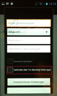
** The process of creating an account only consists of simple words that the user has to fill in (user name, password). But there are two fields/ buttons where I personally didn’t hear yet. Firstly I didn’t know what to choose as a domain and secondly I don’t know what “Verbinden über Tor (Benötigt Orbot app) means. Maybe that should be explained more to the user. | ** The process of creating an account only consists of simple words that the user has to fill in (user name, password). But there are two fields/ buttons where I personally didn’t hear yet. Firstly I didn’t know what to choose as a domain and secondly I don’t know what “Verbinden über Tor (Benötigt Orbot app) means. Maybe that should be explained more to the user. | ||
[[File:new_account_complication.jpg]] | [[File:new_account_complication.jpg | 200px]] | ||
* Log In | * Log In | ||
| Line 37: | Line 54: | ||
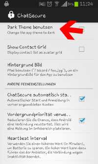
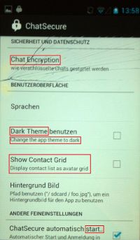
** All options are clear or they are explained but it would be better to keep one language and not to have an English heading and a German explanation. | ** All options are clear or they are explained but it would be better to keep one language and not to have an English heading and a German explanation. | ||
[[File:settings_language.jpg]] | [[File:settings_language.jpg | 200px]] | ||
Some terms where difficult for me to understand. | |||
*Create new account: | |||
**I don't know what "Tor" is. Maybe there could be some help and more information in the app. | |||
[[File:tor_chat_secure.JPG | 200px]] | |||
== User control and freedom== | == User control and freedom== | ||
* There are two possibilities to close the app but if you use the first, the program is closed and you get the information “ChatSecure stopped”. That is an error because it shows that the app didn’t react correctly. (no screenshot possible) | * There are two possibilities to close the app but if you use the first, the program is closed and you get the information “ChatSecure stopped”. That is an error because it shows that the app didn’t react correctly. (no screenshot possible) | ||
*I need the app-extern "back" button to get out of the settings. Everywhere else in the app there are functions that allow me to switch back or find an exit. But in my opinion it's not a big problem. Just a litte flaw of the app. | |||
== Consistency and standards == | == Consistency and standards == | ||
| Line 58: | Line 83: | ||
** The settings largely follow platform conventions, like e.g. vibrate, audio. | ** The settings largely follow platform conventions, like e.g. vibrate, audio. | ||
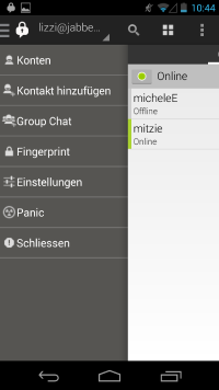
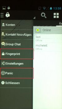
** the menu is partially clear. But there is one items, which is confusing. | |||
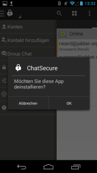
The "panic - button" enables the user to cancel the app but there is an extra security query, if he really want to cancel. | |||
[[File:nutzerstudien_menu1.png | 200 px]] | |||
[[File:nutzerstudien_panic_abfrage.png | 200 px]] | |||
All in all the app is easy to understand. The "moves" you have to make to use the app are quite familiar and like on every other smartphone. | |||
There are just two things, that seemed to be a problem for me. | |||
*Settings: | |||
**I don't understand what the "Fingerpringt"-button is supposed to be used to. | |||
**Also the "Panic"-button could confuse the user. | |||
[[File:settings_chat_secure.JPG | 200px]] | |||
It also would be more helpful to use one language (German or English) consequent in the whole app, than to mix up both languages. It also would help the app to appear more serious. | |||
[[File:language_chat_secure.JPG | 200px]] | |||
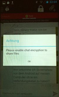
The last thing I recognized, is that I have to encrypt my chat to send a file. But if I'm allowed to chat without encryption, why can't I send a picture without encrypt my chat? | |||
[[File:bilder_senden_chat_secure.JPG | 200px]] | |||
== Error prevention == | == Error prevention == | ||
* I didn’t notice any error prevention while creating an account, signing in or at the settings. | * I didn’t notice any error prevention while creating an account, signing in or at the settings. | ||
There were no errors in the app. Just the system crash when I created my account (see "visibly of system status"). | |||
But in the whole app I can't find any help- or support-page. Maybe it would be usefull to create such a page to give quick help to the user. | |||
== Recognition rather than recall== | == Recognition rather than recall== | ||
| Line 73: | Line 123: | ||
** The user has to remember that he/she has to enter the password at the tool button at the right side. There is no instruction for it. | ** The user has to remember that he/she has to enter the password at the tool button at the right side. There is no instruction for it. | ||
[[File:login_complication.jpg]] | [[File:login_complication.jpg | 200px]] | ||
* Settings | * Settings | ||
| Line 84: | Line 134: | ||
* couldn’t find out differences for novice users and experts. | * couldn’t find out differences for novice users and experts. | ||
I think that the offered providers don't sound very confidental to uninformed users because of the unfamiliar names. There should be some more information about the providers (e.g. "xmmp.jp" or "neko.im"). | |||
[[File:nutzerstudien_anmedlung_create_jabberanbieter.png | 200 px]] | |||
For the "first use"-user the account settings are a little bit hard to understand. But I think this results out of missing knowledge in the domains internet and programming. For the user, who is a little more comfortable with this topics it should be no problem. | |||
In all other aspects I don't see any differences for beginners and advanced users. | |||
== Aesthetic and minimalist design== | == Aesthetic and minimalist design== | ||
| Line 97: | Line 154: | ||
** The design of the settings are well listed and clear. There is only one button for each option. | ** The design of the settings are well listed and clear. There is only one button for each option. | ||
The design is quite modern and organized. | |||
== Help users recognize, diagnose, and recover from errors== | == Help users recognize, diagnose, and recover from errors== | ||
* There was one error message that occurs after closing the program normally. It asked if you want to send the problem to the developers. | * There was one error message that occurs after closing the program normally. It asked if you want to send the problem to the developers. | ||
* There are a lot off bugs within the app and most of the time ChatSecure close the app an asks the user if he would send a report to the developer. In some case there are warnings or error messages | |||
[[File:nutzerstudien_crash.png | 200 px]] | |||
[[File:nutzerstudien_crash_data.png | 200 px]] | |||
The only bug/error that happend to me was the system crash, when I created my account. | |||
== Help and documentation == | |||
It would be very useful to have an short help- or support-page to give quick help to the user. | |||
* couldn’t find a option for help or documentation so it would be necessary to add it. | * couldn’t find a option for help or documentation so it would be necessary to add it. | ||
Latest revision as of 04:03, 14 March 2014
Visibility of system status
- New Account
- While creating an account the app keeps the user informed about what is to do. There are several input fields which have to be filled. If all fields are filled up, the user gets into the main page of ChatSecure where he/she sees a box with the account.
- Unfortunately there is no special information that the creation was successful.
- The list of the provider sounds not very confidential to someone who is not familiar with "jabber". So it would useful to give the user some help. The same would be necessary down to the option "Verbinden über Tor (Benötigt Orbotapp)" - I think some of the user don't know what this item means. One solution could be an infomationbutton next to the pointed problems. (picture 2)
- Log In
- On the start page the user finds his created account and the information if it is on or off. So the app always shows if the user is signed in or not.
- Usually the user pushes the button of the account to start to chat. Then you get in your inside page with your friendlist. But you can’t go online without entering your password (if you didn’t save the password) Than you get this information:
- What misses at the beginning is the request to enter the password if it isn’t saved.
- There is no visible button to enter the password on the main page. When the user found out that it is the tool button where he/she can enter the password, then the app shows “application accomplished” and then the status “online” at the main page.
- When the user is finally online, he/she gets into the chat page and there is a button with “online” so that the user knows his/her status.
- Settings
- There are visible boxes to fill with ticks so that the user always knows which option he/she uses or not.
- Create new account:
- The created account is visible and thus it's sure that the account was successfully created.
- But after I created a new account and agreed to the certificate the system crashed.
File:Syytem crash chat secure.jpeg
- Login:
- When the system is about to login a little loading bar could be usefull to show the status of the login-progress. But thus the login-progress is quite fast, the missing loading bar is no problem.
Match between system and the real world
- New Account
- The process of creating an account only consists of simple words that the user has to fill in (user name, password). But there are two fields/ buttons where I personally didn’t hear yet. Firstly I didn’t know what to choose as a domain and secondly I don’t know what “Verbinden über Tor (Benötigt Orbot app) means. Maybe that should be explained more to the user.
- Log In
- The words “on” and “off” are clear to the user, it is also simple to find out that the user have to shove the button to change the status.
As already shown it isn’t intuitive for the user to enter the password with the help of the tool button at the right side.
- Settings
- All options are clear or they are explained but it would be better to keep one language and not to have an English heading and a German explanation.
Some terms where difficult for me to understand.
- Create new account:
- I don't know what "Tor" is. Maybe there could be some help and more information in the app.
User control and freedom
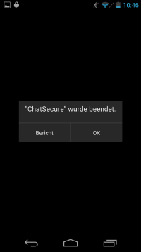
- There are two possibilities to close the app but if you use the first, the program is closed and you get the information “ChatSecure stopped”. That is an error because it shows that the app didn’t react correctly. (no screenshot possible)
- I need the app-extern "back" button to get out of the settings. Everywhere else in the app there are functions that allow me to switch back or find an exit. But in my opinion it's not a big problem. Just a litte flaw of the app.
Consistency and standards
- New Account
- The app uses standard words that other apps uses too, like user name, password etc.
- Log In
- Maybe first the user doesn’t notice the difference between “on”/”off” and “online”/”offline”.
- Unlike others, who have a slide bar to log in, I have to click on a checkmark. Since I have never logged in that way I needed some time to figure out that this is the log-in-button.
- Settings
- The settings largely follow platform conventions, like e.g. vibrate, audio.
- the menu is partially clear. But there is one items, which is confusing.
The "panic - button" enables the user to cancel the app but there is an extra security query, if he really want to cancel.
All in all the app is easy to understand. The "moves" you have to make to use the app are quite familiar and like on every other smartphone. There are just two things, that seemed to be a problem for me.
- Settings:
- I don't understand what the "Fingerpringt"-button is supposed to be used to.
- Also the "Panic"-button could confuse the user.
It also would be more helpful to use one language (German or English) consequent in the whole app, than to mix up both languages. It also would help the app to appear more serious.
The last thing I recognized, is that I have to encrypt my chat to send a file. But if I'm allowed to chat without encryption, why can't I send a picture without encrypt my chat?
Error prevention
- I didn’t notice any error prevention while creating an account, signing in or at the settings.
There were no errors in the app. Just the system crash when I created my account (see "visibly of system status").
But in the whole app I can't find any help- or support-page. Maybe it would be usefull to create such a page to give quick help to the user.
Recognition rather than recall
- New Account
- At the main page there is a plus button to create a new account or to use an existing one. The user has to remember that but it is quite intuitive. For other actions the user doesn’t have to remember something from another part.
- Log In
- The user has to remember that he/she has to enter the password at the tool button at the right side. There is no instruction for it.
- Settings
- There are two possible options to find the settings. Either the user pushes the left button at the smartphone (e.g. Samsung Galaxy S2) or he/she goes throw the lock and chooses “settings”. The second one is more intuitive for the user.
For the first possibility there is no advice that the settings are at that place but it isn’t necessary because there is the second one.
Flexibility and efficiency of use
- couldn’t find out differences for novice users and experts.
I think that the offered providers don't sound very confidental to uninformed users because of the unfamiliar names. There should be some more information about the providers (e.g. "xmmp.jp" or "neko.im").
For the "first use"-user the account settings are a little bit hard to understand. But I think this results out of missing knowledge in the domains internet and programming. For the user, who is a little more comfortable with this topics it should be no problem.
In all other aspects I don't see any differences for beginners and advanced users.
Aesthetic and minimalist design
- New Account
- There are no irrelevant buttons and a clear, simple design.
- Log In
- The design is simple but there are redundant steps to log in (first shove at “on”, than enter the password, than push on the account etc.) It would be enough to have one action to sign in so that it is more comfortable.
- Settings
- The design of the settings are well listed and clear. There is only one button for each option.
The design is quite modern and organized.
Help users recognize, diagnose, and recover from errors
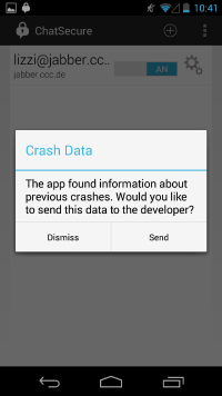
- There was one error message that occurs after closing the program normally. It asked if you want to send the problem to the developers.
- There are a lot off bugs within the app and most of the time ChatSecure close the app an asks the user if he would send a report to the developer. In some case there are warnings or error messages
The only bug/error that happend to me was the system crash, when I created my account.
Help and documentation
It would be very useful to have an short help- or support-page to give quick help to the user.
- couldn’t find a option for help or documentation so it would be necessary to add it.
