IFD:Nutzerstudien WiSe1314/Sicherheit endpresentation (security): Difference between revisions
| (40 intermediate revisions by 5 users not shown) | |||
| Line 1: | Line 1: | ||
==Aims of design== | ==Aims of design== | ||
We concentrated on the interface of the message window. First, it should be easy to handle, of course. It should provide an uncomplicated and plain interface, where you can figure out the functions fast and remember them for the next time. It’s essential to spare symbols that confuses the user or that are barely necessary by themselves. So we searched for some design ideas to answer the questions: | We concentrated on the interface of the message window. First, it should be easy to handle, of course. It should provide an uncomplicated and plain interface, where you can figure out the functions fast and remember them for the next time. It’s essential to spare symbols that confuses the user or that are barely necessary by themselves. So we searched for some design ideas to answer the questions: | ||
* What can I do to guarantee a | * What can I do to guarantee a convenient handling in the message window? | ||
* How can we improve the interface for the functions of secure, | * How can we improve the interface for the functions of secure, insecure and verified messaging? | ||
<span style="color:#ee9966">Phrasing your goals as questions is a good way to guide the process. These are both quite valuable and relevant questions. I'm unclear who '''I''' is in the first question, the designer or the user.</span> | |||
'''EDIT''': Thank you. I and We are the designer. | |||
==Ideas== | ==Ideas== | ||
<span style="color:#598193">Könntet ihr die Ideenfindung in den Prozess einordnen? Wann und warum habt ihr das gemacht? Es sieht wie Lösungsideen für Probleme aus, die nach der Nutzerfoschung festgestellt wurden. Sollte der Abschnitt hier drinnen sein, weil im Arbeitsbuch ein solcher Abschnitt ist: In dem Arbeitsbuch ging es um erste Ideen, zu denen man forschen könnte (tut mir leid, wenn das nicht klar war, schreibt mir gerne dazu, dann kann ich es verbessern)</span> | |||
<br>'''EDIT''': We came up with this ideas after using ChatSecure for the first time. We wanted to improve the interface before our user interviews according to the question: How do we communicate security? | |||
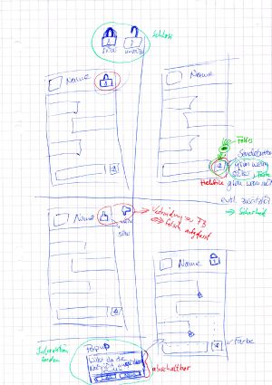
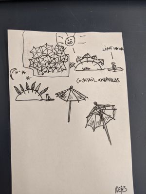
We searched for possible symbols that provide security and tried out some designs to improve the current look of the chat. Examples had been locks and shields in many variations. We also tried out various colors to make clear the differences between functions. | We searched for possible symbols that provide security and tried out some designs to improve the current look of the chat. Examples had been locks and shields in many variations. We also tried out various colors to make clear the differences between functions. | ||
We discussed our ideas and criticized them. The | We discussed our ideas and criticized them. The different colors are feedback from the group. | ||
<br>''Green'': the group liked the idea | <br>''Green'': the group liked the idea | ||
<br>''Blue'': neutral / comments | <br>''Blue'': neutral / comments | ||
| Line 13: | Line 19: | ||
[[File:NuStu_prototyping.jpg | 300px]] [[File:ideas.jpg | 300px]] | [[File:NuStu_prototyping.jpg | 300px]] [[File:ideas.jpg | 300px]] | ||
<span style="color:#ee9966">I like that you started with very quick and raw sketches! I think its important to generate lots of ideas in the beginning, so doing rough sketches is important. I would like to see more sketches with all sorts of ideas from small makeovers to radical new ideas. Its also possible to do quick user tests with very rough sketches.</span> | |||
'''EDIT''': Sorry, but we didn't make more sketches that time. | |||
==How we prepared for interviews / our questions== | ==How we prepared for interviews / our questions== | ||
| Line 26: | Line 35: | ||
* Have you ever been attacked before? | * Have you ever been attacked before? | ||
We | <span style="color:#ee9966">A good set of questions. They should be tighter, more targetted. Like instead of "would you want to improve something?" say it very directly: "what would you improve?" or "What do you like about the app's interface?"</span> | ||
We interviewed ten people of these courses of studies below. Since we all studies something similar we had an easy access to them. | |||
<span style="color:#598193">Warum habt ihr Studierende ausgewählt? (es ist auch o.k. Personen auszuwählen, weil man einfachen Zugang hat – solange ihr schreibt, warum, z.B, weil auch diese einen Chat-Client benutzen und ihr so mehr Erfahrung im Interviewen sammeln könnt…) </span> | |||
<br> '''EDIT''': For no particular reason. Our friends are mostly students from our courses, that's why. | |||
<span style="color:#ee9966">Ideally, a user study would be made up of people who use the software in ways that are directly relevant to what you are trying to achieve. Of course, its not always possible to spend the time to find the perfect users, so finding willing candidates is still valuable as long as you take into account the experience and possible bias of the people who actually participate in your user study.</span> | |||
{| class="wikitable" | {| class="wikitable" | ||
| Line 74: | Line 89: | ||
| Game Design | | Game Design | ||
|} | |} | ||
==Preparation for the interviews / Observation== | ==Preparation for the interviews / Observation== | ||
| Line 88: | Line 105: | ||
'''Student 3:''' | '''Student 3:''' | ||
Before doing the interview I looked up our last topic and / or problems of the course. Based on these information I made some notes and put them into possible questions. Afterwards I | Before doing the interview I looked up our last topic and / or problems of the course. Based on these information I made some notes and put them into possible questions. Afterwards I arranged them to fit a better order for the talk. | ||
Because writing, asking and thinking is to much at the same time, i decided to use a audio recorder with the permission of the test subjects. This made it possible to keep the talk running. In my opinion it's more polite to concentrate on the interview partner instead writing everything down. This way of interviewing enables you rewind the whole interview and maybe check for a certain aspect as often as you wish. After all things were done I wrote down the findings for documentation and share purpose. | Because writing, asking and thinking is to much at the same time, i decided to use a audio recorder with the permission of the test subjects. This made it possible to keep the talk running. In my opinion it's more polite to concentrate on the interview partner instead writing everything down. This way of interviewing enables you rewind the whole interview and maybe check for a certain aspect as often as you wish. After all things were done I wrote down the findings for documentation and share purpose. | ||
<span style="color:#ee9966">Taking notes during the process is a good way to remember key details. Having a video of the process is very useful for going back and getting a feeling for what the user was doing. By focusing on the video on the device and not the user, it can make the user less self-conscious.</span> | |||
==The interviews== | ==The interviews== | ||
'''Student 1:''' | '''Student 1:''' | ||
* Test subject 1: She is not quite satisfied with her current chat programs. Sometimes she holds back her opinion about political references and don’t give an access to her | * Test subject 1: She is not quite satisfied with her current chat programs. Sometimes she holds back her opinion about political references and don’t give an access to her address, e.g. in Facebook. She’d like to have a chat that’s secure, but she only uses it, if all of her friends would use it, too. | ||
* Test subject 2: She knows about the dangers of someone that could spy out her messages, but it doesn’t bother her at all. As long as it isn’t someone that she knows and it could have consequences for her, she not interested in a secure chat. For her functions and look is more important. | |||
<span style="color:#ee9966">She does care some about security because she adds "as long as". A good follow up question would be about how much usability she would give up to guarantee that the "as long as" never happens. Or perhaps, if there were two apps that were both easy to use, would she prefer the more secure one?</span> | |||
* Test subject 3: She is a quite cautious person that feels insecure all the time when being in the internet. She don’t hold back with her opinion, but writes messages with the perpetual feeling of “I can be watched now.” She would appreciate a chat that is secure, but one that is instinctively and simple to handle, because she gives up pretty fast and changes the app when she needs a longer time to figure out the single functions. | |||
<span style="color:#ee9966">It would also be useful to find out how much she extra is willing to work to understand an app if it provides security.</span> | |||
'''EDIT''': I even asked both, 1 and 3, that question! Both didn't have any ideas, so I asked them if it would be okay to be asked a question in the app that she and her partner have set up before. It was an effort, both agreed it wouldn't bother them and they would use such a chat. | |||
'''Student 2:''' | '''Student 2:''' | ||
* Test subject 1: Person one preferred messages to plan things, if they aren't complicated. Because he is working in the IT business, he | * Test subject 1: Person one preferred messages to plan things, if they aren't complicated. Because he is working in the IT business, he has thought about the security of his messages, how the data is encoded and how the password is saved. The scope of functions in ChatSecure is okay, but the registration through a third party isn't comfortable. The person doesn't liked the design of ChatSecure at this time, because the contact view is very confused. | ||
<span style="color:#ee9966">Did he have specific concerns about the third party, or was he saying that that part of the app's interface was confusing?</span> | |||
'''EDIT''': It's just circuitous to register on a third party. It had nothing to do with the interface. | |||
* Test subject 2: Person two wasn't | * Test subject 2: Person two wasn't really interested in the security of his messages. He had heard about some vulnerabilities in Facebook but he think he can't do something against. The scope of functions in ChatSecure is okay, but it could be more color in the design. | ||
* Test subject 3: The third person have also think about the security of his messages because of the news in the media. But he would not change his chat program, because of the amount of people in programs like WhatsApp. | * Test subject 3: The third person have also think about the security of his messages because of the news in the media. But he would not change his chat program, because of the amount of people in programs like WhatsApp. | ||
<span style="color:#ee9966">Yes, the "network effect" is a big hurdle in getting people to use a new app. Having a sense of where the tipping point is where this user would switch to a more secure app would be quite useful when thinking about which part is most important to focus on first.</span> | |||
'''Student 3:''' | '''Student 3:''' | ||
* Test subject 1: He is a person who uses | * Test subject 1: He is a person who uses instant-chat only for some basic talks about dispensable topics with friends. In the first part of the interview he answered the questions not containing security issues. This gave a good impression of the person's thoughts about this kind of software and security in general. In the second part he answered questions directly linked to the security topic. By directly asking him about security problems and concerns, he gave some interesting answers. The main statement of this talk was: Don't think about it, or you will panic. | ||
* Test subject 2: He is a person with high skills in electronic and computer | * Test subject 2: He is a person with high skills in electronic and computer technology. His attitude towards security and secure chat software were very negative. One big problem of secure systems is that they are not quite secure or that they are to complex to use, he said. In his opinion it would be good if programs inform the user about security issues and everything else should be done automatically. | ||
* Test subject 3: She is a person with also good knowledge on computers and software. Chat-software is for her a good medium for fast message transport. She says unfortunately oneself has no chance to check if the security promises of the companies are right. In her opinion the best way to secure own data is to publish only the data you are quite | * Test subject 3: She is a person with also good knowledge on computers and software. Chat-software is for her a good medium for fast message transport. She says unfortunately oneself has no chance to check if the security promises of the companies are right. In her opinion the best way to secure own data is to publish only the data you are quite sure to publish. | ||
==Data Analysis== | ==Data Analysis== | ||
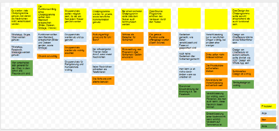
We searched for specific answers in the interviews and looked how it could help to spot a problem. Then we put all our results together and created an affinity | We searched for specific answers in the interviews and looked how it could help to spot a problem. Then we put all our results together and created an affinity diagram. | ||
[[File:affinity.jpg | 900px]] | [[File:affinity.jpg | 900px]] | ||
| Line 129: | Line 166: | ||
* The design should be functional AND appealing | * The design should be functional AND appealing | ||
It was also interesting for us to find out that the main percentage of the users know about possible security issues: | It was also interesting for us to find out that the main percentage of the users know about possible security issues: | ||
| Line 137: | Line 171: | ||
* fear of theft of an account/a mobile device | * fear of theft of an account/a mobile device | ||
* e.g. personal messages were posted on the pinboard because of a Facebook bug | * e.g. personal messages were posted on the pinboard because of a Facebook bug | ||
<span style="color:#ee9966">Overall a good set of results from the interviews. These could be improved by getting more information on what the specific barriers to using different software are. All of the users seemed to care about security to some degree, but it sounds like some were willing to work more in order to be secure. Knowing what these users' key issues were would be very useful when figuring out what improvements are the highest priority in order to get more people to start using ChatSecure.</span> | |||
==Choosing Ideas and creating prototype== | ==Choosing Ideas and creating prototype== | ||
<span style="color:#598193">Warum habt ihr dieses Thema ("informing the user what is going on, if…") gewählt? Nutzerforschung? Vortest? Heuristik?</span> | |||
<br>'''EDIT''': To improve our prototype, we did a [http://www.uni-weimar.de/medien/wiki/IFD:Nutzerstudien_WiSe1314/HeuristicAnalysisSecurity heuristic analysis] to search for specific problems in the chat. This analysis is divided in ten subitems. We had been going through them all and found some problems which we wanted to take care of. For time reasons though, we couldn’t involve them all. | |||
===Prototype 1=== | ===Prototype 1=== | ||
This prototype is for informing the user what is going on, if the message can't be encrypted. | This prototype is for informing the user what is going on, if the message can't be encrypted. | ||
[[File:pro1.jpg | 300px]] | [[File:pro1.jpg | 300px]] | ||
| Line 153: | Line 192: | ||
==Improvement of the first prototype== | ==Improvement of the first prototype== | ||
<span style="color:#598193">Schöne Bebilderung!</span> | |||
<span style="color:#598193">"Testet" diesen Abschnitt nochmal mit folgender "Heuristik": 1) Gibt es einen Bezug von Text und Bild, der die Änderungen/Vorschläge im Design einfach verständlich und deutlich macht, wenn man noch nicht mit euren Ideen und eurer Forschung vertraut ist? 2) ist es klar auf welches Bild-Element sich der Text bezieht, wenn man kein Deutsch spricht?</span> | |||
===Protoype 2a)=== | ===Protoype 2a)=== | ||
To make the user keep an eye | To make the user keep an eye on the current security level, we added colour to the send button. This means the button has the same colour as the bar with the names of the contacts. | ||
'''EDIT''': So you know by clicking on the send button, whether the state is unsafe(red), safe(yellow) or safe and verified(green). You can also see the current status in the little lock above. But some test person told us, they don't look above by each sending of a message. | |||
[[File:pro.jpg | 900px]] | |||
<span style="color:#ee9966">Providing feedback where the user actually looks when working is key. Its not always easy to tell that in advance, that's where user testing comes in. So you got come valuable information in your test here. One idea related to the coloring to consider: the app is called ChatSecure, so people expect secure messaging. That expectation can be represented in the app, so when the messages are secure, the app looks like a "normal" Android messaging app. Then use the color to represent when things are not secure. That could make the non-secure states stand out more.</span> | |||
===Protoype 2b)=== | ===Protoype 2b)=== | ||
A next question was how we could show | A next question was how we could show that the message is not encrypted. This also included the problem how one could start encryption. | ||
<span style="color:#598193">Warum habt ihr dieses Thema ("informing the user what is going on, if…") gewählt? Nutzerforschung? Vortest? Heuristik? Logische begründung, denn… (eure Erklärung)</span> | |||
'''EDIT:''' As described above, some test persons told us, they want to be informed by sending if their message isn't save. This is another possibility to inform the user. | |||
[[File:nust_security_prototype.png | 600px ]] | [[File:nust_security_prototype.png | 600px ]] | ||
| Line 166: | Line 218: | ||
We discussed this idea in the group and decided that this would not be easy to understand. So we gave up this idea. | We discussed this idea in the group and decided that this would not be easy to understand. So we gave up this idea. | ||
<span style="color:#ee9966">This would be a very valuable thing to have for people using ChatSecure in high risk situations, where it is important that they don't mistakenly send messages insecurely. An example is a journalist under surveillance from the state. But for many people, it would just annoy them. I wouldn't discard this idea so quickly, I think it could be made workable. And it would work a lot better than a popup once the user learns it.</span> | |||
===Protoype 2c)=== | ===Protoype 2c)=== | ||
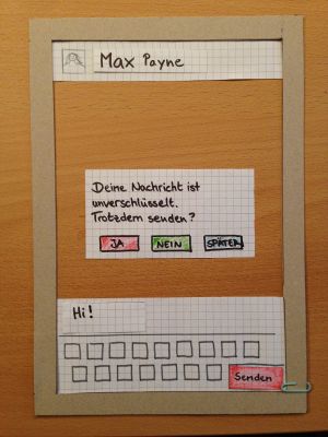
We added a pop up, which appears when the user tries to start an | We added a pop up, which appears when the user tries to start an insecure chat or to remind the user to verify himself and/or his contact person. | ||
'''EDIT:''' The user have to choose, whether he will send the message unsafe or try a safe sending on another time. He also has the opportunity to save his response for all time. This can be changed in the settings. | |||
[[File:impro2.jpg | 300px]] [[File:pro2a.jpg | 300px]] | [[File:impro2.jpg | 300px]] [[File:pro2a.jpg | 300px]] | ||
===Prototype 2d)=== | ===Prototype 2d)=== | ||
If the message is secure (In the speechbubble in the middle picture is written: “start secure messaging”, because one problem was that user don’t know what OTR means.) | If the message is secure (In the speechbubble in the middle picture is written: “start secure messaging”, because one problem was that user don’t know what OTR means.) | ||
| Line 191: | Line 239: | ||
[[File:pro2b2.jpg | 900px]] | [[File:pro2b2.jpg | 900px]] | ||
We tested it and our testperson went through it without problems. | |||
= | <span style="color:#ee9966">This is a good balance of familiar interface experience and quick to use regularly. Its not as flashy as the swipe, but seems like it would not get too annoying if you saw it regularly.</span> | ||
===Prototype 2e)=== | |||
Because some of our test persons expressed concerns about the many buttons needed to start a secure chat and especially about their labels, we decided to bring everything to one switch. | |||
[[File:prototyp_schalter.png | 300px]] | |||
We gave up this idea, because a switch is not much more easy as we thought. Since ChatSecure is a chat where people want to chat secure obviously, we thought it would be a better idea to start the security function automatically. | |||
[[File:nust_security_prototype_automatic.png | 400px]] | |||
<span style="color:#ee9966">You are right, starting the secure session is too complicated. The on/off switch would be a nice representation, but because of technical constraints, I don't think it would be workable. We tried it and it was confusing people. The problem is the on/off widget cannot represent anything but on or off, and it takes a while for the OTR session to start. So that leaves the on/off switch in a confusing state while OTR is starting. OTR is neither on nor off. We still don't have a great answer for this problem, but it seems that a button with an icon that changes is the best bet. Then we can represent multiple states.</span> | |||
<span style="color:#ee9966">Starting OTR automatically all the time would also make things easier, but that also has technical limitations. OTR works by sending text messages, and if someone is using a program that does not include OTR, they'll see those odd OTR messages. Its not a huge problem, but it does freak some people out.</span> | |||
==Presentation== | ==Presentation== | ||
<span style="color:#598193">Schön, dass ihr eure Vortragsthemenund Erkenntnisse dazu nochmal zusammenfasst!</span> | |||
'''Student 1:''' | '''Student 1:''' | ||
| Line 217: | Line 267: | ||
My topic had been ''security and usability of passwords''. It was really interesting to inform myself about that. The gap between easy understanding (usability) and security of password-protected websites was one theme. In my presentantion I explained that system builder to think out of the perspective of the user. <br> | My topic had been ''security and usability of passwords''. It was really interesting to inform myself about that. The gap between easy understanding (usability) and security of password-protected websites was one theme. In my presentantion I explained that system builder to think out of the perspective of the user. <br> | ||
However, what I liked the most in my research had been the studies about what passwords other people choose and how they choose them. I was quite surprised about how easy people's passwords can be encrypted and that hacker go social ways more than mathematical ones to crack them. | However, what I liked the most in my research had been the studies about what passwords other people choose and how they choose them. I was quite surprised about how easy people's passwords can be encrypted and that hacker go social ways more than mathematical ones to crack them. | ||
<span style="color:#ee9966">Its always surprising, but still, "social engineering" is still the main way people break into computer systems. Edward Snowden used a lot of social engineering techniques to get access to many of the documents that he leaked.</span> | |||
'''Student 2:''' | '''Student 2:''' | ||
My presentation was about prototyping. It was interesting, how many types of prototypes are existing. There are many ways to test new ideas. You have to choose, which type of prototyp is the best for your product. | My presentation was about prototyping. It was interesting, how many types of prototypes are existing. There are many ways to test new ideas. You have to choose, which type of prototyp is the best for your product. | ||
<span style="color:#ee9966">I find that rapid prototyping is essential to the process of making good user experiences. For most people, the design process works best when there are many iterations on the idea, so making more iterations as fast as possible means more ideas get explored.</span> | |||
'''Student 3:''' | '''Student 3:''' | ||
| Line 226: | Line 282: | ||
My talk was about designing interfaces for secure or security based systems. The main statement of these paper was, that the most of the classical rules of design does not meet the requirements of such an interface. The authors based their thesis upon user tests with the e-mail encryption tool pgp. It was also interesting to read how a test should be organised and which aspects of the test subjects should be kept in mind. All in all it was a very interesting topic for me and i could recommend this paper to everyone. | My talk was about designing interfaces for secure or security based systems. The main statement of these paper was, that the most of the classical rules of design does not meet the requirements of such an interface. The authors based their thesis upon user tests with the e-mail encryption tool pgp. It was also interesting to read how a test should be organised and which aspects of the test subjects should be kept in mind. All in all it was a very interesting topic for me and i could recommend this paper to everyone. | ||
[[ | <span style="color:#ee9966">Representing technical limitations to the user in a simple way will always be challenging. User testing has demonstrated itself to be a great method for finding out how well ideas and designs map to real experience.</span> | ||
==What we learned / conclusions:== | |||
<span style="color:#598193">Ich habe mich sehr gefreut, eure Dokumentation zu lesen. Leider endet sie etwas abrupt. Es würde bei mir als Leser und vermutlich auch unseren Mentoren einen sehr guten letzten Eindruck hinterlassen, wenn hier noch eine Zusammenfassung der wichtigsten Erkenntnisse und Vorschläge zu lesen wäre; Sinnigerweise mit einer Übersicht in Bild- oder Grafikform (siehe Mail) </span> | |||
<span style="color:#ee9966">I also want to see more. I think you had a lot of good design ideas, but there was not a lot of information outside that to back up the designs.</span> | |||
From our research, we got a lot of information about the requirements and the possible use of a chat application. The most important features people wanted to be part of such an application where group chat functionality, image transfer, smileys and an easy to use but appealing interface. People often want to plan parties in a chat, so the group function could be necessary and image transfer is also an important factor of communication for our interviewed students. | |||
For our prototypes, we concentrated to improve the interface. Here is a graphical summary of our proposals. | |||
[[File:Zusammenfassung prototyp.jpg | 900px]] | |||
Latest revision as of 22:16, 19 March 2014
Aims of design
We concentrated on the interface of the message window. First, it should be easy to handle, of course. It should provide an uncomplicated and plain interface, where you can figure out the functions fast and remember them for the next time. It’s essential to spare symbols that confuses the user or that are barely necessary by themselves. So we searched for some design ideas to answer the questions:
- What can I do to guarantee a convenient handling in the message window?
- How can we improve the interface for the functions of secure, insecure and verified messaging?
Phrasing your goals as questions is a good way to guide the process. These are both quite valuable and relevant questions. I'm unclear who I is in the first question, the designer or the user. EDIT: Thank you. I and We are the designer.
Ideas
Könntet ihr die Ideenfindung in den Prozess einordnen? Wann und warum habt ihr das gemacht? Es sieht wie Lösungsideen für Probleme aus, die nach der Nutzerfoschung festgestellt wurden. Sollte der Abschnitt hier drinnen sein, weil im Arbeitsbuch ein solcher Abschnitt ist: In dem Arbeitsbuch ging es um erste Ideen, zu denen man forschen könnte (tut mir leid, wenn das nicht klar war, schreibt mir gerne dazu, dann kann ich es verbessern)
EDIT: We came up with this ideas after using ChatSecure for the first time. We wanted to improve the interface before our user interviews according to the question: How do we communicate security?
We searched for possible symbols that provide security and tried out some designs to improve the current look of the chat. Examples had been locks and shields in many variations. We also tried out various colors to make clear the differences between functions.
We discussed our ideas and criticized them. The different colors are feedback from the group.
Green: the group liked the idea
Blue: neutral / comments
Red: problems of the idea
I like that you started with very quick and raw sketches! I think its important to generate lots of ideas in the beginning, so doing rough sketches is important. I would like to see more sketches with all sorts of ideas from small makeovers to radical new ideas. Its also possible to do quick user tests with very rough sketches. EDIT: Sorry, but we didn't make more sketches that time.
How we prepared for interviews / our questions
For our interviews, we tried to choose open questions that don’t require a yes or no, but longer answers. So we would find out more about what our test subjects like or not.
Main questions have been:
- What chats do you use?
- Are you happy with them or would you want to improve something?
- Which functions are important for you?
- Have you ever think about the security in the chat programs? Why?
- Are you feeling secure in your currently used chats? If no, did you restrict yourself in some way and how far?
- What are the limits of effort you would accept to feel safer in a chat?
- Have you ever been attacked before?
A good set of questions. They should be tighter, more targetted. Like instead of "would you want to improve something?" say it very directly: "what would you improve?" or "What do you like about the app's interface?"
We interviewed ten people of these courses of studies below. Since we all studies something similar we had an easy access to them.
Warum habt ihr Studierende ausgewählt? (es ist auch o.k. Personen auszuwählen, weil man einfachen Zugang hat – solange ihr schreibt, warum, z.B, weil auch diese einen Chat-Client benutzen und ihr so mehr Erfahrung im Interviewen sammeln könnt…)
EDIT: For no particular reason. Our friends are mostly students from our courses, that's why.
Ideally, a user study would be made up of people who use the software in ways that are directly relevant to what you are trying to achieve. Of course, its not always possible to spend the time to find the perfect users, so finding willing candidates is still valuable as long as you take into account the experience and possible bias of the people who actually participate in your user study.
| Number | Age class | Course of studies |
|---|---|---|
| 1 | <20 | Media Science |
| 2 | 20-25 | Computer Science |
| 3 | 20-25 | Business Economics |
| 4 | 20-25 | Computer Science |
| 5 | 20-25 | Computer Science |
| 6 | 20-25 | Computer Science |
| 7 | 20-25 | Computer Science and Media |
| 8 | 20-25 | Computer Science and Media |
| 9 | 20-25 | Media Arts/Media Design |
| 10 | 25-30 | Game Design |
Preparation for the interviews / Observation
Student 1:
The preparatioin was quite easy for me, because I’ve already known the test subjects. It was fast done to find a fixed date. During the interviews II realized that I sometimes had to look between the lines to filter what my interview partner really thinks. So I got the most usable answers by questioning their answers (“Why do you think so?”) or ask a question like “So, do you think it’s like…?” I used pen and paper, I haven’t had audio equipment, but the written answers had been useful.
Student 2:
Before the interviews I prepared a list of questions. This was helpful, to keep the focus in the talks and don't ask yes or no questions. I also used pen and paper or the computer to make notes while the interview. I made short notes, because they are written down quickly. After the interview I've formulate this notes and add more informations.
Student 3:
Before doing the interview I looked up our last topic and / or problems of the course. Based on these information I made some notes and put them into possible questions. Afterwards I arranged them to fit a better order for the talk. Because writing, asking and thinking is to much at the same time, i decided to use a audio recorder with the permission of the test subjects. This made it possible to keep the talk running. In my opinion it's more polite to concentrate on the interview partner instead writing everything down. This way of interviewing enables you rewind the whole interview and maybe check for a certain aspect as often as you wish. After all things were done I wrote down the findings for documentation and share purpose.
Taking notes during the process is a good way to remember key details. Having a video of the process is very useful for going back and getting a feeling for what the user was doing. By focusing on the video on the device and not the user, it can make the user less self-conscious.
The interviews
Student 1:
- Test subject 1: She is not quite satisfied with her current chat programs. Sometimes she holds back her opinion about political references and don’t give an access to her address, e.g. in Facebook. She’d like to have a chat that’s secure, but she only uses it, if all of her friends would use it, too.
- Test subject 2: She knows about the dangers of someone that could spy out her messages, but it doesn’t bother her at all. As long as it isn’t someone that she knows and it could have consequences for her, she not interested in a secure chat. For her functions and look is more important.
She does care some about security because she adds "as long as". A good follow up question would be about how much usability she would give up to guarantee that the "as long as" never happens. Or perhaps, if there were two apps that were both easy to use, would she prefer the more secure one?
- Test subject 3: She is a quite cautious person that feels insecure all the time when being in the internet. She don’t hold back with her opinion, but writes messages with the perpetual feeling of “I can be watched now.” She would appreciate a chat that is secure, but one that is instinctively and simple to handle, because she gives up pretty fast and changes the app when she needs a longer time to figure out the single functions.
It would also be useful to find out how much she extra is willing to work to understand an app if it provides security.
EDIT: I even asked both, 1 and 3, that question! Both didn't have any ideas, so I asked them if it would be okay to be asked a question in the app that she and her partner have set up before. It was an effort, both agreed it wouldn't bother them and they would use such a chat.
Student 2:
- Test subject 1: Person one preferred messages to plan things, if they aren't complicated. Because he is working in the IT business, he has thought about the security of his messages, how the data is encoded and how the password is saved. The scope of functions in ChatSecure is okay, but the registration through a third party isn't comfortable. The person doesn't liked the design of ChatSecure at this time, because the contact view is very confused.
Did he have specific concerns about the third party, or was he saying that that part of the app's interface was confusing?
EDIT: It's just circuitous to register on a third party. It had nothing to do with the interface.
- Test subject 2: Person two wasn't really interested in the security of his messages. He had heard about some vulnerabilities in Facebook but he think he can't do something against. The scope of functions in ChatSecure is okay, but it could be more color in the design.
- Test subject 3: The third person have also think about the security of his messages because of the news in the media. But he would not change his chat program, because of the amount of people in programs like WhatsApp.
Yes, the "network effect" is a big hurdle in getting people to use a new app. Having a sense of where the tipping point is where this user would switch to a more secure app would be quite useful when thinking about which part is most important to focus on first.
Student 3:
- Test subject 1: He is a person who uses instant-chat only for some basic talks about dispensable topics with friends. In the first part of the interview he answered the questions not containing security issues. This gave a good impression of the person's thoughts about this kind of software and security in general. In the second part he answered questions directly linked to the security topic. By directly asking him about security problems and concerns, he gave some interesting answers. The main statement of this talk was: Don't think about it, or you will panic.
- Test subject 2: He is a person with high skills in electronic and computer technology. His attitude towards security and secure chat software were very negative. One big problem of secure systems is that they are not quite secure or that they are to complex to use, he said. In his opinion it would be good if programs inform the user about security issues and everything else should be done automatically.
- Test subject 3: She is a person with also good knowledge on computers and software. Chat-software is for her a good medium for fast message transport. She says unfortunately oneself has no chance to check if the security promises of the companies are right. In her opinion the best way to secure own data is to publish only the data you are quite sure to publish.
Data Analysis
We searched for specific answers in the interviews and looked how it could help to spot a problem. Then we put all our results together and created an affinity diagram.
Results:
- Most people use chat programs that are unsafe. The amount of friends that use a specific chat is more important. They know about the danger in these chats, but it doesn’t bother them enough to change to another one. Related to this we also found out that people using chat software for business had much more concerns about their personal information and especially the topic and content of the talk then the private users.
- Standard functions like Smileys and data/picture transfer should be offered
- There should be a function to create a group discussion
- Chats are used for job messages as for private ones
- User want to see (e.g. by a lock-symbol), if a program or message is secure or not
- Open Source programs provide trust
- The design should be functional AND appealing
It was also interesting for us to find out that the main percentage of the users know about possible security issues:
- fear of being in a computer surveillance/being watched in general
- fear of theft of an account/a mobile device
- e.g. personal messages were posted on the pinboard because of a Facebook bug
Overall a good set of results from the interviews. These could be improved by getting more information on what the specific barriers to using different software are. All of the users seemed to care about security to some degree, but it sounds like some were willing to work more in order to be secure. Knowing what these users' key issues were would be very useful when figuring out what improvements are the highest priority in order to get more people to start using ChatSecure.
Choosing Ideas and creating prototype
Warum habt ihr dieses Thema ("informing the user what is going on, if…") gewählt? Nutzerforschung? Vortest? Heuristik?
EDIT: To improve our prototype, we did a heuristic analysis to search for specific problems in the chat. This analysis is divided in ten subitems. We had been going through them all and found some problems which we wanted to take care of. For time reasons though, we couldn’t involve them all.
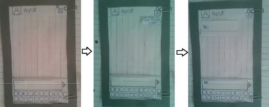
Prototype 1
This prototype is for informing the user what is going on, if the message can't be encrypted.
Testing it / Results
When testing it, we found out that the colors had been irritating for our testperson.
Improvement of the first prototype
Schöne Bebilderung!
"Testet" diesen Abschnitt nochmal mit folgender "Heuristik": 1) Gibt es einen Bezug von Text und Bild, der die Änderungen/Vorschläge im Design einfach verständlich und deutlich macht, wenn man noch nicht mit euren Ideen und eurer Forschung vertraut ist? 2) ist es klar auf welches Bild-Element sich der Text bezieht, wenn man kein Deutsch spricht?
Protoype 2a)
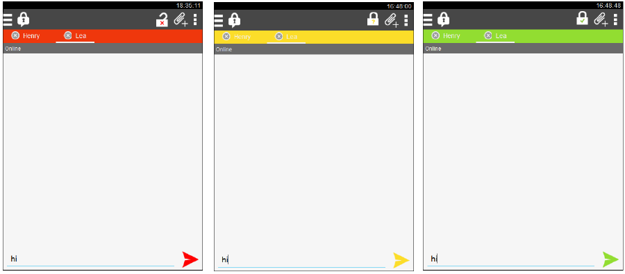
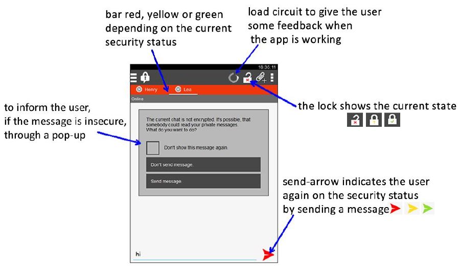
To make the user keep an eye on the current security level, we added colour to the send button. This means the button has the same colour as the bar with the names of the contacts.
EDIT: So you know by clicking on the send button, whether the state is unsafe(red), safe(yellow) or safe and verified(green). You can also see the current status in the little lock above. But some test person told us, they don't look above by each sending of a message.
Providing feedback where the user actually looks when working is key. Its not always easy to tell that in advance, that's where user testing comes in. So you got come valuable information in your test here. One idea related to the coloring to consider: the app is called ChatSecure, so people expect secure messaging. That expectation can be represented in the app, so when the messages are secure, the app looks like a "normal" Android messaging app. Then use the color to represent when things are not secure. That could make the non-secure states stand out more.
Protoype 2b)
A next question was how we could show that the message is not encrypted. This also included the problem how one could start encryption. Warum habt ihr dieses Thema ("informing the user what is going on, if…") gewählt? Nutzerforschung? Vortest? Heuristik? Logische begründung, denn… (eure Erklärung)
EDIT: As described above, some test persons told us, they want to be informed by sending if their message isn't save. This is another possibility to inform the user.
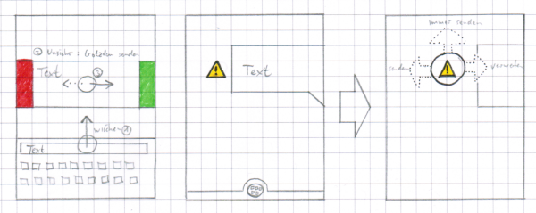
The idea was to show a litte exclamation mark sign beside the message on which one could touch. Then some actions should be possible. For example swipe left to send even if it is unsecure.
We discussed this idea in the group and decided that this would not be easy to understand. So we gave up this idea.
This would be a very valuable thing to have for people using ChatSecure in high risk situations, where it is important that they don't mistakenly send messages insecurely. An example is a journalist under surveillance from the state. But for many people, it would just annoy them. I wouldn't discard this idea so quickly, I think it could be made workable. And it would work a lot better than a popup once the user learns it.
Protoype 2c)
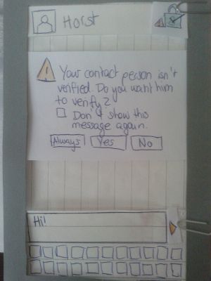
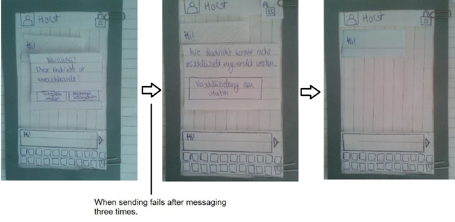
We added a pop up, which appears when the user tries to start an insecure chat or to remind the user to verify himself and/or his contact person.
EDIT: The user have to choose, whether he will send the message unsafe or try a safe sending on another time. He also has the opportunity to save his response for all time. This can be changed in the settings.
Prototype 2d)
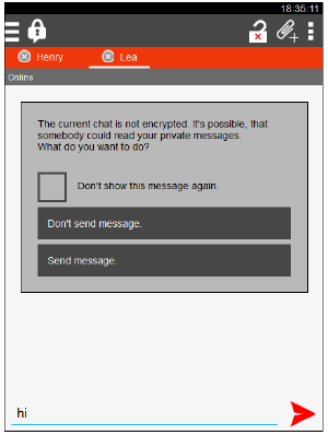
If the message is secure (In the speechbubble in the middle picture is written: “start secure messaging”, because one problem was that user don’t know what OTR means.)
If the message is not secure, a pop-up comes out to tell the user what is going on and if he wants to continue or to cancel the message-sending:
We tested it and our testperson went through it without problems.
This is a good balance of familiar interface experience and quick to use regularly. Its not as flashy as the swipe, but seems like it would not get too annoying if you saw it regularly.
Prototype 2e)
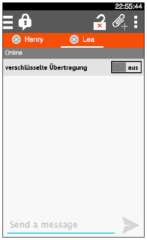
Because some of our test persons expressed concerns about the many buttons needed to start a secure chat and especially about their labels, we decided to bring everything to one switch.
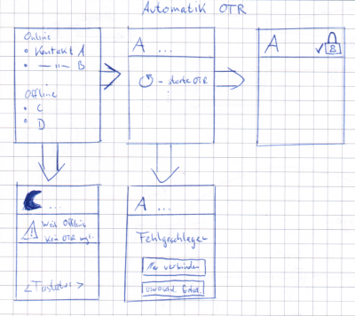
We gave up this idea, because a switch is not much more easy as we thought. Since ChatSecure is a chat where people want to chat secure obviously, we thought it would be a better idea to start the security function automatically.
You are right, starting the secure session is too complicated. The on/off switch would be a nice representation, but because of technical constraints, I don't think it would be workable. We tried it and it was confusing people. The problem is the on/off widget cannot represent anything but on or off, and it takes a while for the OTR session to start. So that leaves the on/off switch in a confusing state while OTR is starting. OTR is neither on nor off. We still don't have a great answer for this problem, but it seems that a button with an icon that changes is the best bet. Then we can represent multiple states.
Starting OTR automatically all the time would also make things easier, but that also has technical limitations. OTR works by sending text messages, and if someone is using a program that does not include OTR, they'll see those odd OTR messages. Its not a huge problem, but it does freak some people out.
Presentation
Schön, dass ihr eure Vortragsthemenund Erkenntnisse dazu nochmal zusammenfasst!
Student 1:
My topic had been security and usability of passwords. It was really interesting to inform myself about that. The gap between easy understanding (usability) and security of password-protected websites was one theme. In my presentantion I explained that system builder to think out of the perspective of the user.
However, what I liked the most in my research had been the studies about what passwords other people choose and how they choose them. I was quite surprised about how easy people's passwords can be encrypted and that hacker go social ways more than mathematical ones to crack them.
Its always surprising, but still, "social engineering" is still the main way people break into computer systems. Edward Snowden used a lot of social engineering techniques to get access to many of the documents that he leaked.
Student 2:
My presentation was about prototyping. It was interesting, how many types of prototypes are existing. There are many ways to test new ideas. You have to choose, which type of prototyp is the best for your product.
I find that rapid prototyping is essential to the process of making good user experiences. For most people, the design process works best when there are many iterations on the idea, so making more iterations as fast as possible means more ideas get explored.
Student 3:
My talk was about designing interfaces for secure or security based systems. The main statement of these paper was, that the most of the classical rules of design does not meet the requirements of such an interface. The authors based their thesis upon user tests with the e-mail encryption tool pgp. It was also interesting to read how a test should be organised and which aspects of the test subjects should be kept in mind. All in all it was a very interesting topic for me and i could recommend this paper to everyone.
Representing technical limitations to the user in a simple way will always be challenging. User testing has demonstrated itself to be a great method for finding out how well ideas and designs map to real experience.
What we learned / conclusions:
Ich habe mich sehr gefreut, eure Dokumentation zu lesen. Leider endet sie etwas abrupt. Es würde bei mir als Leser und vermutlich auch unseren Mentoren einen sehr guten letzten Eindruck hinterlassen, wenn hier noch eine Zusammenfassung der wichtigsten Erkenntnisse und Vorschläge zu lesen wäre; Sinnigerweise mit einer Übersicht in Bild- oder Grafikform (siehe Mail)
I also want to see more. I think you had a lot of good design ideas, but there was not a lot of information outside that to back up the designs.
From our research, we got a lot of information about the requirements and the possible use of a chat application. The most important features people wanted to be part of such an application where group chat functionality, image transfer, smileys and an easy to use but appealing interface. People often want to plan parties in a chat, so the group function could be necessary and image transfer is also an important factor of communication for our interviewed students.
For our prototypes, we concentrated to improve the interface. Here is a graphical summary of our proposals.
