IFD:Nutzerstudien WiSe1314/Gruppe Anmeldung endpresentation: Difference between revisions
| (22 intermediate revisions by 4 users not shown) | |||
| Line 3: | Line 3: | ||
During the course "Nutzerstudien" we focused on the smartphone app "ChatSecure" by interrelating the security of chat apps. | During the course "Nutzerstudien" we focused on the smartphone app "ChatSecure" by interrelating the security of chat apps. | ||
We wanted to find out about the importance of security in chat apps for students at our age. Further we were | We wanted to find out about the importance of security in chat apps for students at our age. Further we were interested in general expectations they have from chat apps and what their problems/wishes are. | ||
For that purpose we tested the app "ChatSecure" with our target group, accomplished usability tests and so developed a varied design to improve the process of creating an account and of signing in. | For that purpose we tested the app "ChatSecure" with our target group, accomplished usability tests and so developed a varied design to improve the process of creating an account and of signing in. | ||
| Line 25: | Line 25: | ||
<span style="color:#598193">Ich denke, dass ''Progress of work'' und ''Course aims'' eine gute und einfache Einleitung sind. </span> | <span style="color:#598193">Ich denke, dass ''Progress of work'' und ''Course aims'' eine gute und einfache Einleitung sind. </span> | ||
<span style="color:#ee9966">Sounds like a straightforward, useful, and doable plan.</span> | |||
=='''Data gathering: Interviews'''== | =='''Data gathering: Interviews'''== | ||
| Line 74: | Line 78: | ||
From the start we were agreed that we want to reach our target group personally by meeting them at the university (fellow students/friends) or at home (homemates). We wanted to talk to them privately to get detailed information and to observe their chat behaviour. | From the start we were agreed that we want to reach our target group personally by meeting them at the university (fellow students/friends) or at home (homemates). We wanted to talk to them privately to get detailed information and to observe their chat behaviour. | ||
<span style="color:#ee9966">In person interviews can give you a lot of focused time and information, and can be quite valuable. Did you consider any other less focused methods of gathering information? Like a survey via facebook, etc. Having a more neutral method of getting information from people might give you things that would not be mentioned in an interview.</span> | |||
Unfortunately we don't made any surveys e.g. on facebook. But that's a very interesting idea and we sure will use these methods next time. | |||
Central questions: | Central questions: | ||
| Line 87: | Line 94: | ||
* What functions and design features do you find most important for a chat app? | * What functions and design features do you find most important for a chat app? | ||
<span style="color:#598193">''Kleine Anmerkung für zukünftige Projekte: Fragen "what are the requirements…" und "how often…" sind schwierig gut zu beantworten und ihr erfahrt dadurch vermutlich wenig über die Gründe für das Nutzerverhalten. "Advantages… Disadvantages" und "which measures" sind gut. Fragt nicht nach generellem, sondern nach "wie machst du…" "was machst du…", "warum hilft… wenn du…" – Dinge, die mit Aktionen zu tun haben, und, noch besser, beobachtet werden können.</span> | <span style="color:#598193">''Kleine Anmerkung für zukünftige Projekte: Fragen "what are the requirements…" und "how often…" sind schwierig gut zu beantworten und ihr erfahrt dadurch vermutlich wenig über die Gründe für das Nutzerverhalten. "Advantages… Disadvantages" und "which measures" sind gut. Fragt nicht nach generellem, sondern nach "wie machst du…" "was machst du…", "warum hilft… wenn du…" – Dinge, die mit Aktionen zu tun haben, und, noch besser, beobachtet werden können.</span> | ||
<span style="color:#ee9966">This is a good range of questions that sounds likely to bring out some of the harder issues of the interface, like finding the threshold where people will give up some security because the interface is too difficult to use. Like the comment above, some of the questions might be too vague without follow-up information. Perhaps there needs to be a couple more targeted questions about examples of when the user gave up on security because of usability issues.</span> | |||
Thank you! We'll try it next time. | |||
==Observation== | ==Observation== | ||
| Line 100: | Line 111: | ||
With that method and the video it was possible to find and analyse the issues the tester had. | With that method and the video it was possible to find and analyse the issues the tester had. | ||
[https://www.youtube.com/watch?v= | [https://www.youtube.com/watch?v=TwxaKDFEOmY&feature=youtu.be Usability test| bessere Qualität] | ||
<br><br><br> | <br><br><br> | ||
<span style="color:#ee9966">Nice video! Good format. Its definitely very useful for watching how a user navigates the app. The user seemed to feel comfortable enough to react naturally during the process, which is quite important. It would be useful to have a higher resolution video to see the details of what is on the screen. It would be nice to see more of these from other users.</span> | |||
What is noticeable during that usability test? | |||
* first part of the video: login with an existing account (all input data are given) | |||
input of | |||
# user domain | |||
# password | |||
# put check mark without any hint | |||
# log on | |||
So in the first part the login process with an existing account works very good and the given task was solved | |||
* second part of the video: to explore the app by yourself | |||
Now in the second part of the usability test the user should explore the app ChatSecure by herself and think loud while testing and exploring. So it was easy to analyse all the steps she made in the test but was not distracted by questions or other confounding factors. | |||
# online status of the contacts were unclear | |||
# ciphering and how it works in the app was not clear. By trial and error the user understands the mechanism with the open and close lock and the color symbolism. | |||
# OTR: in the beginning the user don't know what to do with OTR. It was the same process as 2) | |||
# verifying fingerprint: there are given three opportunities but there is no explanation what is the result or for what it is useful. | |||
So the second part was very revealing because the user had no given task, she only should explore an try out the app by herself. You can see the unaffected way of proceeding of the user and the occuring problems. | |||
During the test we found out... | During the test we found out... | ||
| Line 113: | Line 145: | ||
Results: | Results: | ||
We evaluated the usability tests and made a heuristic analysis for creating a new account and the login-progress. | We evaluated the usability tests and made a heuristic analysis for creating a new account and the login-progress. | ||
<span style="color:#598193">Der Abschnitt zu Observation zeigt eine gute Strukturierung, da bin ich sehr gespannt auf die Ergebnisse dieser Tests. leider steht unter "What is noticeable during that usability test?" nur welcher Art die Ergebnisse sind ("which problems appeared") und nicht was die Ergebnisse selber sind ("Problems: The ''foo'' irritates users, because it looks like the ''bar'' they already know from ''qux'')</span> | |||
In the course of our course we learned about the 10 most general principles for interaction design. To understand this so called "heuristics" and to get in touch with them we did an analysis with the app. This is what we found out: | |||
[http://www.uni-weimar.de/medien/wiki/IFD:Nutzerstudien_WiSe1314/HeuristicAnalysisAnmeldung heuristic analysis] | [http://www.uni-weimar.de/medien/wiki/IFD:Nutzerstudien_WiSe1314/HeuristicAnalysisAnmeldung heuristic analysis] | ||
<span style="color:#ee9966">The heuristic analysis provides a thorough overview of the issues discovered in the user testing. It would be interesting to see links to specific quotes and actions of users in the testing in relation to the points in the analysis. Then if I want to understand a specific problem better, I find the quotes, or reference in the video (you can link to specific times in a youtube video, for example).</span> | |||
=='''Data Analysis & Main Results'''== | =='''Data Analysis & Main Results'''== | ||
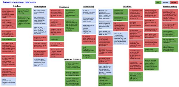
To analyze the data we got, we wrote down the interviews and focused on concisely statements that were important for our task. So we picked out some theses independent from each other and created a kind of digital pin board. There we collected the most important information and tried to arrange the notes into groups. So we got a good summary of our interview results and a much better basis for the designs and improvements. | To analyze the data we got, we wrote down the interviews and focused on concisely statements that were important for our task. So we picked out some theses independent from each other and created a kind of digital pin board. There we collected the most important information and tried to arrange the notes into groups. So we got a good summary of our interview results and a much better basis for the designs and improvements. | ||
[[File:Nutzerstudien-Authentifizierung.jpg| 600 px]] | [[File:Nutzerstudien-Authentifizierung.jpg| 600 px]] | ||
* App Requirements | * App Requirements | ||
** | ** It is of prime importance that the app has to be easily accessible. So it has to be widespread to make the user downloading it. | ||
** The app should be for free. | ** The app should be for free. | ||
** For the user it’s important to be up-to-date and flexible with messages. So he/she prefers an app for chatting. | ** For the user it’s important to be up-to-date and flexible with messages. So he/she prefers an app for chatting. | ||
| Line 135: | Line 172: | ||
** The user wants to send out photos/videos. | ** The user wants to send out photos/videos. | ||
** The user likes to express its emotion with a lot of smileys. | ** The user likes to express its emotion with a lot of smileys. | ||
** The function "writes..." is not | ** The function "writes..." is not necessary. | ||
<span style="color:#ee9966">It is interesting to hear that people want to see the online status. We mostly hear feedback saying that online status is irrelevant in modern messaging apps (i.e. more like SMS). So perhaps we need to be thinking about how to provide SMS-like "send anytime" messaging while still including the idea of online status, rather than eliminating the idea of online/offline/etc entirely.</span> | |||
| Line 151: | Line 191: | ||
** A “real” profile picture is soothing for the user. | ** A “real” profile picture is soothing for the user. | ||
** Authenticity doesn't loom large for students personally. | ** Authenticity doesn't loom large for students personally. | ||
<span style="color:#ee9966">Some sections here are a good collection of overarching ideas for making good software. Other sections here are a couple of specific points, like wanting to see when a user is online. Each section should have a couple overarching ideas, with some important, specific points. For example, what specific things are required to provide an "up-to-date and flexible" messaging experience. What general rules did you learn about security?</span> | |||
==Research and problem solutions== | ==Research and problem solutions== | ||
| Line 156: | Line 199: | ||
'''What specific problem we want to solve''' | '''What specific problem we want to solve''' | ||
We want to solve some problems with the login-process and make it easier to use. | We want to solve some problems with the login-process we had as we first used the app and make it easier to use. | ||
It's hard and circular to login with one of your accounts, because there are too many steps until you are finally logged in. Moreover the buttons are difficult to find on the interface. | It's hard and circular to login with one of your accounts, because there are too many steps until you are finally logged in. Moreover the buttons are difficult to find on the interface. | ||
Therefore we want to create a new login-process. | Therefore we want to create a new login-process. | ||
| Line 173: | Line 215: | ||
This application doesn't contain a login process. You only have to choose the app to be online and you directly see all of your conversations. It is quite easy and intuitive. | This application doesn't contain a login process. You only have to choose the app to be online and you directly see all of your conversations. It is quite easy and intuitive. | ||
<span style="color:#ee9966">WhatsApp is a good example of sacrificing security and privacy to make it easy to use. WhatsApp definitely provides a simple login, but no app has been able to simplify the login that much without creating serious security and privacy concerns. For example, the WhatsApp login and password are generated based on data from the phone which can leak out. The user cannot even change the password once its leaked. Anyone with that username/password can then read and write messages using that account from anywhere on the internet: http://blog.philippheckel.com/2013/07/05/how-to-sniff-the-whatsapp-password-from-your-android-phone-or-iphone/ </span> | |||
2. Facebook Messenger | 2. Facebook Messenger | ||
This application functions nearly the same way as WhatsApp, so you don't need a password to sign in. | This application functions nearly the same way as WhatsApp, so you don't need a password to sign in. | ||
<span style="color:#ee9966">Facebook is a much better example to work with since it does require a password, and it is a password that the user sets and can change.</span> | |||
Our conclusion: | Our conclusion: | ||
Both applications manage without a password. That's quite intuitive but it isn't quite save. While doing our interviews we experienced that it would be convenient to have a password to have a safety warranty (e.g. in case of losing the smartphone) | Both applications manage without a password. That's quite intuitive but it isn't quite save. While doing our interviews we experienced that it would be convenient to have a password to have a safety warranty (e.g. in case of losing the smartphone). | ||
<span style="color:#ee9966">One thing that both WhatsApp and Facebook have in common is that they both make the app and they also run the service that the app uses. This is the difficult part of ChatSecure: it is just the app, someone else is providing the service. The advantage is that anyone can provide the service (companies, student groups, universities, individuals, etc.) This means the user can choose a service provider that they trust the most, but that makes the login procedure a lot more complicated. One idea that works well in this kind of situation is having "sensible defaults". That means that the app will choose a specific service by default, and the user can just choose a username and password. Then if the user wants more choice, then can expand a hidden section that contains all of the options.</span> | |||
<span style="color:#ee9966">Another approach is to ask the user a question before setting up the account. Something like "how concerned are you about the security and privacy of this account?" Then based on the answer to that question, ChatSecure would choose the defaults for the user (things like which service, whether to use Tor or not, etc. Then the user could optionally change those defaults.</span> | |||
==First design considerations and ideas== | ==First design considerations and ideas== | ||
After the | After the interviews, the observations while usability tests and the comparison with other apps, we could draw the first design conclusion and ideas: | ||
1. We want the process of creating an account and signing in as | 1. We want the process of creating an account and signing in as intuitive as possible (comparable with WhatsApp and Facebook Messenger) | ||
<br> | |||
2. We want the app as safe as possible (safer than WhatsApp and Facebook Messenger) | 2. We want the app as safe as possible (safer than WhatsApp and Facebook Messenger) | ||
| Line 194: | Line 249: | ||
* reduce redundant buttons | * reduce redundant buttons | ||
* clarify inconclusive and obscure functions/buttons | * clarify inconclusive and obscure functions/buttons | ||
<span style="color:#ee9966">One thing to consider with the password is whether it is a good idea for the app to not remember the password. Certain high-risk users might want to avoid saving their password on the phone in case the phone is lost. But if the password is stored in a way that it cannot be recovered, and access to the app requires a password on a lock screen, then there is no longer a good reason to avoid saving the password. ChatSecure can now do both: it stores everything encrypted, and it has a lock screen for the whole app. In this case, I think it makes sense to remove the option for saving the account password, and just make it always save it. Then perhaps ChatSecure can forget the password if the user forces a logout. I believe this is how the Facebook app handles the password: it automatically remembers it until the user manually requests to logout.</span> | |||
==Prototypes== | ==Prototypes== | ||
<span style="color:#ee9966">I would like to see more quick and dirty sketches of ideas. Like quick doodles on paper of all sorts of radical ideas. What you have here is a good optimization of the existing processes. But a radical reshaping of the process could have a much much bigger payoff in terms of improving usability.</span> | |||
'''Version 1''' | '''Version 1''' | ||
| Line 202: | Line 262: | ||
It occurs when you want to switch from offline to online as an extra field. | It occurs when you want to switch from offline to online as an extra field. | ||
[[File:Prototyp Anmeldeprozess.jpg|600px]] | <span style="color:#ee9966">This definitely makes a lot of sense, it should be easy to enter the password if it is not saved. And ChatSecure should prompt the user when it wants the password, rather than making the user go find where to enter the password.</span> | ||
[[File:Prototyp Anmeldeprozess.jpg|600px| Overview of our first paper prototype]] | |||
<br> | |||
[[File:nutzerstudien_version1_1.JPG|200px| additional password entering button]] | |||
[[File:nutzerstudien_version1_2.JPG|200px| your own status, so you can choose between different status types]] | |||
<br> | <br> | ||
<br> | <br> | ||
<br> | <br> | ||
'''Version 2''' | '''Version 2''' | ||
<br> | <br> | ||
<br> | |||
<br>Moreover we separated the symbol of the own status and the symbol of the contact's status, so there's no more confusion. Now it's clear what your own status is and what's the status of your contacts. | Our next steps for our prototypes were to thought about a clear arrangement of the contact online/contact offline menu. | ||
<br>We also added a star on the right side next to the contact's name. That's optional for every contact and a way to fix your favourite contacts on top of the list. | In our usability tests we found out, that the design is very confusing and the tester couldn't really find out wich contact was online and who not. | ||
So in the first two pictures and in the last one you can see different ways of representation of the contact menu. At the top you see online/offline and at the left side you see accessorily the color symbolism green/red. In the first one there is an extra area (yellow) for these contact, which are "beschäftigt". | |||
< | <br>Moreover we separated the symbol of the own status and the symbol of the contact's status, so there's no more confusion. Now you can change your status by clicking on the lock and it will change the color according to your status (image 3). | ||
Now it's clear what your own status is and what's the status of your contacts. | |||
<br>We also added a yellow star on the right side next to the contact's name. That's optional for every contact and a way to fix your favourite contacts on top of the list. | |||
<br> | |||
<br> | <br> | ||
[[File:nutzerstudien_version2_1.JPG|200px]] | [[File:nutzerstudien_version2_1.JPG|200px]] | ||
| Line 224: | Line 288: | ||
[[File:nutzerstudien_version2_4.JPG|200px]] | [[File:nutzerstudien_version2_4.JPG|200px]] | ||
[[File:nutzerstudien_version2_5.JPG|200px]] | [[File:nutzerstudien_version2_5.JPG|200px]] | ||
<br> | |||
<br> | <br> | ||
<br> | <br> | ||
'''Version 3''' | '''Version 3''' | ||
<br> | |||
<br> | <br> | ||
For the next iteration we focused on improving the progress of creating an account. | For the next iteration we focused on improving the progress of creating an account. | ||
At this juncture we | At this juncture we considered that it is very important that the user could follow all of his actions and understands the results. | ||
<br>We added info buttons near interface-Elements that were misunderstood in our tests. So the user can get fast help without | We also wanted a clear and visible design to show the system status. | ||
So we went trough the first steps an change some details so that all steps are clear for the user. | |||
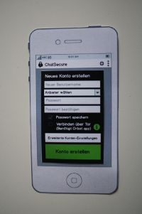
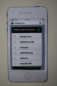
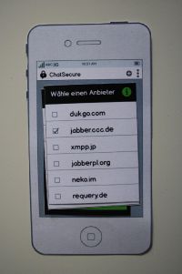
<br>We added info buttons near interface-Elements that were misunderstood in our tests. So the user can get fast help without searching for it very long. We think this is a solution helping new users and not annoying user with a bigger knowledge. (images 5,6,7) | |||
<span style="color:#ee9966">The idea of allowing people to find out more info on the account setup screen is quite valuable. One thing to also consider is how to use information that the program can automatically detect. For example, Tor/Orbot is a separate app, and ChatSecure can detect if it is installed or not. So ChatSecure could change the account setup screen based on that.</span> | |||
For all ordinary citizen it's not clear what is meant with Tor/Orbot respectively they don't know that it is a separate app. So it would useful to give a hint in an infomation window about this topic and allows the user to decide between diffenrent procedures to go on. | |||
In the last two picture (image 9 and 10) you see the screen, in which the user can quickly switch between several accounts. | |||
[[File:nutzerstudien_version3_1.JPG|200px]] | [[File:nutzerstudien_version3_1.JPG|200px]] | ||
[[File:nutzerstudien_version3_2.JPG|200px]] | [[File:nutzerstudien_version3_2.JPG|200px]] | ||
| Line 244: | Line 318: | ||
[[File:nutzerstudien_version3_9.JPG|200px]] | [[File:nutzerstudien_version3_9.JPG|200px]] | ||
[[File:nutzerstudien_version3_10.JPG|200px]] | [[File:nutzerstudien_version3_10.JPG|200px]] | ||
<br>Furthermore we improved the design for the list of contacts once more and clearly seperated "online" and "offline" from each other in order to prevent mistakes and confusion. This two lists are know reachable with a kind of "tabs". (images 11, 13,14) | |||
In the first two pictures there is our "old" design with the two lists marked with the corresponding colors . The light blue bar at the left side points to an unread message. | |||
Our new idea of separating the two lists was implement with tabs (image 13 and 14). You can clearly see in which tab you are because this one in colored and the other one is grayed out. | |||
<br> | |||
<span style="color:#598193">Bezug zu Bildern herstellen (wie in der Mail angemerkt)</span> | |||
<span style="color:#ee9966">It is interesting to see that you adding online presense to the interface. It used to be part of ChatSecure, back when it was called Gibberbot, but we actually removed the representation of online status to simplify things. It seems to be very much an open question of whether having online/offline presence info in messaging apps is a useful thing. Some people very much demand it, while for many it is just confusing. From what I've seen of new messaging apps, the trend in mobile apps is to remove it, but that could just be a trend that changes in a year. So perhaps there is a middle ground somewhere, a way to include the information without having be dominant or confusing.</span> | |||
[[File:nutzerstudien_version3_11.JPG|200px]] | [[File:nutzerstudien_version3_11.JPG|200px]] | ||
[[File:nutzerstudien_version3_12.JPG|200px]] | [[File:nutzerstudien_version3_12.JPG|200px]] | ||
| Line 252: | Line 336: | ||
'''Version 4 - final version''' | '''Version 4 - final version''' | ||
<br> | <br> | ||
In the last and final version we used an old idea from the first prototype and grided the password-request in the progess of creating an account. | In the last and final version we used an old idea from the first prototype and grided the password-request in the progess of creating an account. (image 5) | ||
<br>Moreover we added all error messages, that appeared in the tests to give feedback to the user in every of this situations and to let her/him decide by her-/himself how to react. | <br>Moreover we added all error messages, that appeared in the tests to give feedback to the user in every of this situations and to let her/him decide by her-/himself how to react. (images 6,7 and 10) | ||
<br> | <br> | ||
<br> | <br> | ||
| Line 269: | Line 353: | ||
[[File:nutzerstudien_version3_14.JPG|200px]] | [[File:nutzerstudien_version3_14.JPG|200px]] | ||
==Our | ==Our results== | ||
<span style="color:#598193">Überblick am Schluss: Sehr gut. Wie in der Mail angemerkt, wäre hier ein guter Platz für eine Zusammenfassung der Änderungen, sozusagen ein Design-Fazit.</span> | <span style="color:#598193">Überblick am Schluss: Sehr gut. Wie in der Mail angemerkt, wäre hier ein guter Platz für eine Zusammenfassung der Änderungen, sozusagen ein Design-Fazit.</span> | ||
FINAL DESIGN RESULTS/UPDATES FOR CHATSECURE: | |||
<span style="color:#ee9966">This is a much clearer representation of the password prompt than what currently exists.</span> | |||
1. additional password entering button | |||
[[File:nutzerstudien_version4_1.JPG|200px]] | |||
2. advice if password is wrong - error message | |||
[[File:nutzerstudien_version4_2.JPG|200px]] | |||
3. generally error messages in case of no connection/wrong enters | |||
<span style="color:#ee9966">Android is pushing away from Ok message boxes, and instead putting as much of the info inline into the interface as possible. The on/off switch is one example of that. I think these errors could also be represented inline too.</span> | |||
[[File:nutzerstudien_version4_3.JPG|200px]] | |||
[[File:nutzerstudien_version4_4.JPG|200px]] | |||
4. new contact order with several colours - two different design ideas | |||
<span style="color:#ee9966">I think image numbers 13 (middle) and 14 (right) represent the online info the best. In 11 (left), it is too dominant and could be potentially confusing because people might think a contact went missing since its not on the Online list, and the offline list is far off the bottom of the screen.</span> | |||
[[File:nutzerstudien_version3_11.JPG|200px]] | |||
[[File:nutzerstudien_version3_13.JPG|200px]] | |||
[[File:nutzerstudien_version3_14.JPG|200px]] | |||
5. yellow stars for most important contacts | |||
<span style="color:#ee9966">I like this idea.</span> | |||
[[File:nutzerstudien_version3_11.JPG|200px]] | |||
[[File:nutzerstudien_version3_13.JPG|200px]] | |||
6. info buttons to improve the user understanding | |||
<span style="color:#ee9966">Definitely needed. I would like to see a sketch of what happens when the user clicks on an info button. Do you know of any existing Android metaphors you can build on?</span> | |||
[[File:nutzerstudien_version3_4.JPG|200px]] | |||
[[File:nutzerstudien_version3_7.JPG|200px]] | |||
Problems we had: | Problems we had: | ||
The first user experiences by ourselves with the app "ChatSecure" passed dragging because of difficulties with the process of creating an account. We lost too much time by trying to test the app. It was a huge problem that the app didn't worked with IOS. | The first user experiences by ourselves with the app "ChatSecure" passed dragging because of difficulties with the process of creating an account. We lost too much time by trying to test the app. It was a huge problem that the app didn't worked with IOS. | ||
<span style="color:#ee9966">Thanks for testing with the app despite the problems! We have recently had a big push to implement new features in ChatSecure, so there are still bugs to work out. Our next big work focus will be improving the UI and the stability. There is also a iOS version, but without quite as many as the security features: https://chatsecure.org</span> | |||
| Line 283: | Line 412: | ||
Furthermore we were well prepared before interviewing so that we could implement that while talking to our target group. | Furthermore we were well prepared before interviewing so that we could implement that while talking to our target group. | ||
Generally we got | Generally we got sufficient background knowledge for our process of work during the course. So we obtained step by step our final design. | ||
Latest revision as of 10:23, 19 March 2014
Course Aims
During the course "Nutzerstudien" we focused on the smartphone app "ChatSecure" by interrelating the security of chat apps. We wanted to find out about the importance of security in chat apps for students at our age. Further we were interested in general expectations they have from chat apps and what their problems/wishes are. For that purpose we tested the app "ChatSecure" with our target group, accomplished usability tests and so developed a varied design to improve the process of creating an account and of signing in.
Progress of work
1. Interviews and target group For that reason we started to interview a few people from our social environment as our target group. So we focused on students at the age of 20 - 30. We reached this test persons personally so we met them to conduct the interviews directly.
2. Analyse and Assessment After that we analysed the results by summing up, comparing and strucuring them.
3. Prototypes and scenarios
Then we began to create prototypes. These prototypes also passed through usability tests to further improve the design.
For that prototypes we constructed scenarios which had to be accomplished by the test users.
4. Improving Design by Iteration We further improved our design by iteration (five steps) to get our final design.
Ich denke, dass Progress of work und Course aims eine gute und einfache Einleitung sind.
Sounds like a straightforward, useful, and doable plan.
Data gathering: Interviews
table of interview partner:
| Number | Age class | Course of studies |
|---|---|---|
| 1 | <20 | Arts |
| 2 | <20 | Arts |
| 3 | 20-25 | Science/Engineering |
| 4 | 25-30 | Science/Engineering |
| 5 | <20 | Fine Arts/Design |
| 6 | <20 | Fine Arts/Design |
| 7 | <20 | Fine Arts/Design |
Reasons for choosing those people:
We wanted to figure out the differences between the students of Arts, Fine Arts/Design and Science/Engineering. So we chose people from our social environment. Because we are students from different courses of studies (Arts, Fine Arts/Design and Science/Engineering) we had the chance to interview these types of students.
Form of accessibility:
From the start we were agreed that we want to reach our target group personally by meeting them at the university (fellow students/friends) or at home (homemates). We wanted to talk to them privately to get detailed information and to observe their chat behaviour.
In person interviews can give you a lot of focused time and information, and can be quite valuable. Did you consider any other less focused methods of gathering information? Like a survey via facebook, etc. Having a more neutral method of getting information from people might give you things that would not be mentioned in an interview.
Unfortunately we don't made any surveys e.g. on facebook. But that's a very interesting idea and we sure will use these methods next time.
Central questions:
- What chat apps/programs do you use and for what purposes (one-on-one interviews or group discussions, image, video and link transfer)?
- Where do you see advantages and disadvantages of your favorite chat program?
- How important authentication is for you?
- How should a trustable profile be? What information are important?
- In what situations you prefer the phone or an E-Mail before chatting?
- What are requirements for you to use a new app with guaranteed security?
- How often do you use them and how important they are for you?
- How important is security for you while chatting with people?
- What measures do you probably adopt to be safe?
- What functions and design features do you find most important for a chat app?
Kleine Anmerkung für zukünftige Projekte: Fragen "what are the requirements…" und "how often…" sind schwierig gut zu beantworten und ihr erfahrt dadurch vermutlich wenig über die Gründe für das Nutzerverhalten. "Advantages… Disadvantages" und "which measures" sind gut. Fragt nicht nach generellem, sondern nach "wie machst du…" "was machst du…", "warum hilft… wenn du…" – Dinge, die mit Aktionen zu tun haben, und, noch besser, beobachtet werden können.
This is a good range of questions that sounds likely to bring out some of the harder issues of the interface, like finding the threshold where people will give up some security because the interface is too difficult to use. Like the comment above, some of the questions might be too vague without follow-up information. Perhaps there needs to be a couple more targeted questions about examples of when the user gave up on security because of usability issues.
Thank you! We'll try it next time.
Observation
After that we did a usability test with ChatSecure to find out how other users deal with the app.
We wanted to find out if the register and login process is intuitive for the user or not. So we got to know about user's handling with apps and their expectations. We hoped to get suggestions and ideas for a better log in process based on the user's behavior.)
- What observations during the interviews did we make?
The tester was asked to say what she/he was thinking and doing while testing the prototype, which problems she/he had and how they could be solved. With that method and the video it was possible to find and analyse the issues the tester had.
Usability test| bessere Qualität
Nice video! Good format. Its definitely very useful for watching how a user navigates the app. The user seemed to feel comfortable enough to react naturally during the process, which is quite important. It would be useful to have a higher resolution video to see the details of what is on the screen. It would be nice to see more of these from other users.
What is noticeable during that usability test?
- first part of the video: login with an existing account (all input data are given)
input of
- user domain
- password
- put check mark without any hint
- log on
So in the first part the login process with an existing account works very good and the given task was solved
- second part of the video: to explore the app by yourself
Now in the second part of the usability test the user should explore the app ChatSecure by herself and think loud while testing and exploring. So it was easy to analyse all the steps she made in the test but was not distracted by questions or other confounding factors.
- online status of the contacts were unclear
- ciphering and how it works in the app was not clear. By trial and error the user understands the mechanism with the open and close lock and the color symbolism.
- OTR: in the beginning the user don't know what to do with OTR. It was the same process as 2)
- verifying fingerprint: there are given three opportunities but there is no explanation what is the result or for what it is useful.
So the second part was very revealing because the user had no given task, she only should explore an try out the app by herself. You can see the unaffected way of proceeding of the user and the occuring problems.
During the test we found out...
- ...how the proband approached to the test,
- ...how long it took her/him to understand the system and structure of the app,
- ...which problems appeared
- ...and where the problems appeared.
Results: We evaluated the usability tests and made a heuristic analysis for creating a new account and the login-progress.
Der Abschnitt zu Observation zeigt eine gute Strukturierung, da bin ich sehr gespannt auf die Ergebnisse dieser Tests. leider steht unter "What is noticeable during that usability test?" nur welcher Art die Ergebnisse sind ("which problems appeared") und nicht was die Ergebnisse selber sind ("Problems: The foo irritates users, because it looks like the bar they already know from qux)
In the course of our course we learned about the 10 most general principles for interaction design. To understand this so called "heuristics" and to get in touch with them we did an analysis with the app. This is what we found out: heuristic analysis
The heuristic analysis provides a thorough overview of the issues discovered in the user testing. It would be interesting to see links to specific quotes and actions of users in the testing in relation to the points in the analysis. Then if I want to understand a specific problem better, I find the quotes, or reference in the video (you can link to specific times in a youtube video, for example).
Data Analysis & Main Results
To analyze the data we got, we wrote down the interviews and focused on concisely statements that were important for our task. So we picked out some theses independent from each other and created a kind of digital pin board. There we collected the most important information and tried to arrange the notes into groups. So we got a good summary of our interview results and a much better basis for the designs and improvements.
- App Requirements
- It is of prime importance that the app has to be easily accessible. So it has to be widespread to make the user downloading it.
- The app should be for free.
- For the user it’s important to be up-to-date and flexible with messages. So he/she prefers an app for chatting.
- Visual Design
- Complexity takes a lot of time, so you need a simple, intuitive, neatly arranged design, which looks uniform on all gadgets.
- Interface & Functions
- It is handy for the user to have an interface, where you can see who is online at the moment and when a contact was online the last time.
- The app should contain a function to let the user know if the chat partner read the messages because it faciliate the communication.
- The user wants to send out photos/videos.
- The user likes to express its emotion with a lot of smileys.
- The function "writes..." is not necessary.
It is interesting to hear that people want to see the online status. We mostly hear feedback saying that online status is irrelevant in modern messaging apps (i.e. more like SMS). So perhaps we need to be thinking about how to provide SMS-like "send anytime" messaging while still including the idea of online status, rather than eliminating the idea of online/offline/etc entirely.
- Security
- It would be useful to have a password for the app.
- To feel safe, the user desires to have a security warranty.
- It is important that apps are immune from viruses. That means that the app should be save. Our probands talked about some safety gaps they experienced on social platforms and other chat providers they used (e.g. private messages that were published on the public profile, spam mails, ...).
- Important information, link, photos, videos, … are often sent by E-Mail.
- Distrust towards apps results e.g. from missing knowledge about safety and smart phone-apps.
- People use safety-options of social networks (e.g. Facebook) but don’t know, if they really work.
- Authenticity
- If you want a trustworthy profile you have to find a good balance between too much and too little information.
- (To much) Personalized advertising makes the user feel insecure.
- A “real” profile picture is soothing for the user.
- Authenticity doesn't loom large for students personally.
Some sections here are a good collection of overarching ideas for making good software. Other sections here are a couple of specific points, like wanting to see when a user is online. Each section should have a couple overarching ideas, with some important, specific points. For example, what specific things are required to provide an "up-to-date and flexible" messaging experience. What general rules did you learn about security?
Research and problem solutions
What specific problem we want to solve
We want to solve some problems with the login-process we had as we first used the app and make it easier to use. It's hard and circular to login with one of your accounts, because there are too many steps until you are finally logged in. Moreover the buttons are difficult to find on the interface. Therefore we want to create a new login-process.
Plans – how we want to solve the problem(s)
--> Using the method: other application's test: Ich freue mich, das ihr hier zusätzliche Methoden (Konkurrenzanalyse) angewandt habt. Das zeigt, dass ihr euch eigene Gedanken macht und eigene Lösungen sucht!
First we start to analyse the login process at other applications. We found out that WhatsApp is the most widespread app to chat for our target group, second one is the Facebook messanger.
1. WhatsApp
This application doesn't contain a login process. You only have to choose the app to be online and you directly see all of your conversations. It is quite easy and intuitive.
WhatsApp is a good example of sacrificing security and privacy to make it easy to use. WhatsApp definitely provides a simple login, but no app has been able to simplify the login that much without creating serious security and privacy concerns. For example, the WhatsApp login and password are generated based on data from the phone which can leak out. The user cannot even change the password once its leaked. Anyone with that username/password can then read and write messages using that account from anywhere on the internet: http://blog.philippheckel.com/2013/07/05/how-to-sniff-the-whatsapp-password-from-your-android-phone-or-iphone/
2. Facebook Messenger
This application functions nearly the same way as WhatsApp, so you don't need a password to sign in.
Facebook is a much better example to work with since it does require a password, and it is a password that the user sets and can change.
Our conclusion:
Both applications manage without a password. That's quite intuitive but it isn't quite save. While doing our interviews we experienced that it would be convenient to have a password to have a safety warranty (e.g. in case of losing the smartphone).
One thing that both WhatsApp and Facebook have in common is that they both make the app and they also run the service that the app uses. This is the difficult part of ChatSecure: it is just the app, someone else is providing the service. The advantage is that anyone can provide the service (companies, student groups, universities, individuals, etc.) This means the user can choose a service provider that they trust the most, but that makes the login procedure a lot more complicated. One idea that works well in this kind of situation is having "sensible defaults". That means that the app will choose a specific service by default, and the user can just choose a username and password. Then if the user wants more choice, then can expand a hidden section that contains all of the options.
Another approach is to ask the user a question before setting up the account. Something like "how concerned are you about the security and privacy of this account?" Then based on the answer to that question, ChatSecure would choose the defaults for the user (things like which service, whether to use Tor or not, etc. Then the user could optionally change those defaults.
First design considerations and ideas
After the interviews, the observations while usability tests and the comparison with other apps, we could draw the first design conclusion and ideas:
1. We want the process of creating an account and signing in as intuitive as possible (comparable with WhatsApp and Facebook Messenger)
2. We want the app as safe as possible (safer than WhatsApp and Facebook Messenger)
first changings/development ideas:
- additional button for entering a password (if it isn't saved)
- reduce redundant buttons
- clarify inconclusive and obscure functions/buttons
One thing to consider with the password is whether it is a good idea for the app to not remember the password. Certain high-risk users might want to avoid saving their password on the phone in case the phone is lost. But if the password is stored in a way that it cannot be recovered, and access to the app requires a password on a lock screen, then there is no longer a good reason to avoid saving the password. ChatSecure can now do both: it stores everything encrypted, and it has a lock screen for the whole app. In this case, I think it makes sense to remove the option for saving the account password, and just make it always save it. Then perhaps ChatSecure can forget the password if the user forces a logout. I believe this is how the Facebook app handles the password: it automatically remembers it until the user manually requests to logout.
Prototypes
I would like to see more quick and dirty sketches of ideas. Like quick doodles on paper of all sorts of radical ideas. What you have here is a good optimization of the existing processes. But a radical reshaping of the process could have a much much bigger payoff in terms of improving usability.
Version 1
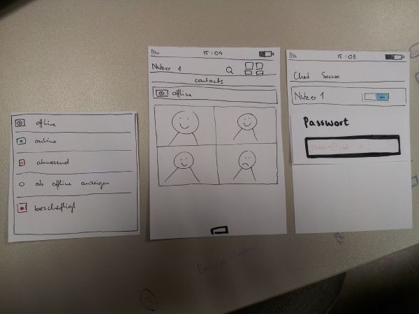
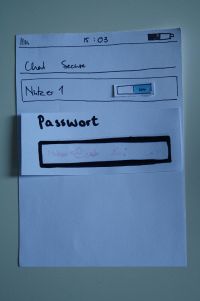
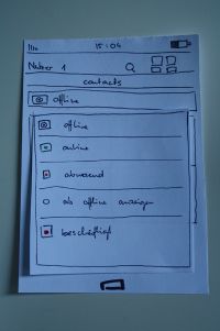
Our first prototype for the login process contains the additional password entering button if it isn't saved. (at the beginning you can choose if you want to save the password for further use or not)
It occurs when you want to switch from offline to online as an extra field.
This definitely makes a lot of sense, it should be easy to enter the password if it is not saved. And ChatSecure should prompt the user when it wants the password, rather than making the user go find where to enter the password.
Version 2
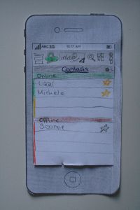
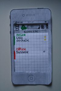
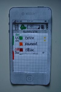
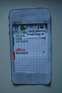
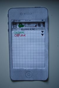
Our next steps for our prototypes were to thought about a clear arrangement of the contact online/contact offline menu.
In our usability tests we found out, that the design is very confusing and the tester couldn't really find out wich contact was online and who not.
So in the first two pictures and in the last one you can see different ways of representation of the contact menu. At the top you see online/offline and at the left side you see accessorily the color symbolism green/red. In the first one there is an extra area (yellow) for these contact, which are "beschäftigt".
Moreover we separated the symbol of the own status and the symbol of the contact's status, so there's no more confusion. Now you can change your status by clicking on the lock and it will change the color according to your status (image 3).
Now it's clear what your own status is and what's the status of your contacts.
We also added a yellow star on the right side next to the contact's name. That's optional for every contact and a way to fix your favourite contacts on top of the list.
Version 3
For the next iteration we focused on improving the progress of creating an account.
At this juncture we considered that it is very important that the user could follow all of his actions and understands the results.
We also wanted a clear and visible design to show the system status.
So we went trough the first steps an change some details so that all steps are clear for the user.
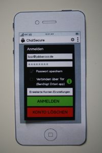
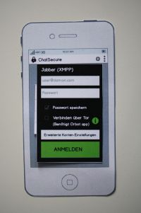
We added info buttons near interface-Elements that were misunderstood in our tests. So the user can get fast help without searching for it very long. We think this is a solution helping new users and not annoying user with a bigger knowledge. (images 5,6,7)
The idea of allowing people to find out more info on the account setup screen is quite valuable. One thing to also consider is how to use information that the program can automatically detect. For example, Tor/Orbot is a separate app, and ChatSecure can detect if it is installed or not. So ChatSecure could change the account setup screen based on that.
For all ordinary citizen it's not clear what is meant with Tor/Orbot respectively they don't know that it is a separate app. So it would useful to give a hint in an infomation window about this topic and allows the user to decide between diffenrent procedures to go on.
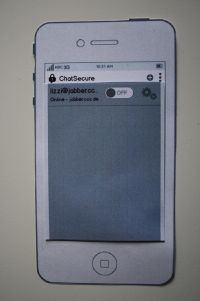
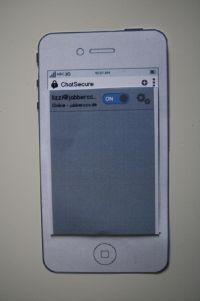
In the last two picture (image 9 and 10) you see the screen, in which the user can quickly switch between several accounts.
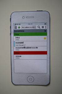
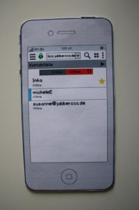
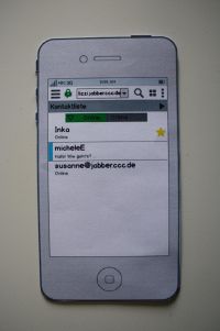
Furthermore we improved the design for the list of contacts once more and clearly seperated "online" and "offline" from each other in order to prevent mistakes and confusion. This two lists are know reachable with a kind of "tabs". (images 11, 13,14)
In the first two pictures there is our "old" design with the two lists marked with the corresponding colors . The light blue bar at the left side points to an unread message.
Our new idea of separating the two lists was implement with tabs (image 13 and 14). You can clearly see in which tab you are because this one in colored and the other one is grayed out.
Bezug zu Bildern herstellen (wie in der Mail angemerkt)
It is interesting to see that you adding online presense to the interface. It used to be part of ChatSecure, back when it was called Gibberbot, but we actually removed the representation of online status to simplify things. It seems to be very much an open question of whether having online/offline presence info in messaging apps is a useful thing. Some people very much demand it, while for many it is just confusing. From what I've seen of new messaging apps, the trend in mobile apps is to remove it, but that could just be a trend that changes in a year. So perhaps there is a middle ground somewhere, a way to include the information without having be dominant or confusing.
Version 4 - final version
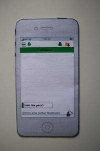
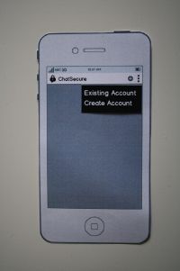
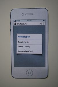
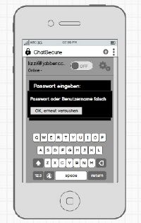
In the last and final version we used an old idea from the first prototype and grided the password-request in the progess of creating an account. (image 5)
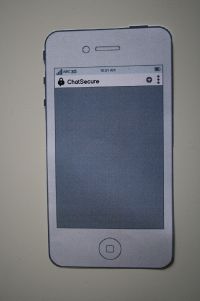
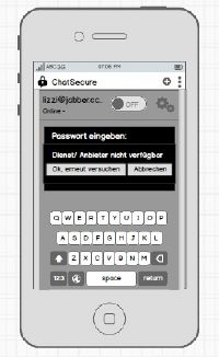
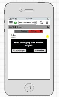
Moreover we added all error messages, that appeared in the tests to give feedback to the user in every of this situations and to let her/him decide by her-/himself how to react. (images 6,7 and 10)




Our results
Überblick am Schluss: Sehr gut. Wie in der Mail angemerkt, wäre hier ein guter Platz für eine Zusammenfassung der Änderungen, sozusagen ein Design-Fazit.
FINAL DESIGN RESULTS/UPDATES FOR CHATSECURE:
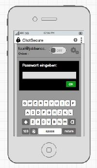
This is a much clearer representation of the password prompt than what currently exists.
1. additional password entering button
2. advice if password is wrong - error message
3. generally error messages in case of no connection/wrong enters
Android is pushing away from Ok message boxes, and instead putting as much of the info inline into the interface as possible. The on/off switch is one example of that. I think these errors could also be represented inline too.
4. new contact order with several colours - two different design ideas
I think image numbers 13 (middle) and 14 (right) represent the online info the best. In 11 (left), it is too dominant and could be potentially confusing because people might think a contact went missing since its not on the Online list, and the offline list is far off the bottom of the screen.
5. yellow stars for most important contacts
I like this idea.
6. info buttons to improve the user understanding
Definitely needed. I would like to see a sketch of what happens when the user clicks on an info button. Do you know of any existing Android metaphors you can build on?
Problems we had:
The first user experiences by ourselves with the app "ChatSecure" passed dragging because of difficulties with the process of creating an account. We lost too much time by trying to test the app. It was a huge problem that the app didn't worked with IOS.
Thanks for testing with the app despite the problems! We have recently had a big push to implement new features in ChatSecure, so there are still bugs to work out. Our next big work focus will be improving the UI and the stability. There is also a iOS version, but without quite as many as the security features: https://chatsecure.org
What did work well:
Our teamwork worked all time. On the one hand inside the course but especially inside our working group because we regulary organised meetings and were always in contact via messaging about the actual state of affairs.
Furthermore we were well prepared before interviewing so that we could implement that while talking to our target group.
Generally we got sufficient background knowledge for our process of work during the course. So we obtained step by step our final design.
