IFD:Nutzerstudien WiSe1314/HeuristicAnalysisSecurity Person5: Difference between revisions
From Medien Wiki
No edit summary |
|||
| Line 10: | Line 10: | ||
== Visibility of system status == | == Visibility of system status == | ||
When you click on the lock and afterwards on "Start OTR”, a charging circle appears on the left side of the lock. This is helpful to show the user that something happens and the app is working. If the contact is offline the loading circle "boosts" permanent and it happens nothing. Thus the user gets no information what’s happens now. | * When you click on the lock and afterwards on "Start OTR”, a charging circle appears on the left side of the lock. This is helpful to show the user that something happens and the app is working. If the contact is offline the loading circle "boosts" permanent and it happens nothing. Thus the user gets no information what’s happens now. | ||
If you click on "verify fingerprint" and afterwards on "OK", the window just closes without a message to the user. So he doesn’t know the current status. | * If you click on "verify fingerprint" and afterwards on "OK", the window just closes without a message to the user. So he doesn’t know the current status. | ||
After "verify Key" appears at once a green marker at the message, but the lock is still showing up with a yellow question mark. The contact bar at the top is also shown in yellow. Thus the user does not know the actually state. | * After "verify Key" appears at once a green marker at the message, but the lock is still showing up with a yellow question mark. The contact bar at the top is also shown in yellow. Thus the user does not know the actually state. | ||
== Match between system and the real world == | == Match between system and the real world == | ||
Clicking the lock with red cross shows "Start OTR". Maybe some unskilled users will not know that “OTR” means Off-the-Record Messaging. So they don’t know, if OTR is about the encryption or not. | * Clicking the lock with red cross shows "Start OTR". Maybe some unskilled users will not know that “OTR” means Off-the-Record Messaging. So they don’t know, if OTR is about the encryption or not. | ||
Use of traffic light colors (red, yellow, green) is known to the user from the real world. However, for first time users may not be immediately clear what color means what. | * Use of traffic light colors (red, yellow, green) is known to the user from the real world. However, for first time users may not be immediately clear what color means what. | ||
When sending an image it has a yellow label, but the message before and after are marked green. The user don’t know why. | * When sending an image it has a yellow label, but the message before and after are marked green. The user don’t know why. | ||
A message is marked in green but under the message comes a cross. The message is encrypted but was not sent? Maybe the user will be confused. | * A message is marked in green but under the message comes a cross. The message is encrypted but was not sent? Maybe the user will be confused. | ||
| Line 32: | Line 32: | ||
After select a function (encryption, add file, menu) in an open chat you just click in the chat box which is still visible. This is intuitive as undo and sufficient. | * After select a function (encryption, add file, menu) in an open chat you just click in the chat box which is still visible. This is intuitive as undo and sufficient. | ||
If you are in the chat and would like to go back to the list of contacts, this is possible by swiping to the left or clicking back button (Samsung phone). The swiping isn’t very intuitive. | * If you are in the chat and would like to go back to the list of contacts, this is possible by swiping to the left or clicking back button (Samsung phone). The swiping isn’t very intuitive. | ||
== Consistency and standards == | == Consistency and standards == | ||
If you click on a message the window to "Verify" open. This isn’t expected by the users because this action should come only by clicking the lock. Moreover, it leads to confusion when the message is already marked as green but still opens a window for verification. | * If you click on a message the window to "Verify" open. This isn’t expected by the users because this action should come only by clicking the lock. Moreover, it leads to confusion when the message is already marked as green but still opens a window for verification. | ||
== Error prevention == | == Error prevention == | ||
If you have already opened the keyboard to write a message and then goes back to the contact view, the keyboard is still open. Typing some characters and they are displayed in an over layer. (Screenshot) If you now close the keyboard this text is still be shown, even if you move to another contact. The keyboard should therefore be closed automatically when you go back to the contact list in order to avoid such errors. | * If you have already opened the keyboard to write a message and then goes back to the contact view, the keyboard is still open. Typing some characters and they are displayed in an over layer. (Screenshot) If you now close the keyboard this text is still be shown, even if you move to another contact. The keyboard should therefore be closed automatically when you go back to the contact list in order to avoid such errors. | ||
[[File:Screenshot_2014-01-09-11-05-47.png]] [[File:Screenshot_2014-01-09-11-06-17.png]] | [[File:Screenshot_2014-01-09-11-05-47.png]] [[File:Screenshot_2014-01-09-11-06-17.png]] | ||
Contact appears offline even though it is online. The chat with the contact, however, is still possible. | * Contact appears offline even though it is online. The chat with the contact, however, is still possible. | ||
[[File:Screenshot_2014-01-09-11-16-06.png]] | [[File:Screenshot_2014-01-09-11-16-06.png]] | ||
| Line 52: | Line 52: | ||
== Recognizing rather than recall == | == Recognizing rather than recall == | ||
Open the contact view from a chat window (swipe to the left) is not intuitive. Instead of the way to swipe to the previous and next contact, you could always put a link to the contact list. | * Open the contact view from a chat window (swipe to the left) is not intuitive. Instead of the way to swipe to the previous and next contact, you could always put a link to the contact list. | ||
== Flexibility and efficiency of use == | == Flexibility and efficiency of use == | ||
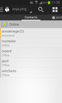
Change the status is hidden behind a small green dot. This function is therefore only for experienced users or people who click anywhere discoverable. That’s okay, because in my opinion this feature is not absolutely necessary. A personally design is not possible with the App. | * Change the status is hidden behind a small green dot. This function is therefore only for experienced users or people who click anywhere discoverable. That’s okay, because in my opinion this feature is not absolutely necessary. A personally design is not possible with the App. | ||
[[File:Screenshot_2014-01-15-11-35-15.png]] | [[File:Screenshot_2014-01-15-11-35-15.png]] | ||
| Line 62: | Line 62: | ||
== Aesthetic and minimalist design == | == Aesthetic and minimalist design == | ||
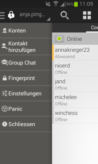
The menu is a mix of German and English words. It would be better if it would be limited to one language. | * The menu is a mix of German and English words. It would be better if it would be limited to one language. | ||
[[File:Screenshot_2014-01-15-11-09-33.png]] | [[File:Screenshot_2014-01-15-11-09-33.png]] | ||
After starting OTR a lock with a yellow question mark appears above. Now the messages have a yellow mark. When you click on the question mark, the possibility of verifying and ending the OTR appears (Verify Key / Beende OTR). Here the German / English mix is also unfavorable for the user. | * After starting OTR a lock with a yellow question mark appears above. Now the messages have a yellow mark. When you click on the question mark, the possibility of verifying and ending the OTR appears (Verify Key / Beende OTR). Here the German / English mix is also unfavorable for the user. | ||
In the top status bar of the phone, a corresponding icon is displayed in case of a new message. This icon is useful if the app is not open yet. However, the Chat Secure icon is also shown in the status bar permanently if the app is running. That means if you get a message you have 2 icons of Chat Secure in the status bar. Will there be more icons of WhatsApp etc. the bar will be full very quickly. Therefore the always visible Chat Secure icon should be removed. | * In the top status bar of the phone, a corresponding icon is displayed in case of a new message. This icon is useful if the app is not open yet. However, the Chat Secure icon is also shown in the status bar permanently if the app is running. That means if you get a message you have 2 icons of Chat Secure in the status bar. Will there be more icons of WhatsApp etc. the bar will be full very quickly. Therefore the always visible Chat Secure icon should be removed. | ||
== Help users recognize, diagnose, and recover from errors == | == Help users recognize, diagnose, and recover from errors == | ||
I have not received any error message from the app. Therefore, no statement about the intelligibility of the message and the quality of the solution paths are taken. | * I have not received any error message from the app. Therefore, no statement about the intelligibility of the message and the quality of the solution paths are taken. | ||
== Help and dokumentation == | == Help and dokumentation == | ||
A help is not available in the menu. This would be very helpful for "beginners". E.g. the traffic light system for the security of the message isn’t immediately clear. | * A help is not available in the menu. This would be very helpful for "beginners". E.g. the traffic light system for the security of the message isn’t immediately clear. | ||
Revision as of 14:13, 17 January 2014
Aufgaben:
- Neuen Kontakt hinzufügen
- Nachricht verschicken auf den Wegen:
- Unsicher
- Verschlüsselt
- Authentifiziert
Beachtet
- Jedes Mitglied der Gruppe macht die Analyse für die Themenfelder der Gruppe (s.o.) selber (= keine Zusammenarbeit), da jede Person andere Fehler findet, sodass sich die Analysen ergänzen.
- Bitte so dokumentieren, dass die Analyse und ihre Ergebnisse dem Lehrenden (Jan) und dem ChatSecure Team verständlich sind. Schreibt auf Englisch (wenn möglich, sonst Deutsch) und nutzt Screenshots oder Skizzen.
Visibility of system status
- When you click on the lock and afterwards on "Start OTR”, a charging circle appears on the left side of the lock. This is helpful to show the user that something happens and the app is working. If the contact is offline the loading circle "boosts" permanent and it happens nothing. Thus the user gets no information what’s happens now.
- If you click on "verify fingerprint" and afterwards on "OK", the window just closes without a message to the user. So he doesn’t know the current status.
- After "verify Key" appears at once a green marker at the message, but the lock is still showing up with a yellow question mark. The contact bar at the top is also shown in yellow. Thus the user does not know the actually state.
Match between system and the real world
- Clicking the lock with red cross shows "Start OTR". Maybe some unskilled users will not know that “OTR” means Off-the-Record Messaging. So they don’t know, if OTR is about the encryption or not.
- Use of traffic light colors (red, yellow, green) is known to the user from the real world. However, for first time users may not be immediately clear what color means what.
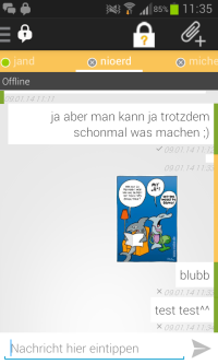
- When sending an image it has a yellow label, but the message before and after are marked green. The user don’t know why.
- A message is marked in green but under the message comes a cross. The message is encrypted but was not sent? Maybe the user will be confused.
User control and freedom
- After select a function (encryption, add file, menu) in an open chat you just click in the chat box which is still visible. This is intuitive as undo and sufficient.
- If you are in the chat and would like to go back to the list of contacts, this is possible by swiping to the left or clicking back button (Samsung phone). The swiping isn’t very intuitive.
Consistency and standards
- If you click on a message the window to "Verify" open. This isn’t expected by the users because this action should come only by clicking the lock. Moreover, it leads to confusion when the message is already marked as green but still opens a window for verification.
Error prevention
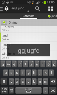
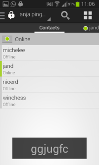
- If you have already opened the keyboard to write a message and then goes back to the contact view, the keyboard is still open. Typing some characters and they are displayed in an over layer. (Screenshot) If you now close the keyboard this text is still be shown, even if you move to another contact. The keyboard should therefore be closed automatically when you go back to the contact list in order to avoid such errors.
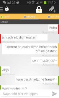
- Contact appears offline even though it is online. The chat with the contact, however, is still possible.
Recognizing rather than recall
- Open the contact view from a chat window (swipe to the left) is not intuitive. Instead of the way to swipe to the previous and next contact, you could always put a link to the contact list.
Flexibility and efficiency of use
- Change the status is hidden behind a small green dot. This function is therefore only for experienced users or people who click anywhere discoverable. That’s okay, because in my opinion this feature is not absolutely necessary. A personally design is not possible with the App.
Aesthetic and minimalist design
- The menu is a mix of German and English words. It would be better if it would be limited to one language.
- After starting OTR a lock with a yellow question mark appears above. Now the messages have a yellow mark. When you click on the question mark, the possibility of verifying and ending the OTR appears (Verify Key / Beende OTR). Here the German / English mix is also unfavorable for the user.
- In the top status bar of the phone, a corresponding icon is displayed in case of a new message. This icon is useful if the app is not open yet. However, the Chat Secure icon is also shown in the status bar permanently if the app is running. That means if you get a message you have 2 icons of Chat Secure in the status bar. Will there be more icons of WhatsApp etc. the bar will be full very quickly. Therefore the always visible Chat Secure icon should be removed.
Help users recognize, diagnose, and recover from errors
- I have not received any error message from the app. Therefore, no statement about the intelligibility of the message and the quality of the solution paths are taken.
Help and dokumentation
- A help is not available in the menu. This would be very helpful for "beginners". E.g. the traffic light system for the security of the message isn’t immediately clear.
