IFD:Nutzerstudien WiSe1314/HeuristicAnalysisAnmeldung Person2: Difference between revisions
From Medien Wiki
No edit summary |
No edit summary |
||
| Line 40: | Line 40: | ||
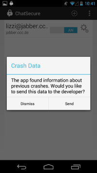
* There are a lot off bugs within the app and most of the time ChatSecure close the app an asks the user if he would send a report to the developer. In some case there are warnungs or error messages | * There are a lot off bugs within the app and most of the time ChatSecure close the app an asks the user if he would send a report to the developer. In some case there are warnungs or error messages | ||
[[File:nutzerstudien_crash.png | 200 px]] | |||
[[File:nutzerstudien_crash_data.png | 200 px]] | [[File:nutzerstudien_crash_data.png | 200 px]] | ||
Revision as of 09:32, 21 January 2014
Aufgaben:
- Anmelden
- Account erstellen
- Einstellungen ("Settings")
Beachtet
- Jedes Mitglied der Gruppe macht die Analyse für die Themenfelder der Gruppe (s.o.) selber (= keine Zusammenarbeit), da jede Person andere Fehler findet, sodass sich die Analysen ergänzen.
- Bitte so dokumentieren, dass die Analyse und ihre Ergebnisse dem Lehrenden (Jan) und dem ChatSecure Team verständlich sind. Schreibt auf Englisch (wenn möglich, sonst Deutsch) und nutzt Screenshots oder Skizzen.
Visibility of system status
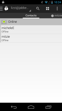
- Your own status is shown in the space above your contacts. So it seems to be the status of all your contact. This is slightly confusing. But with a klick on the green circle you can change your status and realize that this is your own status.
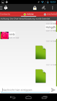
- During the chat, all your messages are marked with a color and show you the security of your message. The colors distinguish between red (unsafe), yellow (only safe from one contact) and green (safe). In addition to the colors, there ist also a lock, which shows you the status of security. If the ciphering break down, there is a warning for the user.
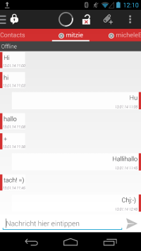
- Feedback of a lot of functions do not exist, so the user don‘t know what happend, for example when you try to start OTR and the contact isn't online, then there appears a permanent rotary circle but nothing happens.
Match between system an the real world
User control an freedom
Consistency and statndards
Error prevention
Recognition rather than recall
Flexibility and efficiency of use
Aesthetic and minimalist design
Help users recognize, diagnose, an recover from errors
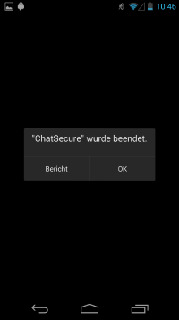
- There are a lot off bugs within the app and most of the time ChatSecure close the app an asks the user if he would send a report to the developer. In some case there are warnungs or error messages
help an documentation
A lot of things are intuitiv, if you are familiar in handling a smartphone. But there are also a lot of bugs and mistakes within the app and there are also some „wrong“ or some unexpected reaction. A few functions do not accord with the norm or there is a other reaction as you would expect in reality.
