mNo edit summary |
|||
| Line 79: | Line 79: | ||
==Wireframes== | ==Wireframes== | ||
[[File:TabWireframes-ProposedAlpha.png]] | |||
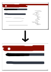
Most of the ideas combined:Better rendering, redesigned close button, favicon, smart image crop. | |||
==Study 1: What do people recall about webpages== | ==Study 1: What do people recall about webpages== | ||
Revision as of 20:41, 3 May 2010
Smart Tabs for Mozilla Mobile
Project by Jan Dittrich
- "How can the way we make the tabs better representing the pages?"
- Goals: make tabs better representing the pages.
- No-Goals: Change the general model of interaction with tabs, Use signficant more screen real estate.
Current Situation
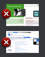
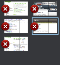
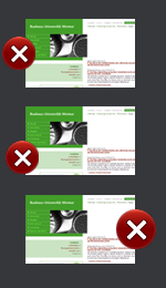
Functions: Tapping on non-framed part of the image makes the respective page appear. Tapping on the area enclosed by the red frame causes the tab to close. This area has currently (1.1 alpha) a width of 57px which makes e.g. 6mm on a N800 or 9mm on an iPhone (on which FF Mobile not runs!).
Ideas for Improvement
Make Closing Botton Less Obstrusive
Make Button Smaller
- Pro: Less space is taken from the image. Button is close to screen edge
- Contra:
- Relevant part of the image not entirely free.
- The Button is harder to see.
Move button to the right edge
- Pro: The more relevant left edge is free.
- Contra:
- The left side is closer to the edge which means the area can be touched easier since one does not care about tapping a close object on the left side.
- When dragging the Bar in, one sees just the Buttons at first.
Smarter Page Crop
Concept: Instead of using the whole view resized as a thumbnail the page is cropped starting in the upper left corner. In my tests a 480px height crop seemd to be decent (the height is more important, since distinctive visual features are often located on the left side)
- Pro: Choosing a more representative part of the page means better recognition and more differenciation between similar pages.
- Contra: ---
Adding Favicon
- Pro: Visual grouping of same Domain-Pages. Recognize logos of commonly used webpages.
- Contra: Could be mistaken for a button if not carefully integrated.
Note:It is likely that the favicon itself is hard to recall for non-frequently used pages. But it often gives color clues for the page. (Further research is needed)
Better rendering quality
- Pro: A better rendering of the tabs will improve the recognition.
- Contra: Performance issues. Could possibly be solved by rendering low-Fi first and when e.g. the user reads the page, the hi-fi Tabs are renderend.
Retrive closed Tabs easier
Provide a "recently closed" button at the "new tab"-view for retrieving closed tabs.
- Pro:If a tab is accidentally closed, it can be retrieved without typing effort
- Contra:takes screen real estate.
Preview pages while finger down, open when up (deferred)
- Pro: Very fast preview, since one could just go over many tabs in one move. Even very shortly displayed content is recognized (siehe: Processing Speed In Cerebral Cortext– Rolls Tovee – 94) It could be triggered with long-tap too: It would trigger a kind of preview overlay and moving to another tab while down whould trigger its preview to occur than.
- Contra: Could get in the way of future attempts to make tab-resorting possible. (not applying to long-tab-triggering or a drag in one of the modes in vertical direction first) May confuse users (?)
- Prototyping results: It works not faster than tapping the pages. This is due to the fact that one can distinguish no more than ~10 tabs (more are unlikely on a mobile device) usually easily. If not, the amount of tabs will be low enough to invoke them by tapping.
But try for yourself: Flash Prototype
I think that this approach is not bad but it will start to perform good with greater item quantities.
Wireframes
 Most of the ideas combined:Better rendering, redesigned close button, favicon, smart image crop.
Study 1: What do people recall about webpages
Conducted by Bastian Bügler and Jan Dittrich
Goal
...is to find out what people can recall about websites they visited previously (about 2-10 Minutes ago)
Methods
Participants had do do simple tasks on several webpages. After a masking time of a couple of minutes filled with other tasks, they had to tell about the features that they link with the webpages.


