(added text and images) |
(changed text) |
||
| Line 25: | Line 25: | ||
Main event graph (Visualization in Touchdesigner) | Main event graph (Visualization in Touchdesigner) | ||
We identified the top 25 most repeated words for the two main groups. In the provided visualization, blue represents shared words between the groups, while pink highlights the words unique to each group: | |||
[[File:Bildschirmfoto 2024-07-28 um 20.12.22.png|frameless|647x647px]] | [[File:Bildschirmfoto 2024-07-28 um 20.12.22.png|frameless|647x647px]] | ||
| Line 64: | Line 64: | ||
[[File:Bildschirmfoto 2024-07-28 um 20.20.05.png|frameless|369x369px]] | [[File:Bildschirmfoto 2024-07-28 um 20.20.05.png|frameless|369x369px]] | ||
Higher Betweenness Centrality (Touchdesigner visualization) | |||
Comparing the two graphs, it's evident that the size of Group 1's network reduced compared to Group 2, which maintained almost the same power flow within its network after this data reduction. This suggests that the distribution of power over information flow is more evenly spread among members of Group 2 than Group 1. | Comparing the two graphs, it's evident that the size of Group 1's network reduced compared to Group 2, which maintained almost the same power flow within its network after this data reduction. This suggests that the distribution of power over information flow is more evenly spread among members of Group 2 than Group 1. | ||
Closeness Centrality: It is defined as the reciprocal of the sum of the shortest path distances of a node to all other nodes in the graph. Therefore, a node with high closeness centrality has short distances to all other nodes of a graph. Closeness can be regarded as a measure of how long it will take to spread information from v to all other nodes sequentially | |||
Let's compare the graphs based on control over information flow and the speed of information dissemination. | Let's compare the graphs based on control over information flow and the speed of information dissemination. | ||
| Line 71: | Line 75: | ||
[[File:Bildschirmfoto 2024-07-28 um 20.22.54.png|frameless|542x542px]] | [[File:Bildschirmfoto 2024-07-28 um 20.22.54.png|frameless|542x542px]] | ||
High Betweenness Centrality and High closenness Centrality (Touchdesigner visualization) | High Betweenness Centrality and High closenness Centrality (Touchdesigner visualization) | ||
Latest revision as of 18:31, 28 July 2024
Ymr.x
Short description:
Ymr.x is an audiovisual interactive installation. Social media’s potential to contribute to partisan polarization is undeniable. Utilizing machine learning and 3D data mapping, we investigate a dataset of more than 8,000 Twitter impressions on a recent local political event to uncover insights and the geometry of users' interactions. Our gamified approach shows an experimental cityscape design, bridging the virtual and physical realms. We invite you to explore the networks between these polarized communities and experience the echo chambers of tweet bubbles.
Video: https://drive.google.com/file/d/1u2xqv55q52FeBkuRw9yHCWJRqqk7GAg4/view?usp=sharing
Research & Code
Social media is often said to connect people with different opinions from around the world. But is this really true? The reality is more complex.
On February 6, 2024, AfD leader Tino Chrupalla appeared on Markus Lanz’s talk show, where he claimed that ZDF had withheld crucial video evidence of an alleged attack on him from the police. This sparked a heated discourse on X (formerly Twitter).
We used extracted relevant data from X using hashtags related to the event via the NodeXL platform. Our goal is to investigate and geometrically analyze the tweets and interactions related to this discourse.
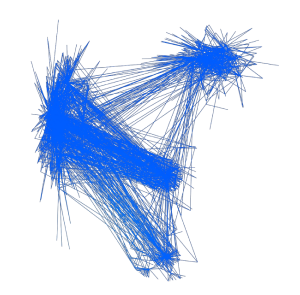
Below is the primary event graph with data reduction applied. Each line represents a Twitter interaction (retweet, mention, mention in retweet, reply, quote, mention in reply, mention in quote). We condensed the entire graph into four major clusters, from which two main groups emerged. Group 1 comprises 3,281 members and 9,470 interactions, while Group 2 consists of 2,656 members and 8,443 interactions.
Main event graph (Visualization in Touchdesigner)
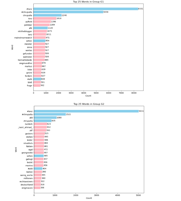
We identified the top 25 most repeated words for the two main groups. In the provided visualization, blue represents shared words between the groups, while pink highlights the words unique to each group:
Word count visualization (Using pandas and matplotlib)
After taking the time to read the bios of the members in the graph, we realized that the political leanings of the accounts in Group 1 were mostly associated with far-right ideologies, while those in Group 2 aligned with the center-left. In terms of politically charged hashtags, Group 2 frequently used #fckafd and #noafd, whereas Group 1 used #meinungsfreiheit.
Below, you can see the connections percentage of each group within themselves and with the other groups. Among them, Groups 1 and 2 are the most isolated, with Group 2 having less than 2% of its interactions with the rest of the clusters.
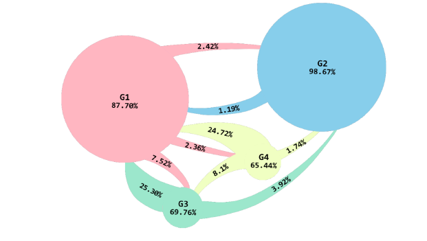
Let’s compare two of the most important relationship networks: mentions in retweets and retweets.
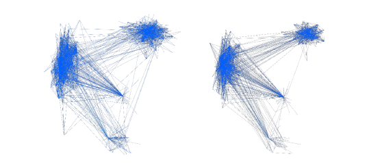
Mentions in retweets, Retweets (Touchdesigner visualization)
Group 2 tends to have most of its interactions through mentions in tweets and the least through retweets, unlike the other groups, which primarily interact by retweeting other group members. Retweeting without mentioning someone in response or writing a comment (quoting) is a form of agreement with the tweet. So, in terms of being under umbrellas of multiple opinions, we have two clusters: one consisting of Groups 1, 3, and 4, and the other of Group 2 alone. The isolation of Group 2 from the rest of the groups forms a polarized network within this discourse.
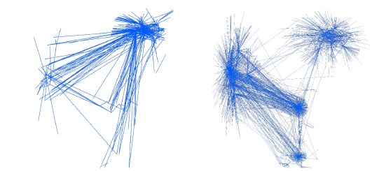
Below is the event graph for the highest impressions, showcasing the most influential interactions within the network:
Interactions with highest impressions (Touchdesigner visualization)
Comparing the two main groups, it is evident that the majority of impactful tweets from Group 1 stem from interactions with other groups, whereas Group 2 generates significant insights from interactions within its own bubble. This underscores the independent identity and survival of Group 2 as a cluster, distinct from interactions with other groups.
Networks of power:
Betweenness Centrality: This measures how often a node appears on the shortest path between other nodes. A high betweenness centrality can indicate a node’s control over information flow within the network.
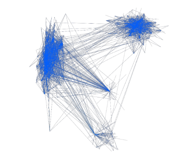
High Betweenness Centrality (Touchdesigner visualization)
The data has been further reduced to focus on users who wield even greater influence over the flow of information.
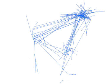
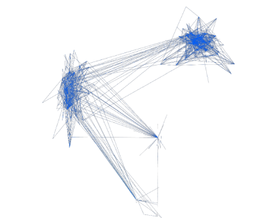
Higher Betweenness Centrality (Touchdesigner visualization)
Comparing the two graphs, it's evident that the size of Group 1's network reduced compared to Group 2, which maintained almost the same power flow within its network after this data reduction. This suggests that the distribution of power over information flow is more evenly spread among members of Group 2 than Group 1.
Closeness Centrality: It is defined as the reciprocal of the sum of the shortest path distances of a node to all other nodes in the graph. Therefore, a node with high closeness centrality has short distances to all other nodes of a graph. Closeness can be regarded as a measure of how long it will take to spread information from v to all other nodes sequentially
Let's compare the graphs based on control over information flow and the speed of information dissemination.
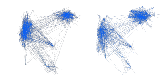
High Betweenness Centrality and High closenness Centrality (Touchdesigner visualization)
The size of the networks for Groups 1 and 3 and 4 remains unchanged in both graphs, but there is a decrease in the size of the network for Group 2. Therefore, the power that Group 2 holds over information spread is attributed to its evenly distributed information flow within the community rather than the speed at which information moves among its members.
Clustering Coefficient: It measures the extent to which nodes in a network form clusters or tightly knit groups. A high clustering coefficient suggests that the network is prone to forming cohesive subgroups, which can influence the spread of information or behavior within the network.
High Betweenness Centrality and High Clustering Coefficient (Touchdesigner visualization)
As the graph of Group 1 loses density, Group 2 remains the same when comparing the networks of members controlling information and the most influential members in terms of spreading opinions and behaviors.
Our analysis reveals distinct patterns in social media dynamics between Group 1 and Group 2. While Group 1 shows a reduction in network density, Group 2 maintains a denser and more evenly distributed influence among its members in controlling information flow and influencing opinions and behaviors. These insights highlight the complex nature of information dissemination within partisan networks and underscore the varying strategies employed by different groups to shape discourse. Understanding these dynamics is crucial for grasping the evolving landscape of digital communication and its impact on societal polarization.
Data cleaning (Step one: removing the unwanted colomns from the dataset, and creating CSV files for group 1-4 seperately):
import pandas as pd
- Read the CSV file and specify the correct header row
file_path = 'AFD-Excel-csv.csv'
- Check the file to identify the correct header row. For this example, assuming the header is on the 2nd row (index 1)
df = pd.read_csv(file_path, encoding='ISO-8859-1', header=1)
- List of columns to keep, adjusted if necessary columns_to_keep = [
'Vertex Group', 'Vertex', 'Followers', 'Followed', 'Tweets', 'Joined Twitter Date (UTC)', 'Location', 'Sentiment List #2: List2 Word Count', 'Sentiment List #1: List1 Word Count', 'Top Words in Tweet by Count', 'Top Words in Tweet by Salience',
'Top Word Pairs in Tweet by Count', 'Top Word Pairs in Tweet by Salience', 'Tweets'
]
# Filter the DataFrame to keep only the specified columns df_filtered = dfcol for col in columns_to_keep if col in df.columns
df_vertex_group_1 = df_filtered[df_filtered['Vertex Group'] == 1] df_vertex_group_2 = df_filtered[df_filtered['Vertex Group'] == 2] df_vertex_group_3 = df_filtered[df_filtered['Vertex Group'] == 3] df_vertex_group_4 = df_filtered[df_filtered['Vertex Group'] == 4]
- Save the filtered DataFrames to separate CSV files df_vertex_group_1.to_csv('Vertex_Group_1.csv', index=False) df_vertex_group_2.to_csv('Vertex_Group_2.csv', index=False) df_vertex_group_1.to_csv('Vertex_Group_3.csv', index=False) df_vertex_group_2.to_csv('Vertex_Group_4.csv', index=False) print("CSV files saved successfully.")
Data cleaning (Step two: update Z values based on target counts for 3d demonstration of the graph):
import pandas as pd import numpy as np
- Function to update Z values based on target counts
def update_z_values(nodes_file, target_counts_file, output_file):
- Load the nodes data
nodes_df = pd.read_csv(nodes_file)
- Load the target counts data
target_counts_df = pd.read_csv(target_counts_file)
- Calculate the adjustment factor target_counts_df['adjustment'] = target_counts_df['Count'] / 733
- Create a dictionary for quick lookup
adjustment_dict = target_counts_df.set_index('Label')['adjustment'].to_dict()
- Apply the adjustments to the Z values
nodes_df['Z'] = nodes_df.apply(lambda row: row['Z'] - adjustment_dict.get(row['Label'], 0), axis=1)
- Ensure Z values don't go below zero nodes_df['Z'] = nodes_df['Z'].clip(lower=0)
- Save the updated DataFrame to a new CSV file nodes_df.to_csv(output_file, index=False)
return nodes_df.head()
- Process each group groups = [
('nodes_group_1_with_Z_smooth.csv', 'nodes_group_1_target_counts.csv', 'nodes_group_1_final.csv'),
('nodes_group_2_with_Z_smooth.csv', 'nodes_group_2_target_counts.csv', 'nodes_group_2_final.csv'),
('nodes_group_3_with_Z_smooth.csv', 'nodes_group_3_target_counts.csv', 'nodes_group_3_final.csv'),
('nodes_group_4_with_Z_smooth.csv', 'nodes_group_4_target_counts.csv', 'nodes_group_4_final.csv')
]
for nodes_file, target_counts_file, output_file in groups: print(f'Processing {nodes_file}')
head = update_z_values(nodes_file, target_counts_file, output_file) print(head)
Visualizing the top 25 word counts:
import pandas as pd
import matplotlib.pyplot as plt
- Define the file path
file_path = # Replace with your actual file path
- Load the Excel file into a pandas DataFrame try:
df = pd.read_excel(file_path) # Adjust 'Sheet1' to your sheet name if different
- Filter and select top 25 words from Group G1 and G2 group_g1 = df[df['Group'] == 'G1']
group_g2 = df[df['Group'] == 'G2']
- Sort by 'Count' column in descending order and select top 25 words group_g1_sorted = group_g1.sort_values(by='Count', ascending=False).head(25) group_g2_sorted = group_g2.sort_values(by='Count', ascending=False).head(25)
- Find mutual words (words present in both G1 and G2)
mutual_words = pd.merge(group_g1_sorted, group_g2_sorted, on='Word', how='inner')
- Plotting G1
plt.figure(figsize=(10, 8))
for i, (word, count) in enumerate(zip(group_g1_sorted['Word'], group_g1_sorted['Count'])):
color = 'skyblue'
if word not in mutual_words['Word'].values:
color = 'lightpink' # Unique to G1
plt.barh(word, count, color=color)
plt.text(count + 5, i, str(count), ha='left', va='center', color='black') # Label count on bar
plt.xlabel('Count')
plt.ylabel('Word')
plt.title('Top 25 Words in Group G1') plt.gca().invert_yaxis()
plt.show()
- Plotting G2
plt.figure(figsize=(10, 8))
for i, (word, count) in enumerate(zip(group_g2_sorted['Word'], group_g2_sorted['Count'])):
color = 'skyblue'
if word not in mutual_words['Word'].values:
color = 'lightpink' # Unique to G2
plt.barh(word, count, color=color)
plt.text(count + 5, i, str(count), ha='left', va='center', color='black') # Label count on bar
plt.xlabel('Count')
plt.ylabel('Word')
plt.title('Top 25 Words in Group G2') plt.gca().invert_yaxis()
plt.show()
except FileNotFoundError:
print(f"File '{file_path}' not found. Please check the file path.")
except Exception as e:
print(f"An error occurred: {str(e)}")
Visualizing connection percentages for each group:
import pandas as pd
import matplotlib.pyplot as plt import numpy as np
- Define the file path
file_path_edges = # Replace with your actual file path
- Load the Excel file into a pandas DataFrame try:
- Read the Excel file with explicit column names specification
df_edges = pd.read_excel(file_path_edges, names=['Group1', 'Group2', 'Edges'])
- Filter rows where Group2 is G1, G2, G3, or G4 groups = ['G1', 'G2', 'G3', 'G4']
- Verify the exact column names in your DataFrame if 'Group2' in df_edges.columns:
df_filtered = df_edges[df_edges['Group2'].isin(groups)] else:
raise KeyError("Column 'Group2' not found in DataFrame. Please verify column names in your Excel file.")
- Calculate total edges for each group
total_edges = df_filtered.groupby('Group1')['Edges'].sum()
- Calculate percentage of self-loops (Group1 == Group2) self_loop_percentages = {}
for group in groups:
if group in total_edges.index:
total_group_edges = total_edges[group]
self_loop_edges = df_filtered[(df_filtered['Group1'] == group) & (df_filtered['Group2'] == group)]['Edges'].sum()
percentage = (self_loop_edges / total_group_edges) * 100
self_loop_percentages[group] = percentage else:
self_loop_percentages[group] = 0
- Define x and y positions for each group (scaled to fit within 0 to 10) group_positions = {
'G1': (3, 6), 'G2': (8, 7), 'G3': (4.5, 2.5), 'G4': (6.5, 4)
}
- Plotting the bubble chart plt.figure(figsize=(10, 8))
- Use defined positions for bubbles
x_positions = [group_positions[group][0] for group in groups] y_positions = [group_positions[group][1] for group in groups]
- Calculate sizes based on the number of edges within each group
sizes = [df_filtered[(df_filtered['Group1'] == group) & (df_filtered['Group2'] == group)]['Edges'].sum() for group in groups]
- Increase bubble sizes for better visibility sizes = [size * 4 for size in sizes]
labels = [f'Group {group[-1]}\n{self_loop_percentages[group]:.2f}%' for group in groups]
bubbles = plt.scatter(x_positions, y_positions, s=sizes, alpha=0.3, c=range(len(groups)), cmap='viridis', edgecolors='w')
- Place labels inside bubbles
for label, x, y in zip(labels, x_positions, y_positions):
plt.text(x, y, label, ha='center', va='center', fontsize=10, color='black')
plt.xlim(0, 10) # Set x-axis limits plt.ylim(0, 10) # Set y-axis limits
plt.show()
except FileNotFoundError:
print(f"File '{file_path_edges}' not found. Please check the file path.")
except KeyError as e:
print(f"KeyError: {str(e)} - Please verify column names in your Excel file.")
except Exception as e:
print(f"An error occurred: {str(e)}")
Data reduction (Distinguishing networks of retweets, mentions, mentions in retweets and quotes):
- networks of Retweets
import pandas as pd import os
- Define the directory path
directory = # Replace with your actual file path
- Define the file names (assuming they are CSV files based on the error message)
file_names = ['edges_group_1.csv', 'edges_group_2.csv', 'edges_group_3.csv', 'edges_group_4.csv']
- Iterate over each file name for file_name in file_names:
file_path = os.path.join(directory, file_name)
try:
# Read the CSV file
df = pd.read_csv(file_path)
- Filter rows where Relationship column has "Retweet" df_retweet = df[df['Relationship'] == 'Mentions']
- Define the output file path
output_file_path = os.path.join(directory, f'Mentions{file_name}')
- Save filtered data to a new CSV file df_retweet.to_csv(output_file_path, index=False)
print(f"Filtered data saved to '{output_file_path}'")
except FileNotFoundError:
print(f"File '{file_path}' not found. Skipping...")
except Exception as e:
print(f"Error processing '{file_path}': {str(e)}")
Data reduction (Social network analysis):
- Filter nodes based on with high ‘Betweenness Centrality' import os
import pandas as pd
- Define the base paths
base_path = # Replace with your actual file path
output_folder = os.path.join(base_path, 'cleanedData', 'power networks')
- Ensure the output folder exists, create it if necessary os.makedirs(output_folder, exist_ok=True)
- Iterate over each group (assuming there are 4 groups) for group_num in range(1, 5):
- Read nodes_group_{group_num}_final_updated.csv
nodes_file_path = os.path.join(output_folder, f'nodes_group_{group_num}_final_updated.csv')
try:
# Read CSV files with different encoding options
nodes_df = pd.read_csv(nodes_file_path, encoding='utf-8')
except UnicodeDecodeError: try:
nodes_df = pd.read_csv(nodes_file_path, encoding='latin-1') except UnicodeDecodeError:
nodes_df = pd.read_csv(nodes_file_path, encoding='utf-16') # Filter nodes_df based on 'Betweenness Centrality' > 500000
high_betweenness_df = nodes_df[nodes_df['Betweenness Centrality'] > 500000]
- Define the output file path for high Betweenness Centrality nodes
high_betweenness_file_path = os.path.join(output_folder, f'high_Betweenness_Centrality_group_{group_num}.csv')
- Save the filtered DataFrame to a new file try:
high_betweenness_df.to_csv(high_betweenness_file_path, index=False)
print(f"Saved high Betweenness Centrality nodes to {high_betweenness_file_path} for group {group_num}")
except PermissionError:
print(f"PermissionError: Check permissions for {high_betweenness_file_path}")
print("Processing complete.")
