IFD:Nutzerstudien WiSe1314/Gruppe Anmeldung endpresentation: Difference between revisions
No edit summary |
No edit summary |
||
| Line 15: | Line 15: | ||
'''2. Analyse and Assessment''' | '''2. Analyse and Assessment''' | ||
After that we analysed the results (infinity diagramming) by summing up, comparing and strucuring. | After that we analysed the results (infinity diagramming) by summing up, comparing and strucuring them. | ||
'''3. Prototypes and scenarios''' | '''3. Prototypes and scenarios''' | ||
| Line 26: | Line 26: | ||
=='''Data gathering: Interviews | =='''Data gathering: Interviews'''== | ||
interview partner: | table of interview partner: | ||
{| class="wikitable" | {| class="wikitable" | ||
| Line 86: | Line 86: | ||
==Observation== | ==Observation== | ||
* What observations during the interviews did we make? | |||
--> here the video can be integrated! | |||
what is noticeable during these usability test? | |||
(After that we did some usability tests of the app (ChatSecure) to find out how others deal with the login process. We wanted to find out if the register and login process is intuitive for the user or not. So we got to know about user's handling with apps and their expectations. We hoped to get suggestions and ideas for a better log in process based on the user's behavior.) | |||
| Line 134: | Line 141: | ||
'''Plans – how we want to solve the problem(s)''' | '''Plans – how we want to solve the problem(s)''' | ||
Method 1: Other application's test | * Method 1: Other application's test | ||
First we start to analyse the login process at other applications. | First we start to analyse the login process at other applications. | ||
| Line 151: | Line 158: | ||
Both applications manage without a password. That's quite intuitive but it isn't quite save. While doing our interviews we experienced that it would be convenient to have a password to have a safety warranty (e.g. in case of losing the smartphone) | Both applications manage without a password. That's quite intuitive but it isn't quite save. While doing our interviews we experienced that it would be convenient to have a password to have a safety warranty (e.g. in case of losing the smartphone) | ||
We want | ==First design considerations and ideas== | ||
We want ChatSecure as intuitive as WhatsApp and Facebook Messenger but we also want it to be staying save. So there have to be an additional button for entering a password and we want to reduce redundant buttons and clarify inconclusive and obscure functions/buttons. | |||
==Prototypes== | ==Prototypes== | ||
| Line 170: | Line 176: | ||
==Our conclusions== | ==Our conclusions== | ||
problems we had | * problems we had | ||
what we would do better next time | * what we would do better next time | ||
our final design | * our final design | ||
Revision as of 15:04, 30 January 2014
DOCUMENTATION
Course Aims
During the course "Nutzerstudien" we wanted to know how important security is for students at our age, what they expect from chat apps and what their problems/whishes are. For that purpose we tested the app "ChatSecure" and tried to improve the design based on usability tests.
Our main focus premised on the process of creating an account and of signing in.
Progress of work
1. Interviews and target group For that reason we started to interview a few people from our social environment as our target group. So we focused on students at the age of 20 - 30. We reached this test persons personally so we met them to conduct the interviews directly.
2. Analyse and Assessment After that we analysed the results (infinity diagramming) by summing up, comparing and strucuring them.
3. Prototypes and scenarios Then we began to create prototypes. These prototypes also passed through usability tests to further improve the design. For that prototypes we constructed scenarios which had to be accomplished by the test users.
4. Improving Design by Iteration We further improved our design by iteration (five steps) to get our final design.
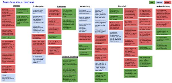
Data gathering: Interviews
table of interview partner:
| Number | Age class | Course of studies |
|---|---|---|
| 1 | <20 | Arts |
| 2 | <20 | Arts |
| 3 | 20-25 | Science/Engineering |
| 4 | 25-30 | Science/Engineering |
| 5 | <20 | Fine Arts/Design |
| 6 | <20 | Fine Arts/Design |
| 7 | <20 | Fine Arts/Design |
Reasons for choosing these people:
We wanted to figure out the differences between the students of Arts, Fine Arts/Design and Science/Engineering. So we chose people from our social environment. Because we are students from different courses of studies (Arts, Fine Arts/Design and Science/Engineering) we had the chance to interview these types of students. Thereby we had a huge spectrum of users.
Central questions:
- What chat apps/programs do you use and for what purposes (one-on-one interviews or group discussions, image, video and link transfer)?
- Where do you see advantages and disadvantages of your favorite chat program?
- How important authentication is for you?
- How should a trustable profile be? What information are important?
- In what situations you prefer the phone or an E-Mail before chatting?
- What are requirements for you to use a new app with guaranteed security?
- How often do you use them and how important they are for you?
- How important is security for you while chatting with people?
- What measures do you probably adopt to be safe?
- What functions and design features do you find most important for a chat app?
Observation
- What observations during the interviews did we make?
--> here the video can be integrated!
what is noticeable during these usability test?
(After that we did some usability tests of the app (ChatSecure) to find out how others deal with the login process. We wanted to find out if the register and login process is intuitive for the user or not. So we got to know about user's handling with apps and their expectations. We hoped to get suggestions and ideas for a better log in process based on the user's behavior.)
Data Analysis & Main Results
- App Requirements
- accessibility is of prime importance, so the app have to be widespread to make the user downloading it.
- The app should be for free.
- For the user it’s important to be up-to-date and flexible with messages. So he/she prefers an app for chatting.
- Visual Design
- Complexity takes a lot of time, so you need a simple, intuitive, neatly arranged design, which looks uniform on all gadgets.
- Interface & Functions
- It is handy for the user to have an interface, where you can see who is online at the moment and when a contact was online the last time.
- The app should contain a function to let the user know if the chat partner read the messages because it faciliate the communication.
- The user wants to send out photos/videos.
- The user likes to express its emotion with a lot of smileys.
- The function "writes..." is not necassary.
- Security
- It would be useful to have a password for the app.
- To feel safe, the user desires to have a security warranty.
- It is important that apps are immune from viruses.
- Important information, link, photos, videos, … are often sent by E-Mail.
- Distrust towards apps results e.g. from missing knowledge about safety and smart phone-apps.
- People use safety-options of social networks (e.g. Facebook) but don’t know, if they really work.
- Authenticity
- If you want a trustworthy profile you have to find a good balance between too much and too little information.
- (To much) Personalized advertising makes the user feel insecure.
- A “real” profile picture is soothing for the user.
- Authenticity doesn't loom large for students personally.
Research and problem solutions
What specific problem we want to solve
We want to solve some problems with the login-process and make it easier to use. It's hard and circular to login with one of your accounts, because there are too many steps until you are finally logged in. Moreover the buttons are difficult to find on the interface. Therefore we want to create a new login-process.
Plans – how we want to solve the problem(s)
- Method 1: Other application's test
First we start to analyse the login process at other applications. We found out that WhatsApp is the most widespread app to chat for our target group, second one is the Facebook messanger.
1. WhatsApp
This application doesn't contain a login process. You only have to choose the app to be online and you directly see all of your conversations. It is quite easy and intuitive.
2. Facebook Messenger
This application functions nearly the same way as WhatsApp, so you don't need a password to sign in.
Our conclusion:
Both applications manage without a password. That's quite intuitive but it isn't quite save. While doing our interviews we experienced that it would be convenient to have a password to have a safety warranty (e.g. in case of losing the smartphone)
First design considerations and ideas
We want ChatSecure as intuitive as WhatsApp and Facebook Messenger but we also want it to be staying save. So there have to be an additional button for entering a password and we want to reduce redundant buttons and clarify inconclusive and obscure functions/buttons.
Prototypes
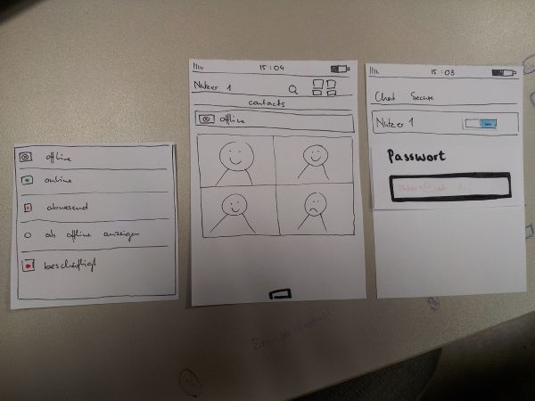
Our first prototype for the login process contains the additional password entering button if it isn't saved. (at the beginning you can choose if you want to save the password for further use or not) It occurs when you want to switch from offline to online as an extra field.
Our conclusions
- problems we had
- what we would do better next time
- our final design

