(Added some study related things) |
No edit summary |
||
| Line 40: | Line 40: | ||
*Contra: Performance issues. Could possibly be solved by rendering low-Fi first and when e.g. the user reads the page, the hi-fi Tabs are renderend. | *Contra: Performance issues. Could possibly be solved by rendering low-Fi first and when e.g. the user reads the page, the hi-fi Tabs are renderend. | ||
===Retrive closed Tabs easier=== | |||
Pro: Provide a Button oder Overlay-Button for retreiving an accidentally closed Tab. | |||
Contra: Takes valuable screen real estate. | |||
==Wireframes== | ==Wireframes== | ||
Revision as of 11:53, 27 April 2010
Smart Tabs for Mozilla Mobile
Project by Jan Dittrich
- "How can the way we make the tabs better representing the pages?"
- Goals: make tabs better representing the pages.
- No-Goals: Change the general model of interaction with tabs, Use signficant more screen real estate.
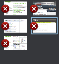
Current Situation
Ideas for Improvement
Put the closing-Button on the right Tab side
- Pro: The more relevant left edge is free.
- Contra:
- The left side is closer to the edge which means the area can be touched easier since one does not care about tapping a close object on the left side.
- When dragging the Bar in, one sees just the Buttons at first.
Smarter Page Crop
Concept: ???
- Pro: Coosing a more representative part of the page means better recognition and more differenciation between similar pages.
- Contra: ---
Adding Favicon
- Pro: Visual grouping of same Domain-Pages. Recognize logos of commonly used webpages.
- Contra: Could be mistaken for a button if not carefully integrated.
Note:It is likely that the favicon itself is hard to recall for non-frequently used pages. But it often gives color clues for the page. (Further research is needed)
Better rendering quality
- Pro: A better rendering of the tabs will improve the recognition.
- Contra: Performance issues. Could possibly be solved by rendering low-Fi first and when e.g. the user reads the page, the hi-fi Tabs are renderend.
Retrive closed Tabs easier
Pro: Provide a Button oder Overlay-Button for retreiving an accidentally closed Tab. Contra: Takes valuable screen real estate.
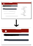
Wireframes
Study 1: What do people recall about webpages
Conducted by Bastian Bügler and Jan Dittrich
Goal
...is to find out what people can recall about websites they visited previously (about 2-10 Minutes ago)
Methods
Participants had do do simple tasks on several webpages. After a masking time of a couple of minutes filled with other tasks, they had to tell about the features that they link with the webpages.


