18 JANUARY 2021
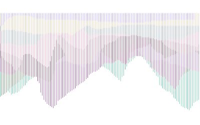
Just for fun, now that I've figured out fullscreen mode, here's a screenshot of the visualization without the fade, so the mappings simply layer on top of each other. Now you see that it could be more aesthetically interesting to have the lines offset so the next layer doesn't always erase the last (although I do like the idea of keeping a palimpsestic element).
16 JANUARY 2021
Just FYI, I figured out how to output my jit.lcd visual to fullscreen via a jit.window. Here is the link to the tutorial I used: https://docs.cycling74.com/max5/tutorials/jit-tut/jitterchapter38.html
And here is my updated project patch:
File:210116_ultrasonic_drawing_with_fullscreen.maxpat
15 JANUARY 2021
The starting point of my counter is also recognizable as the starting point of my line segments moving from left to right. In order to shift this starting point over by one pixel every other round, so that the layering lines are offset, I had the idea to define an if/then statement by even and odd numbers (that is, integers that are divisible by 2 versus those that are not), assign them the numbers 1 and 2, and then select 1 for a certain operation and 2 for another. The patch successfully gives off respective bangs for evens and odds, and even appears to apply the addition object when triggered, but the addition of +1 and -1 at the bottom still doesn't work when applied to my bigger project patch, and I don't know why yet.
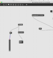
Here is the smaller patch focused on selecting evens and odds:
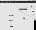
And here is my current main patch (using the number slider rather than my sensor data, so you can use it without the sensor), where the line does not appear to be offset every other round as I intended. Maybe it's simply not connected up properly?
File:210115_ultrasonic_drawing.maxpat
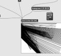
Regarding my main patch above, I have one additional small question. For the object "jit.op @op + @val 1" (which you can see on the left), I would like to slow down how often the value is added (like maybe every 4th bang rather than every bang?), if that's the right way to think about it? That way the lines wouldn't fade as quickly in the image. The goal is to have more layering than is happening now. Any suggestions?
14 JANUARY 2021
Better late than never! Here are two screen recordings of my interactions with my patch, to make it easier to troubleshoot:
2 JANUARY 2021 (Happy New Year!)
Before Christmas, I spent some time developing my patch. After a lot of trial and error, somehow I was still only able to get the number slider to work to generate the image, and not the live data coming in from my sensor (even though the numbers were printing in the console just fine). So, that's something I need help debugging. I also have very specific (hopefully straightforward!) questions that would make sense to discuss in a one-on-one meeting.
Christmas patch: File:Dec_21_ultrasonic_drawing.maxpat
14 DECEMBER 2020
I've rewatched the YouTube tutorials I found, and I've tried to simplify and adapt the steps to suit my drawing needs. However, I still can't quite get it to work. I want the patch to draw vertical line segments, one at a time, plotted from left to right, and at regular time intervals as data from my ultrasonic sensor comes in. In the end, I would want it to look more or less like my drawings below (see 9 December).
Here's the patch that still needs troubleshooting:
9 DECEMBER 2020
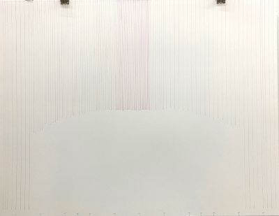
Here's an analogue drawing I'm making using the data from my ultrasonic sensor. It takes a long time with a pen and ruler! So Max/MSP is a good solution. Here's a low-quality photo of the drawing:
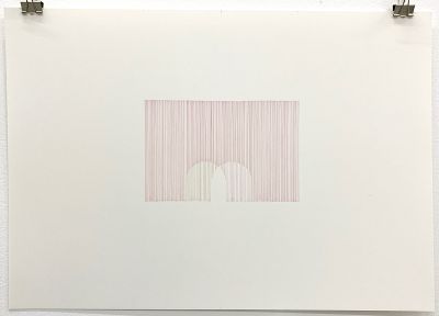
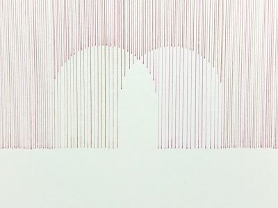
And here is another drawing, Sounding Landshapes (Sphere) – two hypothetical readings showing movement of a sphere over time:
4 DECEMBER 2020
I searched around the internet for some tutorials on how to make animated drawings, and I found a really good series focused on jit.lcd. However, I still need to find out how to draw lines in a non-randomized way using my data from the ultrasonic sensor. I haven't been able to find the answer via google, I think because my question is too specific and I have a pretty clear way that I want it to look. So, feedback on how to change the objects and messages to that end would be much appreciated!
- Here is my patch: File:drawing_test_oval.maxpat
- Does this help? File:Drawing_test_line.maxpat
And here are the four tutorials that taught me how to build the patch:
Part 1: https://www.youtube.com/watch?v=QH6eAg2_2vU
Part 2: https://www.youtube.com/watch?v=5qI2CZPWr1c&t=315s
Part 3: https://www.youtube.com/watch?v=nKDP-Yo-Muk
Part 4: https://www.youtube.com/watch?v=S4jsH6JyHSY&t=15s
30 NOVEMBER 2020
Here are relevant artworks that I feel could be inspiring for this class:
Timo Arnall, Immaterials: Light painting WiFi, 2011 https://vimeo.com/20412632
Katie Paterson, As the World Turns, 2010 http://katiepaterson.org/portfolio/as-the-world-turns/
Taavi Suisalu, Distant Self-Portrait, 2016 https://taavisuisalu.xyz/@/distant-self-portrait/
File:Liz_Screen Recording 2020-11-28 at 16.07.43.mov
File:test_analogue-to-digital-to-analogue.maxpat
Here's a patch-in-progress, now that I was successfully able to get my ultrasonic sensor readings to appear in the Max console. I'm also including a screen recording of the Max print feed, so you can see what's going on – I see that the console is breaking up the lines of data into smaller pieces (which I can imagine is simple enough to fix). For example, in Max/MSP, the word "distance" is broken up between several lines, and so are the numerical figures. Here is an example of how the same data shows up in the Arduino serial plotter. Just a note, I have included the word "distance" to also be printed, just to reduce confusion about values.
15:41:05.887 -> Distance: 68.54
15:41:05.958 -> Distance: 68.54
15:41:06.063 -> Distance: 50.18
15:41:06.171 -> Distance: 50.17
15:41:06.278 -> Distance: 50.98
15:41:06.387 -> Distance: 51.39
15:41:06.459 -> Distance: 51.37
15:41:06.563 -> Distance: 50.93
15:41:06.667 -> Distance: 50.52
15:41:06.769 -> Distance: 50.52
Now that I'm thinking more of the aesthetic exploration, I would be interested to have this data converted into a digital drawing that changes over time, so I suppose that would be a video or animation. I'm particularly interested in how a drawn line in digital space can be infinitely thin (unlike a pencil line, which is defined by the material), and so I could imagine playing with what are known as "space-filling curves" that approach infinity – for example, Peano curves or Hilbert curves. Here's the wikipedia page for an overview of what's behind them:
