Smart Tabs for Mozilla Mobile
Project by Jan Dittrich
- "How can the way we make the tabs better representing the pages?"
- Goals: make tabs better representing the pages.
- No-Goals: Change the general model of interaction with tabs, Use signficant more screen real estate.
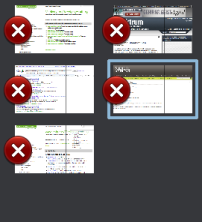
Current Situation
Ideas for Improvement
Put the closing-Button on the right Tab side
- Pro: The more relevant left edge is free.
- Contra:
- The left side is closer to the edge which means the area can be touched easier since one does not care about tapping a close object on the left side.
- When dragging the Bar in, one sees just the Buttons at first.
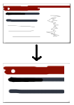
Smarter Page Crop
- Concept:
- Pro: Coosing a more representative part of the page means better recognition and more differenciation between similar pages.
- Contra: ---
Adding Favicon
- Pro: Visual grouping of same Domain-Pages. Recognize logos of commonly used webpages.
- Contra: Could be mistaken for a button if not carefully integrated.
Note:It is likely that the favicon itself is hard to recall for non-frequently used pages. But it often gives color clues for the page. (Further research is needed)


