This project is presented by Carlo Enke ● Johannes Lerdon ● Sven Sommerlatte.
Concept
Which problem did you identify?
There is no simple, quick-to-use solution that allows average web users to sort their bookmarks by relevance (rating,visits).
Why are current systems unable to solve this problem?
They are unable to solve this problem because they are not as practicable and efficient as they should/could be. Most systems solving special cases but no one is combining current systems to get a real useful 'built-in toolbar'. Another big fail is the design of the current ones - it's not really intuitive and much too interlaced.
Interviewing results
Users...
- predominantly using the bookmark-toolbar
- arrange their bookmarks on-the-fly
- propose a relevance ranking
- want a clearly design
Only a few of them use folders and those who do not use bookmarks, close the browser and “Save and Exit”.
What research findings led you to your first concept?
In our reseach we figured out that most users don't use 'advanced' bookmarking (e.g. tags) to increase their workflow. In fact of this, we can say it's quite bad arranged/implemented. So we wanted to merge our ideas of a new toolbar with newly-arranged advance functions.
In 140 characters, what is the essence of your project/solution?
Our solution intends to help average web users better organize, arrange and re-find bookmarks as easy and fast as possible.
Implementation
How did you ensure that a beginner can use your solution?
The most important thing of our plannings was that we wanted not to implemet any new standards, because these can easily become confusing. Therefore we tried to assume and combine all known systems and automate advanced functions as much as possible.
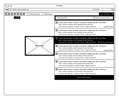
A bookmark consists of a screenshot of the page, its title, URL, favicon, current date and the relevance to the user - rated by the user. The clou is, most data will automatically be added. Last visit, visits and frequency of use will be updated over time.
What makes your solution more useful or efficient than current products?
Our product will not reinvent bookmarking, but combine existing products and optimize them in combination to obtain an easy-to-use toolbar.
(Essential: Sketches and/or Video to illustrate the interaction)
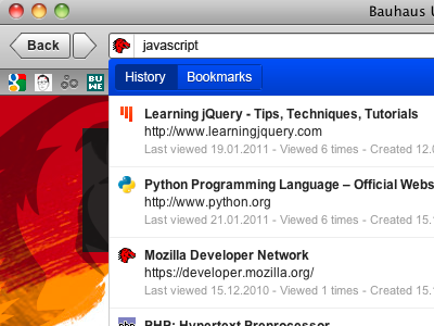
01/02/2011 The live search function has been implemented within the address input field.
19/01/2011 Short demonstration video of how the bookmarks live search is working.
15/12/2010 A video showing the first version of a partly functioning prototype built using HTML, CSS, Javascript (JQuery), PHP and MySQL.
<videoflash type=youtube>f_zAZgPOanI</videoflash>
User tests
How did you test your design?
Our prototype has been tested by about 10 people - our class and circle of acquaintances. We provided them a limited prototype created with PHP, SQL and jQuery. So they were able to use the protoype straightforward. Furthermore each tester has been introduced briefly to the prototype.
What new problems did you identify?
While testing the prototype some of the testers claimed that it would be much easier to have only one textfield. Furthermore the prototype does not have a history function so a switch would be necessary. So the user could choose which database should be searched on keydown.
What did you change following your user tests?
We've merged the live search with the address bar as shown in the third demonstration video.
Mentor Comments
James Kalbach
Concept
- In larger projects teams and within organizations, the ability to communicate design clearly and succinctly is very important. The problem definition for this project is unclear and includes many different aspects: bookmark toolbar, relevance, clear design, using folders. I’d like to hear a more focused statement about the issue you’re addressing.
- What type of “research” did you conduct, with how many people, and with whom?
- The essence of your project statement is more than 140 characters. It should just include who, what, where, why, when and how. Perhaps something like: “Our solution intends to help average web users better organize, arrange and re-find bookmarks they’ve created in a local browser.”
Implementation
- The explanation of the solution is well done. The video in particular is very good and goes a long way in illustrating the intent of your project.
- I would have liked to have heard more about existing solutions for bookmarking and a comparison of their capabilities and shortcomings against your idea.
- The sorting features are good on the folders.
- What happens if there is a very long list of bookmarks in a given folder? Does the menu extend beyond the page fold at the bottom of the browser? What are the limits to the number of bookmarks that can put in a folder?
- Did you consider filtering bookmarks in addition to just sorting them?
- What alternative directions did you explore before arriving at this solution?
User tests
- Please describe more about the tests you conducted, including an indication of the method, users, and findings.
Overall, this is a well-thought-out project that really shows you paid attention to the detail of interaction design and the overall experience.
Excellent work.
Cennydd Bowles
I'm impressed. It's a solution that shows clear, detailed thought.
I too think you could be more precise with your definition of the problem, since it jumps around a little and lacks the precision we see in your prototypes. A little more detail about the research you've conducted would help make a stronger case for your work.
I think you're wise to adopt the approach that existing convention matters and that there is value in recombining and improving existing solutions. Due to the mass audience for this sort of system, there's definitely a MAYA principle thing going on here (see cennydd.co.uk/2008/maya-principle/) and it would be easy to detract from the system's usability and UX by going too far in the quest for perfection.
Your prototypes are impressive and well executed, and I'd say you're very close to a real breakthrough - although I must confess that the third version doesn't convince me, mostly since the user's attention is required in two locations simultaneously; the URL and the search function. Is there yet a simpler solution that recombines the visual focus in an elegant way?
Eric Reiss
To continue the discussion we started when I visited you in Weimar, the problem you set out to solve is unclear. The description of the problem actually describes the current usage pattern, but doesn't identify the problem. Hence, the ultimate success of your project is unclear as I am still uncertain as to what your goals were - the essence of innovation: solving a problem.
In general, the more time you spend discussing and defining the problem, the easier it is to create a solution and critique it internally within the design team. I just don't feel you spent enough time on this. Instead, I suspect you took the assignment and immediately started sketching stuff.
I do like that you build on existing best-practices. I am unsure (like Jim) as to how your proposed solution will scale (a problem, I might add, that you share with several of the other project groups).
The prototype is indeed impressive. Nicely done. It gives a much clearer picture of what you want to achieve - for me, it seems to help the user recall WHICH site they bookmarked and WHY they did so. And although you didn't state this clearly, it IS a problem and your attempt to solve it is excellent. Well done, gentlemen!


