Aims of data gathering
We wanted to know how to improve the design and/or functions in Chat-Secure, regarding the security-problem. People should immediatly see that it's a secure chat through its interface. So we searched for possible symbols that provide security and tried out some designs to improve the current look of the chat.
--Hans 21:40, 18 December 2013 (CET)
Data Gathering: Interviews/Observation
We interwiewed ten people of these courses of studies below. Since we all studies something similar we had an easy access to them. We asked them about their chat behavior in general and especially how they think about security.
| Number | Age class | Course of studies |
|---|---|---|
| 1 | <20 | Media Science |
| 2 | 20-25 | Computer Science |
| 3 | 20-25 | Business Economics |
| 4 | 20-25 | Computer Science |
| 5 | 20-25 | Computer Science |
| 6 | 20-25 | Computer Science |
| 7 | 20-25 | Computer Science and Media |
| 8 | 20-25 | Computer Science and Media |
| 9 | 20-25 | Media Arts/Media Design |
| 10 | 25-30 | Game Design |
Main questions:
- What chats do you use?
- Are you happy with them or would you want to improve something?
- Which functions are important for you?
- Have you ever think about the security in the chat programs?
- Are you feeling secure in your currently used chats? If no, did you restrict yourself in some way and how far?
- What are the limits of effort you would accept to feel safer in a chat?
- Have you ever been attacked before?
Data Analysis
How we analysed the data: We searched for specific answers in the interviews and looked how it could help to spot a problem. Then we put all our results together and created an affinity diagramm.
--Hans 21:43, 18 December 2013 (CET)
Main Results Data Analysis
Results:
- Most people use chat programs that are unsafe. The amount of friends that use a specific chat is more important did the users know that the apps they use were unsafe?--Hans 21:44, 18 December 2013 (CET)
- Standard functions like Smileys and data/picture transfer should be offered
- There should be a function to create a group discussion
- Chats are used for job messages as for private ones
- User want to see (e.g. by a lock-symbol), if a program or message is secure or not
- Open Source programs provide trust
- The design should be functional AND appealing
What we learned from our user research: We got a lot of information about the requirements and the possible use of a chat application. The most important features people wanted to be part of such an application where group chat functionality, image transfer, smileys and an easy to use but appealing interface. People often want to plan parties in a chat, so the group function could be necessary and image transfer is also an important factor of communication for most people.
It was also interesting for us to find out that the main percentage of the users know about possible security issues:
- fear of being in a computer surveillance/being watched in general
- fear of theft of an account/a mobile device
- e.g. personal messages were posted on the pinboard because of a Facebook bug
However, they did not try to find an alternative. Related to this we also found out that people using chat software for business had much more concerns about their personal information and especially the topic and content of the talk then the private users.
--Hans 21:50, 18 December 2013 (CET)
What specific problem we want to solve
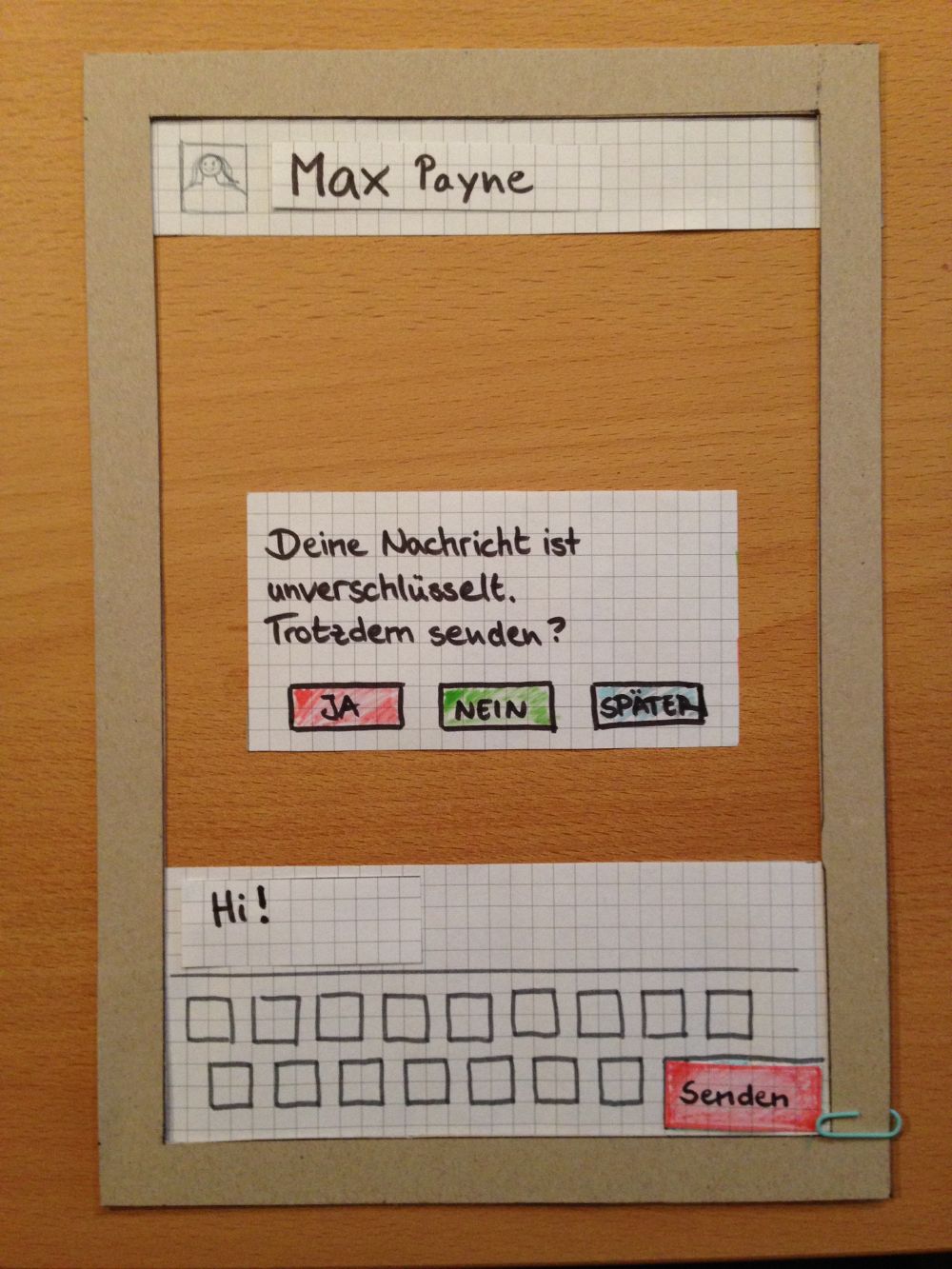
The interface should communicate security to the user. Therefore we want to improve the interface of ChatSecure in a way, that everyone is able to understand what is meant with the symbols. To create such a design, we drew some of our own design-ideas on a paper. It showed the message window and some applications and icons we added to it, e.g. the lock symbol next to the Accountname and in the speech bubbles itself. These things intensify the security-feeling. Then we discussed those ideas, made a prototype and tested it on a comrade who wasn`t in our working group.
--Hans 21:56, 18 December 2013 (CET)
Plans – how we want to solve the problem(s)
The ideas of last week worked quite well, but not properly understandable. The problem of the red color we`d chosen for the Send-Button for an insecure message didn't work out. Our test subject thought the button couldn't be clicked at all. So, in the next week, we would look for similiar applications and how they deal with authentification and security methaphors. After that, we would improve our prototype with the results of the last weeks and try out different approaches to solve our problems, regarding the prototype itself, the layout and the colours. Then we would test it again.
