Course Aims
During the course "Nutzerstudien" we focused on the smartphone app "ChatSecure" by interrelating the security of chat apps. We wanted to find out about the importance of security in chat apps for students at our age. Further we were interessted in generelly expectations they have from chat apps and what their problems/whishes are. For that purpose we tested the app "ChatSecure" with our target group, accomplished usability tests and so developed a varied design to improve the process of creating an account and of signing in.
Progress of work
1. Interviews and target group For that reason we started to interview a few people from our social environment as our target group. So we focused on students at the age of 20 - 30. We reached this test persons personally so we met them to conduct the interviews directly.
2. Analyse and Assessment After that we analysed the results by summing up, comparing and strucuring them.
3. Prototypes and scenarios
Then we began to create prototypes. These prototypes also passed through usability tests to further improve the design.
For that prototypes we constructed scenarios which had to be accomplished by the test users.
4. Improving Design by Iteration We further improved our design by iteration (five steps) to get our final design.
Ich denke, dass Progress of work und Course aims eine gute und einfache Einleitung sind.
Data gathering: Interviews
table of interview partner:
| Number | Age class | Course of studies |
|---|---|---|
| 1 | <20 | Arts |
| 2 | <20 | Arts |
| 3 | 20-25 | Science/Engineering |
| 4 | 25-30 | Science/Engineering |
| 5 | <20 | Fine Arts/Design |
| 6 | <20 | Fine Arts/Design |
| 7 | <20 | Fine Arts/Design |
Reasons for choosing those people:
We wanted to figure out the differences between the students of Arts, Fine Arts/Design and Science/Engineering. So we chose people from our social environment. Because we are students from different courses of studies (Arts, Fine Arts/Design and Science/Engineering) we had the chance to interview these types of students.
Form of accessibility:
From the start we were agreed that we want to reach our target group personally by meeting them at the university (fellow students/friends) or at home (homemates). We wanted to talk to them privately to get detailed information and to observe their chat behaviour.
Central questions:
- What chat apps/programs do you use and for what purposes (one-on-one interviews or group discussions, image, video and link transfer)?
- Where do you see advantages and disadvantages of your favorite chat program?
- How important authentication is for you?
- How should a trustable profile be? What information are important?
- In what situations you prefer the phone or an E-Mail before chatting?
- What are requirements for you to use a new app with guaranteed security?
- How often do you use them and how important they are for you?
- How important is security for you while chatting with people?
- What measures do you probably adopt to be safe?
- What functions and design features do you find most important for a chat app?
Kleine Anmerkung für zukünftige Projekte: Fragen "what are the requirements…" und "how often…" sind schwierig gut zu beantworten und ihr erfahrt dadurch vermutlich wenig über die Gründe für das Nutzerverhalten. "Advantages… Disadvantages" und "which measures" sind gut. Fragt nicht nach generellem, sondern nach "wie machst du…" "was machst du…", "warum hilft… wenn du…" – Dinge, die mit Aktionen zu tun haben, und, noch besser, beobachtet werden können.
Observation
After that we did a usability test with ChatSecure to find out how other users deal with the app.
We wanted to find out if the register and login process is intuitive for the user or not. So we got to know about user's handling with apps and their expectations. We hoped to get suggestions and ideas for a better log in process based on the user's behavior.)
- What observations during the interviews did we make?
The tester was asked to say what she/he was thinking and doing while testing the prototype, which problems she/he had and how they could be solved. With that method and the video it was possible to find and analyse the issues the tester had.
- What is noticeable during that usability test?
During the test we found out...
- ...how the proband approached to the test,
- ...how long it took her/him to understand the system and structure of the app,
- ...which problems appeared
- ...and where the problems appeared.
Results: We evaluated the usability tests and made a heuristic analysis for creating a new account and the login-progress. Der Abschnitt zu Observation zeigt eine gute Strukturierung, da bin ich sehr gespannt auf die Ergebnisse dieser Tests. leider steht unter "What is noticeable during that usability test?" nur welcher Art die Ergebnisse sind ("which problems appeared") und nicht was die Ergebnisse selber sind ("Problems: The foo irritates users, because it looks like the bar they already know from qux) Auch die Heuristische Analyse, die ihr gemacht habt, hat eine kurze Hinleitung und deutliche Erwähnung verdient!
Data Analysis & Main Results
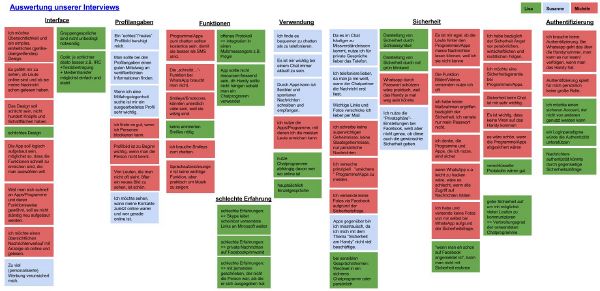
To analyze the data we got, we wrote down the interviews and focused on concisely statements that were important for our task. So we picked out some theses independent from each other and created a kind of digital pin board. There we collected the most important information and tried to arrange the notes into groups. So we got a good summary of our interview results and a much better basis for the designs and improvements.
- App Requirements
- It is of prime importance that the app has to be easily accessible. So it has to be widespread to make the user downloading it.
- The app should be for free.
- For the user it’s important to be up-to-date and flexible with messages. So he/she prefers an app for chatting.
- Visual Design
- Complexity takes a lot of time, so you need a simple, intuitive, neatly arranged design, which looks uniform on all gadgets.
- Interface & Functions
- It is handy for the user to have an interface, where you can see who is online at the moment and when a contact was online the last time.
- The app should contain a function to let the user know if the chat partner read the messages because it faciliate the communication.
- The user wants to send out photos/videos.
- The user likes to express its emotion with a lot of smileys.
- The function "writes..." is not necassary.
- Security
- It would be useful to have a password for the app.
- To feel safe, the user desires to have a security warranty.
- It is important that apps are immune from viruses. That means that the app should be save. Our probands talked about some safety gaps they experienced on social platforms and other chat providers they used (e.g. private messages that were published on the public profile, spam mails, ...).
- Important information, link, photos, videos, … are often sent by E-Mail.
- Distrust towards apps results e.g. from missing knowledge about safety and smart phone-apps.
- People use safety-options of social networks (e.g. Facebook) but don’t know, if they really work.
- Authenticity
- If you want a trustworthy profile you have to find a good balance between too much and too little information.
- (To much) Personalized advertising makes the user feel insecure.
- A “real” profile picture is soothing for the user.
- Authenticity doesn't loom large for students personally.
Research and problem solutions
What specific problem we want to solve
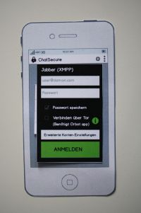
We want to solve some problems with the login-process we had as we first used the app and make it easier to use. It's hard and circular to login with one of your accounts, because there are too many steps until you are finally logged in. Moreover the buttons are difficult to find on the interface. Therefore we want to create a new login-process.
Plans – how we want to solve the problem(s)
--> Using the method: other application's test: Ich freue mich, das ihr hier zusätzliche Methoden (Konkurrenzanalyse) angewandt habt. Das zeigt, dass ihr euch eigene Gedanken macht und eigene Lösungen sucht!
First we start to analyse the login process at other applications. We found out that WhatsApp is the most widespread app to chat for our target group, second one is the Facebook messanger.
1. WhatsApp
This application doesn't contain a login process. You only have to choose the app to be online and you directly see all of your conversations. It is quite easy and intuitive.
2. Facebook Messenger
This application functions nearly the same way as WhatsApp, so you don't need a password to sign in.
Our conclusion:
Both applications manage without a password. That's quite intuitive but it isn't quite save. While doing our interviews we experienced that it would be convenient to have a password to have a safety warranty (e.g. in case of losing the smartphone).
First design considerations and ideas
After the intervies, the observations while usability tests and the comparision with other apps, we could draw the first design conclusion and ideas:
1. We want the process of creating an account and signing in as inutitve as possible (comparable with WhatsApp and Facebook Messenger) 2. We want the app as safe as possible (safer than WhatsApp and Facebook Messenger)
first changings/development ideas:
- additional button for entering a password (if it isn't saved)
- reduce redundant buttons
- clarify inconclusive and obscure functions/buttons
Prototypes
Version 1
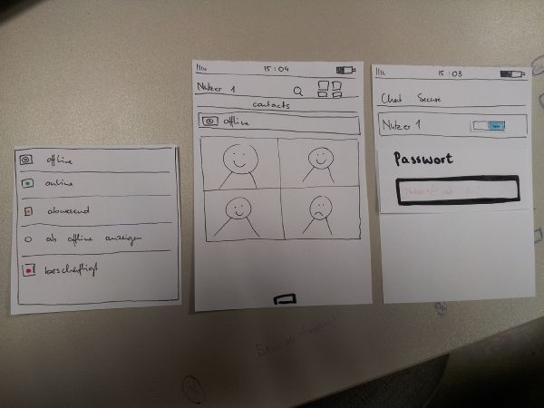
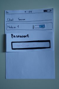
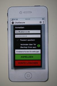
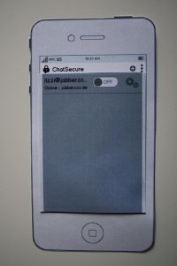
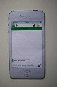
Our first prototype for the login process contains the additional password entering button if it isn't saved. (at the beginning you can choose if you want to save the password for further use or not)
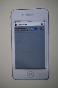
It occurs when you want to switch from offline to online as an extra field.
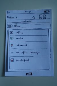
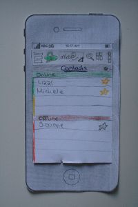
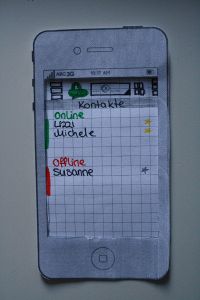
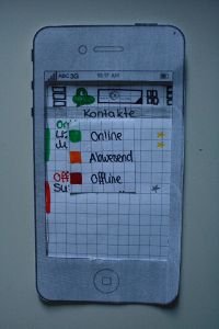
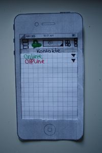
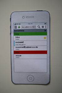
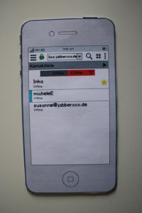
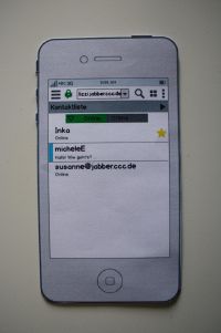
In the next step for our prototype we thought about a clear arrangement of the contact online/contact offline menu. In our usability tests we found out, that the design is very confusing and the tester couldn't really find out wich contact was online and who not.
Moreover we separated the symbol of the own status and the symbol of the contact's status, so there's no more confusion. Now it's clear what your own status is and what's the status of your contacts.
We also added a star on the right side next to the contact's name. That's optional for every contact and a way to fix your favourite contacts on top of the list.
Version 3
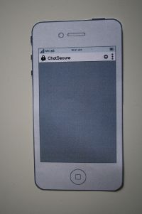
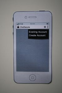
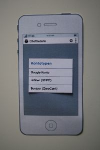
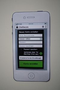
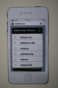
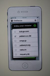
For the next iteration we focused on improving the progress of creating an account.
At this juncture we found it very importent that the user could follow all of his actions and understands the results. We also wanted a clear and visible design to show the system status.
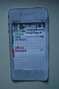
We added info buttons near interface-Elements that were misunderstood in our tests. So the user can get fast help without serching for it very long. We think this is a solution helping new users and not annoying user with a bigger knowledge.
Furthermore we improved the design for the list of contacts once more and clearly seperated "online" and "offline" from each other in order to prevent mistakes and confusion. This two lists are know reachable with a kind of "tabs".
Bezug zu Bildern herstellen (wie in der Mail angemerkt)
Version 4 - final version
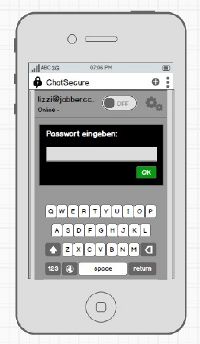
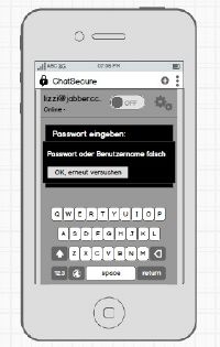
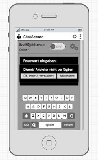
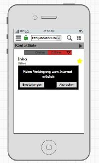
In the last and final version we used an old idea from the first prototype and grided the password-request in the progess of creating an account.
Moreover we added all error messages, that appeared in the tests to give feedback to the user in every of this situations and to let her/him decide by her-/himself how to react.






Our design conclusions
Problems we had:
The first user experiences by ourselves with the app "ChatSecure" passed dragging because of difficulties with the process of creating an account. We lost too much time by trying to test the app. It was a huge problem that the app didn't worked with IOS.
