Smart Tabs for Mozilla Mobile
Project by Jan Dittrich
- "How can the way we make the tabs better representing the pages?"
- Goals: make tabs better representing the pages.
- No-Goals: Change the general model of interaction with tabs, Use signficant more screen real estate.
Current Situation
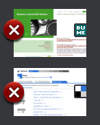
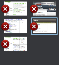
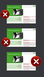
Functions: Tapping on non-framed part of the image makes the respective page appear. Tapping on the area enclosed by the red frame causes the tab to close. This area has currently (1.1 alpha) a width of 57px which makes e.g. 6mm on a N800 or 9mm on an iPhone (on which FF Mobile not runs!).
(current) Wireframes
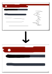
 Most of the ideas combined:Better rendering, redesigned close button, favicon, smart image crop.
Ideas for Improvement
Make Closing Botton Less Obstrusive
(Discussion of the wireframes is in the same order: from top to bottom.)
Make Button Smaller
- Pro: Less space is taken from the image. Button is close to screen edge
- Contra:
- Relevant part of the image not entirely free.
- The Button is harder to see.
Move the button down
- Pro: Frees the recognition-relevant upper-left part entirely.
- Contra:
- The target area has probably to move down a bit too; needs testing on a touchscreen-device.
- One Problem that could occur is that people will probably be more likely to tap below an item (they still see it) than to tap above it (it covers even more than usually). The availiable target area could become too small because of that.
Move button to the right edge
- Pro: The more relevant left edge is free.
- Contra:
- The left side is closer to the edge which means the area can be touched easier since one does not care about tapping a close object on the left side.
- When dragging the Bar in, one sees just the Buttons at first.
Smarter Page Crop
Concept: Choose a better crop of the page as thumbnail. Acually it already works pretty well, since mainly the upper left corner is present due to the small screen of the mobile devices. In my tests a 480px height crop seemd to be decent (the height is more important, since distinctive visual features are often located on the left side)
- Pro: Choosing a more representative part of the page means better recognition and more differenciation between similar pages.
- Contra: ---
Adding Favicon
- Pro: Visual grouping of same Domain-Pages. Recognize logos of commonly used webpages.
- Contra: Could be mistaken for a button if not carefully integrated.
Note:It is likely that the favicon itself is hard to recall for non-frequently used pages. But it often gives color clues for the page. (Further research is needed)
Better rendering quality
- Pro: A better rendering of the tabs will improve the recognition.
- Contra: Performance issues. Could possibly be solved by rendering low-Fi first and when e.g. the user reads the page, the hi-fi Tabs are renderend.
Retrive closed Tabs easier
Provide a "recently closed" button at the "new tab"-view for retrieving closed tabs.
- Pro:If a tab is accidentally closed, it can be retrieved without typing effort
- Contra:takes screen real estate.
Preview pages while finger down, open when up (deferred)
- Pro: Very fast preview, since one could just go over many tabs in one move. Even very shortly displayed content is recognized (see also: Processing Speed In Cerebral Cortext– Rolls Tovee – 94) It could be triggered with long-tap too: It would trigger a kind of preview overlay and moving to another tab while down whould trigger its preview to occur than.
- Contra: Could get in the way of future attempts to make tab-resorting possible. (not applying to long-tab-triggering or a drag in one of the modes in vertical direction first) May confuse users (?)
- Prototyping results: It works not faster than tapping the pages. This is due to the fact that one can distinguish no more than ~10 tabs (more are unlikely on a mobile device) usually easily. If not, the amount of tabs will be low enough to invoke them by tapping.
But try for yourself: Flash Prototype
I think that this approach is not bad but it will start to perform good with greater item quantities.
Study 1: What do people recall about webpages
Conducted by Bastian Bügler and Jan Dittrich
Goal
...is to find out what people can recall about websites they visited previously (about 2-10 Minutes ago)
Methods
Participants had do do simple tasks on several webpages. After a masking time of a couple of minutes filled with other tasks, they had to tell about the features that they link with the webpages.


