i n t r o *
In 1998, Perry Hoberman exhibited his installation "System Maintenance" as part of the DEAF98 EXHIBITION entitled "The Art of the Accident" in Rotterdam: [1]
System Maintenance played with the (dis)continuities of physical and virtual space. It was about the mixture of three realities: the life-size furniture moving on wheels in the center of the installation, a virtual platform of the same furniture on a computer, and a small scale "doll's house model" of the same furniture. All three spaces are filmed from the same height, position and field of view, superimposed onto a single large-scale video projection. The images of the three rooms are then balanced and merged together. The installation invites the participant to assimilate all three spaces of furniture, like a Rubick's Cube.
Around 2:50 sec of this video, Hoberman was saying something intriguing to me: "I designed the furniture first on a computer. I didn’t take it seriously, like making it ergonomically correct. But I thought I was making it roughly the right size. On a computer, this chair looked just fine. But when you sit now on this chair, you feel like you're six years old."
t e a s e r t x t *
This semester I decided to question postulates of relation between virtual and real architectural space. How would it look like if the architectural space I create is actually not contemplated and designed around strict architectural rules of scale and dimensions? What are my ideal dimensions of architectural elements that I can create by my own, without any prefabricated rules?
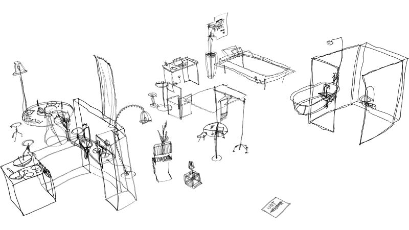
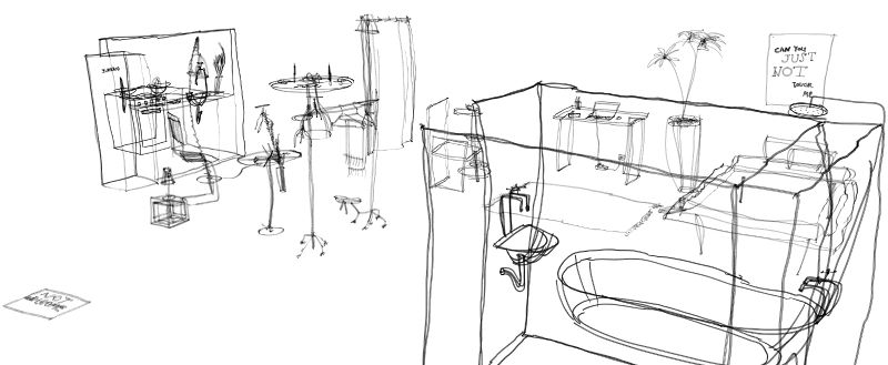
During the semester, I was working with Google's Tilt Brush, in order to accomplish my desires. I created a collection of architectural elements and furniture I use everyday in real life, but I made them suitable for my height and size, my preferences of their disposition and the quality of space, neglecting the rules I learned while studying architectural design. Therefore, the bathtub is right next to the bed, the bed and dining table, which have a great importance to me, turned out to be over over-sized without that intention, etc.
In the next step, I decided to make a research and a comparison of the furniture and space I've created, with something that is established etalon of architecture. Therefore I made a dimensional analysis and visual comparison, that was clearly implicating how my intuition on creating space from a blank canvas differs from what I am used to while I design standardized architectural spaces.
n e u f e t rulez*
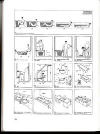
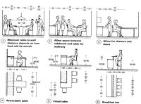
Before I come to you with my project, I want to make a small overture by mentioning the number one authority for architecture students - Mr. Neufert. His collection of dimension rules on few hundreds of pages is dating from last century and still is the biggest and the most detailed collection of rules about architectural space. We used it a lot and were always getting back to it while designing spaces.
p r o j e c t*
Hello MTV, welcome to my crib!
1
2
3
Tiltbrush snapshots>
d i m e n s i o n a l a n a l y s i s*
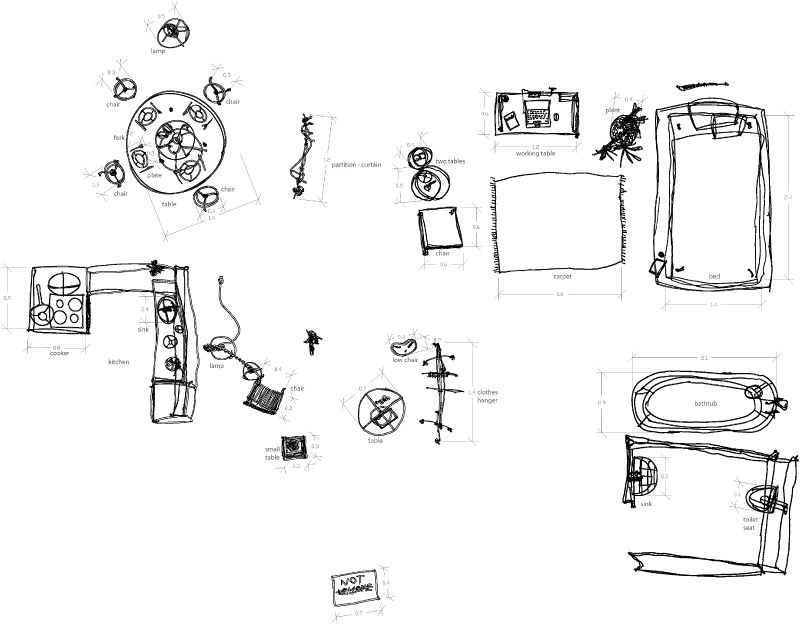
I placed a newly designed surrounding in architectural program and started to make a dimensional analysis. Thus, I created a typical drawing - floor plan and noticed: some elements vary from normalizations a lot, and some just slightly.
collection of floor plan dimensional analysis
In the next step, I added a reference of height to the narrative, as well as the standardized element next to the element I drew. This step is showing more precisely how much I've missed.
- note: standardized elements are colored in magenda
collection of comparative analysis
As a conclusion of my research, I decided to make two videos of Unity experience of the space I created.
The first one is without any references for scale, such as humans. I am just walking around, with my own height. The space I am going through seems pretty normal and right-sized. It is even a bit tight to me - while I was walking I was scared that I don't run into something. Then I realized the space area is quite big- around 80sqm, and VR just tricked me a bit. But still, everything seemed quite fine.
Afterward, I placed in a scene Idle - humanoid as a reference, with average woman size and height of 163cm. Then I realized... Okay, it's true. It's really hard to understand scale in VR... Idle was fitting to the scenario as Perry Hoberman said, like a child: the bed is huge for her, the tables, sinks and kitchen elements are too high, some furniture pieces are disproportional, and while sitting on chair, her feet can't reach the ground.
